• Home
  • About
  • Contact
  • Advertise

Devlounge

Design, Develop, and Grow

ateşli sevgilisi fantezisini yaşamak istediğini söyler porno ona arkadaşları varken onunla gizli saklı seks yapmak istediğini sikiş söyleyen kız hafta sonu için gelen arkadaşının görmediği bir sikiş açıdan sakso çekmeye başlayınca adamın yarağını bu altyazılı porno şekilde indiremez ve açık şekilde salonda sikişimeye sex izle başladıklarında misafir kızı da bu sekslerine rokettube konuk ederler seks yapacağını düşünmeyerek onun sex izle oyun oynadığını zanneder sabah olur ve herkes uyanır hd porno bu sırada yanında şişme mankenini de getiren sapık erotik hikayeler genç sınav haftası ders çalışan genç adam üvey annesinin sikiş eve gelmesiyle hayatının şokunu yaşar

  • Home
  • Code
  • Design
  • Design Focus
  • Interviews
  • Publishing
  • Strategy
  • Webapps
  • Extras

Design Focus: Animate.js

April 29, 2016 By Sophia Lucero

Check out these dynamically designed sites that all happen to be JavaScript conferences.

Designs of the Week

Need help in promoting your site? INeedHits has been in the search engine marketing since 1996!
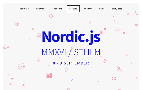
Nordic.js
Nordic.js

Wingdings is that you? There are a lot of “back-to-basics” making their way into website designs these days, like the bright blue and the pixelated, low-resolution images, and on top of that it’s the famous symbol font whose glyphs are gliding through a 3-dimensional stream. Even the circular shadowed bullets are used as markers for the carousel.
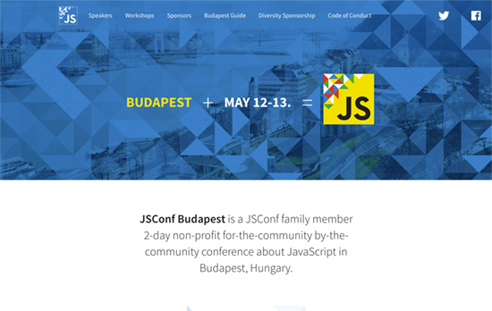
JSConf Budapest
JSConf Budapest

Quite the elegant triangle animation in the header that lets you interact with it too. I also like that the speaker avatars have their corners cut off in the shape of triangles too.
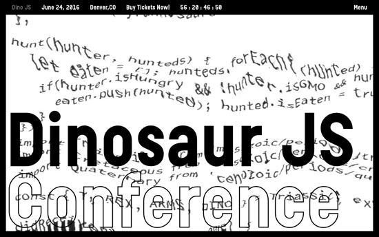
Dinosaurjs
Dinosaurjs

Also greets you with this cool glitchy effect applied to a block of code, this site is probably the kookiest of all with its oversized cursors and headings. I also like the black and white not just as a color scheme but as a negative filter when the text scrolls through the edges.

Social Media Weekly

Design – Design debugging
“Developers typically split the task of finding issues from building a project for wider release. These modes are often called debug and release. I think designers should take a similar approach.”

CSS – Flexbox Patterns
“Flexbox is awesome, but it introduces many new concepts that can make it difficult to use. These interactive examples will show you practical ways to use it to build UI components. They start out simple and get more complex near the end. You can start using these patterns in your own code right away, though I recommend you apply accessibility best practices to the markup (like using semantic HTML5 elements).”

Design – The Way We Build
“This process led us to the development of our new Design Language System (or DLS), as well as a suite of internal and third-party tools that allow our teams to not only work smarter, but also closer. The DLS is a collection of components defined by shared principles and patterns. This allows for rapid iteration using a shared vocabulary across design, engineering, and other disciplines. The structure of the DLS is simple and coherent, easing communication across teams.”

Build on DIYThemes’ Thesis Framework for rock solid SEO and great layout customization options.
5 Reasons You Need to Be Using jQuery

February 24, 2016 By Devlounge

jQuery is one of the best-known development tools available, and since its emergence just 10 years ago, it’s exploded in popularity. In fact, it powers roughly 65 percent of the top 10,000 most popular sites on the Internet. So what exactly is it, and is it worth learning? [Read more…]

Friday Focus 03/09/12: Chalked Up

March 9, 2012 By Sophia Lucero

It’s back to the classroom this week on Friday Focus as we study designs that feature the chalkboard effect on them.

Designs of the Week

Search Optimized, Turn-Key Designs, Unlimited Everything. Start building with the Genesis Framework today.

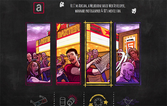
Adrian Baxter's website
Adrian Baxter

Most blackboard effect designs stick to the the scratchy white on black (sometimes green) look, but this one uses multiple colors (there’s colored chalk, after all). There’s a bit of a movie and zombie apocalypse motif going on in the different pages (even parallaxed on the homepage), all clever ideas as you’ll discover.

Mustache website
Mustache

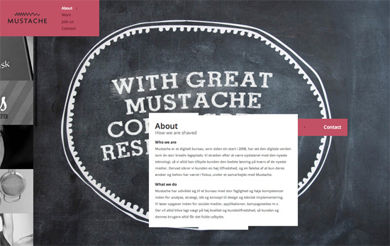
Surprisingly no mustaches in the design, but it’s there in the copy (e.g. “the clients we have shaved”), logo, and favicon. The way this site is laid out isn’t noticeably different at first, but you’ll find things that make you go “hmmm”, like how the portfolio images are in a fixed scrolling panel at the right, and have this stylized “magnifying glass” hover effect. I also find it interesting that the content boxes have uneven edges made up of multiple rectangles.

Planboard website
Planboard

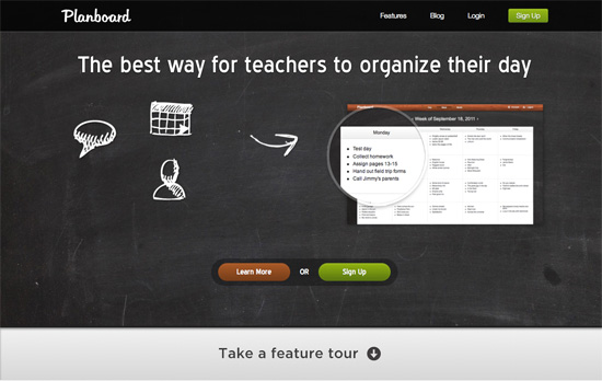
I like how all the info is spaced out nicely and easy to read, but the type in the heading doesn’t match, and for such a tall area, there could have been more info in it. It’s nice how the texture repeats in the footer area though.

TSE-WebDesign website
TSE-WebDesign

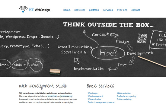
There’s a slide-bounce effect to displaying the “blackboard area” once you load each page, and each heading is a specific design that matches the content. I also like the little underline touch on the menu links and the logo, the kind you find inside Photoshop.

Knock Knock Factory website
Knock Knock Factory

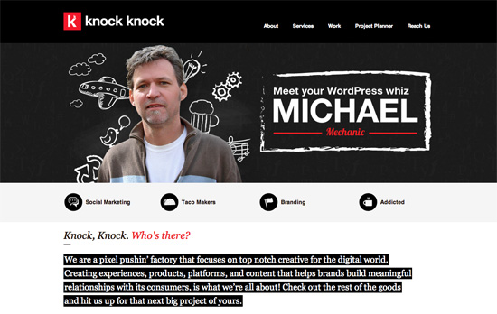
I like the red-white-black color scheme that’s softened a little by the “blackboard area” that mixes actual portraits with scribbled graphic elements. Unfortunately you don’t see that in the rest of the pages, where icons are featured prominently.

Social Media Weekly

Make Headway, make intuitive layouts, make it your WordPress theme of choice!

JavaScript – Thinking Async
“Here’s the rub: when you load JavaScript from a third party you should do it asynchronously. You might want to load your own scripts asynchronously too, but for this article let’s focus on third parties.”

User Experience – Lean ways to test your new business idea
“These techniques allow us to test our business idea while it’s still an idea — before developers have written a single line of code.”

Business – Docracy
“Docracy is a social repository of legal documents. Our mission is to make useful legal documents freely available to the public.”

Web Design – New tools for web design and development: February 2012
“In this new regular feature Mark Penfold rounds up 10 of the best new tools for web designers and developers that we have come across.”

Friday Focus 11/04/11: Side Scrolling

November 4, 2011 By Sophia Lucero

Like the parallax effect, horizontal scrolling is a popular technique to grab people’s attentions and making a website stand out. It also challenges the usual top to bottom browsing we are accustomed to, so it should always be used with caution. Let’s see if this week’s featured designs are on point. Happy Friday Focus!

Designs of the Week

Moods of Norway website
Moods of Norway

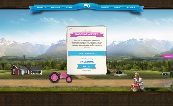
It’s great how before you begin scrolling, when you hover on the “Scroll” button (ribbon actually), the screen goes dark to give you a hint about your scrolling options: it covers all bases from arrow keys, scrollbars, scroll wheel, and even touch. Several vehicles (a pink tractor and boat, a yellow limousine) lead you through different sceneries as different cards in the stack move to the top, each containing descriptions for the current section. Selecting it moves the viewport “up”. The shadow of the floating page is a little too strong, almost looks like a solid border, and the body text could be a little more styled to match all the other elements. One last thing I find weird: the hover color in the navigation is a very strong pink that clashes with the blue ribbon background. Overall though, very pleasant site!

Ivan Akimov's website
Ivan Akimov

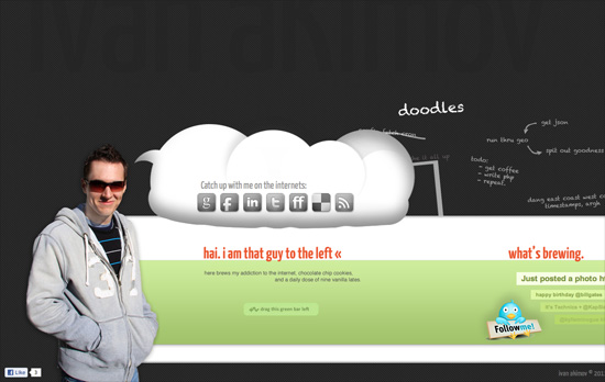
At first I wondered why there was a lot of space at the top then I noticed some very subtle text in the background. Navigation is different from the usual horizontally scrolling sites out there: instead of dragging the scrollbar, you do the dragging action anywhere in the green area. Which isn’t bad at all if you don’t mind inadvertently highlighting elements on the page. I like how the latest tweets are arranged although the social icons seem to have larger emphasis than the rest of the content.

mooweex website
mooweex

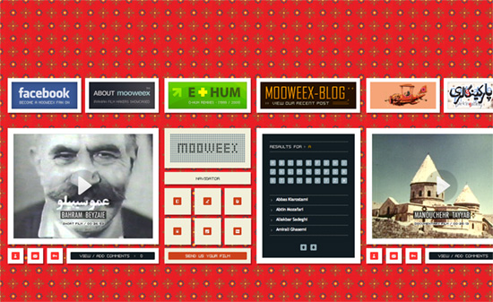
I just wish the background pattern wasn’t so bright so I can enjoy the old school look going on here, between the pixelized fonts and icons. What’s weird, though, is there seems to be no visual hierarchy. The title is mixed with the navigation in between each video, while the About and Blog are displayed alongside the ad-like boxes at the top.

Falanxia website
Falanxia

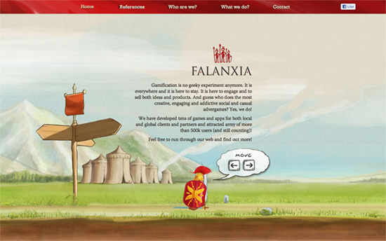
This one captures the platformer video game format with the keyboard navigation, which even accelerates the character (from walking to running) if you press long enough. I also enjoy enjoy the watercolor, storybook-like illustrations on the site.

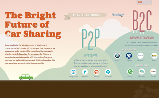
The Future of Car Sharing website
The Future of Car Sharing

Not only is this a wonderfully animated side-scrolling site, it’s also one long horizontal infographic. It uses both motion and the landscape to take advantage of objects and depict statistics and comparisons through them: flags, trees, houses, you name it.

Social Media Weekly

Responsive Web Design, Mobile Web Design – Multi-Device Web Design: An Evolution
“From responsive Web design to future friendly thinking, here’s how I’ve seen things evolve over the past year and a half.”

Design – Lots of Ipsum
“There is just too many awesome Lorem Ipsum (placeholder) text generators going around lately not to round them up.”

JavaScript – 140byt.es
“140byt.es is a tweet-sized, fork-to-play, community-curated collection of JavaScript”

User Experience – Don’t Give Your Users Shit Work
“We need to get out of this idea that the act of spending time on a project means that you spent your time wisely. Sometimes you’re just wasting your time.”

Friday Focus 08/12/11: Slashed Text

August 12, 2011 By Sophia Lucero

We’ve seen a lot of slanting, skewed designs before, but there seems to be an even more specific trend related to that: cropping away text by the use of diagonal lines, as though their edges have been slashed away.

Designs of the Week

Ralph Millard's website
Ralph Millard

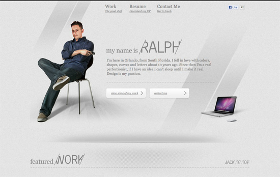
The way the images are sliced are extremely odd and even unsemantic. Why not just reuse the dividers and background headers per section? Splitting a large image is a little more understandable perhaps to load things faster, but that also means you’re making multiple HTTP requests.

Adriano Brzozowski's website
Adriano Brzozowski

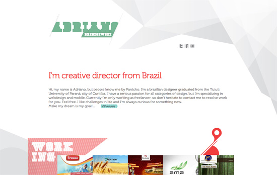
Here’s another site that uses triangles (and a couple of other shapes), and I like how it frames the Work section nicely. The use of green on the hover boxes is a little surprising even you do see it in the logo. Also, the lightbox mentions website URLs, but are not linked. Is that on purpose (some designers don’t like people to see the finished product cause there’s a good chance it’s been wrecked by other people already!) or a limitation of the script?

BUILD Windows website
BUILD Windows

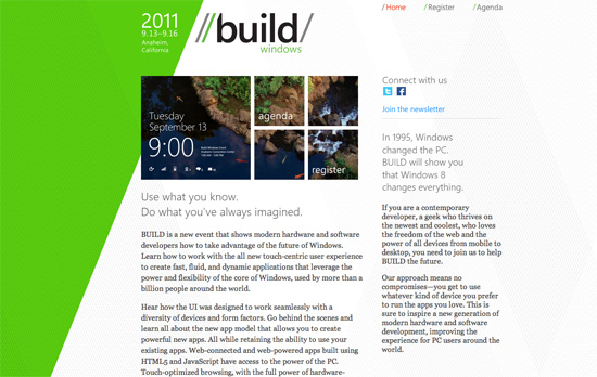
While the Metro user interface that’s coming to Windows 8 impresses me, this Build logo—which is supposed to promote that same slick feel—does not. This also applies to the rest of the site design. Using Segoe with Georgia doesn’t feel that modern at all. There are bits of the Metro look here and there, but they could have taken things much further. Maybe because it’s just a conference site?

Social Media Weekly

Typography – FreeFacing
A subsection to the site Layman’s Layout, FreeFacing recommends various typographic styles using only the free fonts available on most computers (OS fonts, Adobe fonts, MS Office fonts). There are also diagrams grouping similar styles and looks (lightweights, heavyweights, cheeky, elegant, etc.).

HTML5 – The <details> and <summary> elements
More information about new semantic elements <details> and <summary>, with further explanations and examples from the HTML5 Doctor.

HTML5, CSS3 – haz.io
Which HTML5 and CSS3 features does your browser support? Visit load this website to find out.

JavaScript – What’s a Closure?
Nathan Whitehead teaches JS closures starting with the most basic lessons and builds from there. Learn by entering code directly on the page.

Design – Developer Lorem Ipsum
Need placeholder text? Try paragraphs upon paragraphs of developer buzzwords!

Next Page »

Code & Tutorials

Which Front-End Development Languages Will Grow in 2017?

Your Guide to Leveraging APIs as a Developer

Bitcoin Processing Website Integration For Web Developers

Website Security For 2016 That All Developers Need To Know

Make your site more sociable with OpenGraph markup

About Devlounge

Want to read more about Devlounge, or maybe you want to contact us, or even advertise? Oh, and don't forget to subscribe to updates!

The Best of Devlounge

Design inspiration

21 Fabulous Print Designs To Inspire You This Week

Search