If you run or design ecommerce sites, one of the biggest responsibilities you have is creating compelling product pages that engage customers and drive sales. And while there are many different industry-specific strategies and product-specific techniques, there are also a handful of best practices that apply across the board. [Read more…]
Design Focus: Sign Up Now
-
Check out these website designs that don’t may not contain much at the moment, but grab your attention with a beautifully crafted sign up page.
Designs of the Week
Create unique, extraordinary websites with Squarespace. No experience necessary!

Love the subtle moving clouds and the masked effect on the photograph. The form steps slide up inside the black circle, and you’re led to a confirmation page with the same transition, the only difference is that the beautiful view had disappeared.
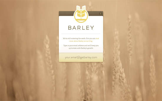
Like the previous site a beautiful background photograph with sites like these make a huge difference for setting the mood. Besides the attention to detail in the interface elements, the interaction is also a beautiful experience: all you have to do is type in your email and it’ll send the form right along, no need to hit Enter or push any button.
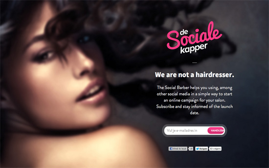
Not sure how a sultry face translates to social media campaigns but I’m curious to see how it all fits into the full site.
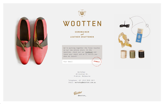
I’d have loved to include this in Excellent E-commerce Photography but let’s enjoy the sneak peeks, the warm copy, and that clever stamp-like submit button. This one’s framed, too.
Social Media Weekly
Ready to go out and design your next website? Try building with the Catalyst Framework.
User Experience – Your Website has Two Faces
“But whether or not our job titles include the phrase “user experience,” we must advocate at least as much for the people who use our software as we do for computer systems.”
Responsive Web Design – REMux: An Experimental Approach to Responsive Web Design
“This concept would solve the biggest challenge: layouts scale almost perfectly within their boundaries.”
User Experience – Stop Designing for “Users”
“Instead of analyzing specific goals and tasks, ACD focuses on the analysis of meaningful, goal-directed actions supported by tools and artifacts in a social world.”
Friday Focus 12/17/10: Curious Creatures
This week on Friday Focus: interesting monsters that are featured as mascots of these designs.
Designs of the Week
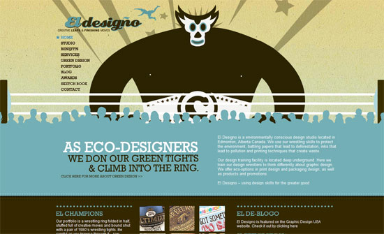
Love the big header that changes for every page; the illustrations are not cliche and the wrestling concept is well thought out.
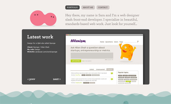
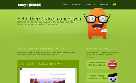
Looks like cute little monsters are her specialty, but I have to wonder why there’s no big brand beside the pink blob. Feels like that’s the only thing missing on this page.
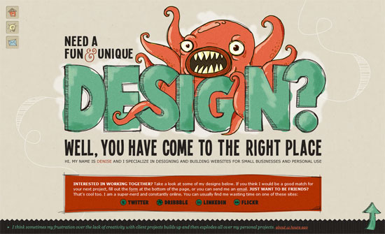
The implementation of the scribbly look all over is just excellent. There’s also a bit of subtle line direction in the background. The strength of the design also lies in its conciseness.
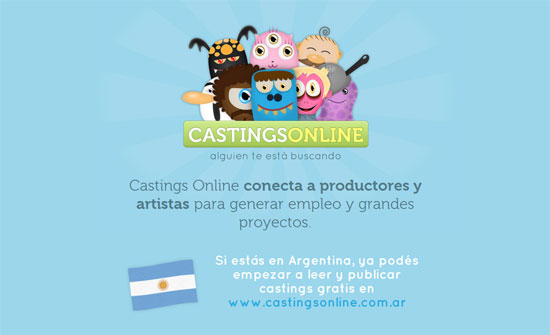
Pretty polished website, but I feel like the creatures were just left in one place and then forgotten.
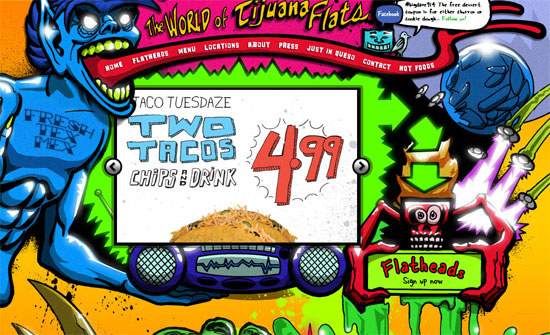
Mind-blowing on imagery alone, but look closer and see how every interface is custom. From the tongue menu to the slot machine donation counter to the handwritten body font. Truly immersive.
Nice and clean, but I feel like the links on the side could be placed right after the welcome blurb, which has an awful lot of whitespace below it.
Very interesting arrangement and controls for the portfolio section. There are arrows in almost each section to encourage you to keep scrolling down. Again, the creatures seem completely forgotten after the first screenful.
Social Media Weekly
Conferences – On Speaking
“The people that get up to speak in front of an audience are no different than the people sitting in the audience. The only difference is that they’ve said yes.”
Design – The Anatomy of a Perfect Landing Page
“Ten key landing page features that draw in users”
Design – Where to Find Fonts that Allow @font-face Embedding
” Just because the font vendor gave you the font for free doesn’t mean you can redistribute it. Same thing with the fonts that came with your computer. Again, you have to check the license to be sure.”
HTML – HTML Lint
“HTML Lint is a tool that makes sure your code looks good. While XHTML was very strict with syntax HTML 5 is more lenient like previous versions of HTML, which means keeping consistent code styles will become more difficult. Validating is not good enough anymore.”
CSS – CSS Without HTML
“I’d call this a bonafide CSS trick!”
JavaScript – Front-end developer essentials – 5 tips for efficient jQuery
“Over the last few months I’d like to think my skills in jQuery have got a lot better, I’ve been using it everyday and for more than just showing and hiding areas of a page. Along the way I’ve read about a few ways in which you can make your code a bit more efficient.”
