• Home
  • About
  • Contact
  • Advertise

Devlounge

Design, Develop, and Grow

  • Home
  • Code
  • Design
  • Design Focus
  • Interviews
  • Publishing
  • Strategy
  • Webapps
  • Extras

Friday Focus 09/10/10: Light Streaks

September 10, 2010 By Sophia Lucero

They’re a bit more abstract than sunbursts and are often used to break the horizontal and vertical lines that run throughout the design. Enjoy some subtle light streaks this week on Friday Focus.

Designs of the Week

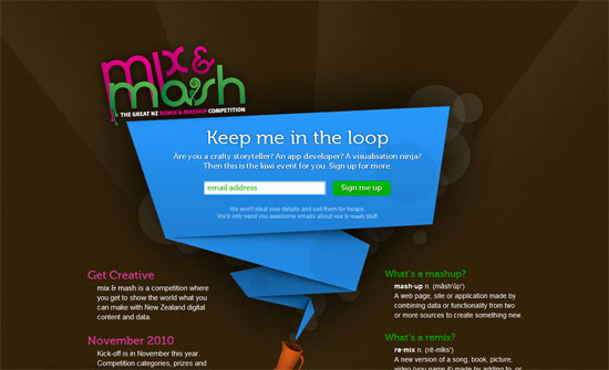
Mix and Mash

Light streaks go well with the bokeh effect, of course, which in here is subtly animated with CSS3 animation properties. I love the folded paper effect as always, and the way it’s done here is even more exciting.

Joseph Alessio

This approach of blocking out image areas where large text appears is something you don’t see often and while it obviates the blockiness, I say it makes the eyes wander a bit further.

Baney Design

I like a slideshow effect that isn’t boxed in. Black and white and minimal design here.

TEDx San Diego

It’s great how the streaks in the header actually show up in the carousel—which slides vertically, and then horizontally for the Speakers block. Also interesting: the two-row header menu.

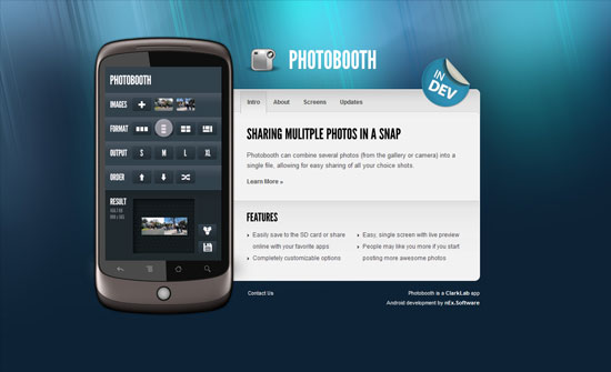
Photobooth for Android

For such a flashy video and lighting effect, I expected an equally flashy transition animation for the tabbed navigation. And the way the layout isn’t center aligned perfectly just throws me off. On another note, I find it interesting that Vimeo actually has portrait-style video dimensions, which is what was used to demo the app inside that Nexus One graphic.

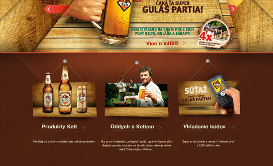
Pivo KELT

I love how all the rectangles on this design were slashed away with diagonal lines, from the buttons in the header navigation to the fancy layered slideshow (look at those wood slabs), to the hanging portraits, to the footer.

Reklama dźwiękowa w Katowicach

The pink and blue does feel vintage but still cheerfully modern. I really like the way the data is arranged in the bottom part, but I wonder if it should have been written in tables, tabular data and all that.

Streamline Safe

I think the headings don’t match so well, but I like how clean this is.

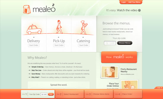
Mealeo

Big, bright buttons everywhere and the colors look lovely (and appetizing, of course).

Social Media Weekly

Design – 8 Minutes with Type Designers
“Each interviewee discusses their proudest achievements, favorite typefaces, sources of inspiration, web fonts and the future of typography.”

Programming – 20 Snippets You should be using from HTML5 Boilerplate
“It is absolutely packed full of fantastic snippets of code that are still very much worth using even if you don’t want to start using html5 boilerplate as your base template.”

CSS – Ordering CSS3 Properties
“We are at a crucial juncture in browser history where some browsers are supporting both the vendor prefixed version and the actual CSS3 property.”

Web Designers: How Consistent Are Your Light Sources?

May 12, 2010 By Lorraine

Most artists understand the importance of a light source, or light direction, in a painting or illustration. Used correctly, it adds realism and dimension to a picture, and can mean the difference between a flat picture and one that “pops out” at you.

Now, website designs don’t have to feature lighting effects- many sites do just fine without them (see Facebook or Google). But I’ve noticed more and more designs that utilize lighting in wonderful ways, and some that- well, fall short of using light correctly.

And the number one reason some sites fail at utilizing light properly? Inconsistency.

Look around you right now. Whether you’re sitting in a cubicle indoors or at an outdoor cafe, there’s probably one major light source. If indoors, it’s the ceiling lights or a desk lamp or even your computer monitor; outside, it’s the sun. The point is that the light and shadows around you are mostly dependent on this one light source.

And that’s what you want to identify in your web design. You want to know:

  • Where the major light source is coming from (in which direction).
  • What the major light source is (a candle, a bare bulb, a disco ball?)
  • How it lights your page. Is it filtered? A spotlight?

Keep in mind that, just as in real life, your light source can change from page to page, and you can use multiple light sources as well.

Being aware of these things can help you create a more consistently-lit design. Every element of your web design should reflect this consistency, including your CSS text and drop-shadows.

Finally, for inspiration, here are a few sites that feature lighting effects beautifully:

DConvulsions
As seen previously on this site, this one is obvious about its light source: it’s brilliantly back-lit.


Makes you feel underwater… subtly.


Simply beautiful. Note the light and shadows on the buttons as well.

Do you use lighting effects in your web designs?

Code & Tutorials

Which Front-End Development Languages Will Grow in 2017?

Your Guide to Leveraging APIs as a Developer

Bitcoin Processing Website Integration For Web Developers

Website Security For 2016 That All Developers Need To Know

5 Reasons You Need to Be Using jQuery

About Devlounge

Want to read more about Devlounge, or maybe you want to contact us, or even advertise? Oh, and don't forget to subscribe to updates!

The Best of Devlounge

php_frameworks

Top 7 PHP Frameworks

Search