• Home
  • About
  • Contact
  • Advertise

Devlounge

Design, Develop, and Grow

ateşli sevgilisi fantezisini yaşamak istediğini söyler porno ona arkadaşları varken onunla gizli saklı seks yapmak istediğini sikiş söyleyen kız hafta sonu için gelen arkadaşının görmediği bir sikiş açıdan sakso çekmeye başlayınca adamın yarağını bu altyazılı porno şekilde indiremez ve açık şekilde salonda sikişimeye sex izle başladıklarında misafir kızı da bu sekslerine rokettube konuk ederler seks yapacağını düşünmeyerek onun sex izle oyun oynadığını zanneder sabah olur ve herkes uyanır hd porno bu sırada yanında şişme mankenini de getiren sapık erotik hikayeler genç sınav haftası ders çalışan genç adam üvey annesinin sikiş eve gelmesiyle hayatının şokunu yaşar

  • Home
  • Code
  • Design
  • Design Focus
  • Interviews
  • Publishing
  • Strategy
  • Webapps
  • Extras

Design Focus: Evergreen

March 8, 2014 By Sophia Lucero

We’re not talking about eco-friendly sites but designs that have taken a liking to this lush hue, now more than ever.

Designs of the Week

Pagelines lets you build WordPress websites and it’s as easy as drag and drop, go check it out!

Verde
Verde

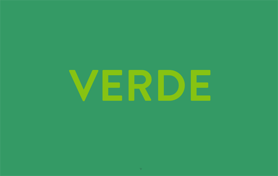
For the minimalists, this is the equivalent of a big photograph, illustration, or video as the homepage header. It color-changes to different shades of green, sometimes coming off too strong for my taste, but one quick swipe downwards and the green disappears into a free-form arrangement of portfolio screens.

Folkelarm
Folkelarm

I like how the logo is broken down into parts and scattered into a circle in the header, then drops down to form it when you scroll down. It also plays with layering a bit by hiding behind the photos in the following screen, and repeats the pattern in the tickets and a couple of other backgrounds. White on blue is a little easier to read than white on green, but these days, the latter is very popular.

Two Minutes With TGD

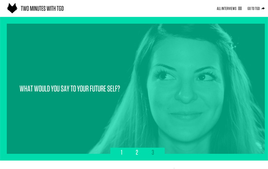
That tall and narrow type definitely reminds me of those movie poster credits, which fits with the video theme of the site. Elsewhere it becomes predominantly black and white, while the lighter shade of green becomes the accent color.

Troi Oiseaux
Troi Oiseaux

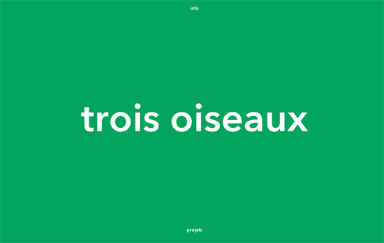
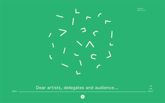
Notice exactly two links in the area, info and projects, sliding in their respective directions. Like the first site featured above it does an uncover as you move on to the portfolio.

Prospek
Prospek

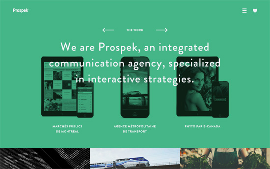
Another site that plays with layering: the devices in the first screen are not stuck to the background but go to the foreground and gain full color on hover. The opposite happens to the images below and get a green-and-black treatment. Their 3-column, full-width layout carries over to the rest of the pages, including their blog.

Social Media Weekly

Build on DIYThemes’ Thesis Framework for rock solid SEO and great layout customization options.

Typography – Whats the Closest Google Font?
“We have all received design from a client with non-web safe fonts. The client does not want to pay the licensing, and you don’t want to break the law. So you are stuck trying to find a needle in the haystack that is the Google Web Fonts. Stop searching.”

User Experience – What We Mean When We Say “responsive”
“I can tell you how to do Responsive Web Design. How we make things “responsive” is up to us. All of us.”

Friday Focus 12/16/11: Under Fire & Water

December 16, 2011 By Sophia Lucero

This week on Friday Focus: designs that use two opposing elements found in nature: fire and water.

Designs of the Week

Zindustry website
Zindustry

Everything is burning in here, from the wooden background to the strips and sheets of paper—not overdone at all. I really like the little area of blue flames whose color echoes as accents throughout the rest of the site. All in all a striking look.

Made By Points website
Made By Points

Here pink is the accent color as seen in the logo, navigation, footer, and the loading screen—which seems to be growing popular in non-Flash sites with lots of graphics. Another parallax-driven site with some translucent backgrounds and some very thin arrows.

Liquid Torch website
Liquid Torch

I like the splashes of water everywhere and the lighting that seems to imply an underwater environment (although I’m leaning towards an aurora in the sky). The top navigation is also fixed and the layout breathes easy.

Family of Fish website
Family of Fish

This site prides itself in beautiful photography, and another round of parallax and fixed background peekaboos take advantage of that. The later not just piles on one full-screen image after another though, there are some interesting effects to be had when you make certain areas of a photo transparent. What is unfortunate, though, is that the descriptions in each page are images.

Social Media Weekly

Web Design – What I Learned About the Web in 2011
It’s time to look back on the year that was and see how far we’ve grown as designers and an industry as a whole.

CSS – Six CSS Layout Features To Look Forward To
Several proposed featured by the CSS Working Group to make our laying out webpages easier.

Web Standards – On HTML and CSS best practices
Strive for the best quality possible.

User Experience – Give Your Users A Hollywood Experience
Learn to build for your audience with film metaphors.

Friday Focus 03/25/11: Sassy Sliders

March 25, 2011 By Sophia Lucero

This week’s Friday Focus features designs that use smart, stunning slideshow techniques that are sure to inspire you. Take some notes!

Designs of the Week

Get Satisfaction

The circus theme combined with the sketchy, painted feel looks great. Everything’s bright and cheerful.

Büro Maisengasse

Minimal but packs a punch with the clothesline effect. Nice integration of Google Translate for language localization, and the header matches each project color/pattern.

Grunnarbeid

Nice little thumbnail tabs to the right for navigating through the slides, and a nice dark overlay to the left for blending into the background.
Zbyšek Nádeník

A more conventional look, but I like how the text and image areas are separated with a nice curvy cut, breaking the typical rectangular silhouette of carousels.

Milky Interactive

The splash of milk makes all the difference. This site’s filled with content but it still feels light and nicely organized.

Daria Zakład Krawiecki w Ciechanowie

Keeping the color scheme in grayscale to let the purple pop is an interesting technique. Although using black text on it isn’t very readable. So is using italics for majority of the site.

Lega-lega

Fun sketchy illustrations everywhere—even the icons for meta information are custom. It also helps that there are tooltips in case they look a little vague. I like the treatment to the scrollbar although maybe some arrows or a change in cursor type would help more.

Bluecadet Interactive

Love or hate the vintage, classical look, the details on this site are to die for. But really, it’s the main slideshow that’s the best part, which comes together in such a pleasant way.

Social Media Weekly

Accessibility – Web Accessibility Toolbar
“In honour of Jim Thatchers important and continuing contribution to making the web a more accessible medium, I have worked on an update to the Web Accessibility Toolbar for Internet Explorer, which includes new features that he has developed.”

HTML – New HTML elements and surrogate <div>s
“What else can we do to move forward without polluting our documents with non semantic wrappers?”

User Experience – Effective Developer Experience
“Platform product owners must be concerned with assisting developers in accomplishing this if end users are to have a good user experience overall. Attention to these details is called developer experience (DX), and enabling app developers to be successful through better DX will create a more successful UX for the platform product.”

Friday Focus 12/10/10: Darkly Textured

December 10, 2010 By Sophia Lucero

This week’s Friday Focus is all about light on dark designs that use subtle, even elegant textures.

Designs of the Week

Texture Lovers

Love the stitching effect with the mixed textures. The placement of the color switcher is a little awkward but the rest of the details are great, see the “exclusive” ribbon and the thumbnail frames.

Corking Design

I like the subtlety of the left-aligned layout, it’s not apparent until you browse the inner pages but the result looks good. Of course, textures are a great way to break the strict look of a strong grid design.

Humzaijaz

I like how the logo blends in with the background to also give it texture. Love the frame and hover details.

Lemon Oak

Nice hover effects and the mix of the icons with the sketchy, chalk-like touches.

Cicero

The slideshow illustrations have a distinct look but all match. I think it would be even better if you could see those characters on the rest of the site.

Intense Engineering

I find it interesting how the slogan is on the left, almost like a secondary logo. Love the design of the lightboxed slideshows everywhere. The design does not miss any opportunity to add techie details.

Every Pixel Counts

This design makes quite the impact, but I have to wonder if they should’ve put up the agency description higher. I like the hover effects on the images and the infographics in the Skills page.

Creative Soapbox

The quality of the slideshow illustrations combined with the vertical switching effect just feels really fresh. (It certainly makes more sense than horizontal sliders that have that weird part where they disappear into nowhere.) The fine borders and shadows you’ll enjoy most in the Blog section.

Social Media Weekly

User Experience – The Coming Zombie Apocalypse: Small, cheap devices will disrupt our old-school UX assumptions
“This problem is simple, but pernicious: designers think of new technologies in terms of yesterday’s tasks, failing to clearly see the real potential of the new technologies.”

Design – Free Web Design Toolkit
25 beautiful and interesting photographs; 27 background images, textures and patterns; One icon set for your site nav

Friday Focus 09/17/10: Scallops and Shears

September 17, 2010 By Sophia Lucero

This week on Friday Focus: designs adorned with the timeless patterns of scalloping and sheared edges.

Designs of the Week

Fresh Cookies Online

The hover effect with the ribbons in the top navigation is a little weird, but overall this is an appetizing design.

Ryan O'Rourke

I wish the links could light up on hover since the design is a light on dark one. Check out the Ethos page for a nice list of web design tips.

Iconnice

Compared to the detail of red and white striped border, other portions of the design feels lack. Being a gallery-type site shouldn’t take away from that.

Vustom

I like how the portfolio boxes are taller and leaner than usual. The design is held together by the red and the ever-popular narrow-uppercase-sans serif type.

Solid Giant

A solid, put-together design, save for two concerns of mine: the type is too small (again with Garamond) and white on shocking pink isn’t the most enjoyable thing to read.

Stick with me, baby!

Excellently designed online store, from the drag-and-drop interface to the fully integrated share buttons. The animations are snappy and fit with the attitude of the brand.

Epping Meats

The columns of lists could be more attractive like the rest of the site.

It's not my type

I think the gradients are a little to bright for what I usually see, and this is built on an existing WordPress theme, but the concept is sound.

Edgar Leijs

Bold and chunky not only in shapes but in type and colors The portfolio section is works well.

Social Media Weekly

Design – Design pixels aren’t frontend pixels
“Something I’ve observed is frontenders and designers often sound like they’re talking about the same thing, while actually talking about different things.”

Design – Good Designers Learn From History
“I foolishly thought of history as dusty facts and faded images. And only the foolish child thinks history doesn’t matter, that it’s irrelevant and inessential to growth.”

Microformats – Simple Semantics With Microformats, Part 1
“At the highest level, microformats are a way to add meaning (semantics) to common web content. At their foundation, microformats are simply sets of HTML attributes (most often rel and class) and values applied to markup in order to describe the content.”

User Interface Design – The Man Who Destroyed the Boring
Interface and Lived

“From the earliest graphical user interfaces, to the latest pixel perfect work seen in apps, the most basic elements of the interface have remained pretty much the same.”

Next Page »

Code & Tutorials

Which Front-End Development Languages Will Grow in 2017?

Your Guide to Leveraging APIs as a Developer

Bitcoin Processing Website Integration For Web Developers

Website Security For 2016 That All Developers Need To Know

5 Reasons You Need to Be Using jQuery

About Devlounge

Want to read more about Devlounge, or maybe you want to contact us, or even advertise? Oh, and don't forget to subscribe to updates!

The Best of Devlounge

5 Ways to Use Social Media to Make Money

Search