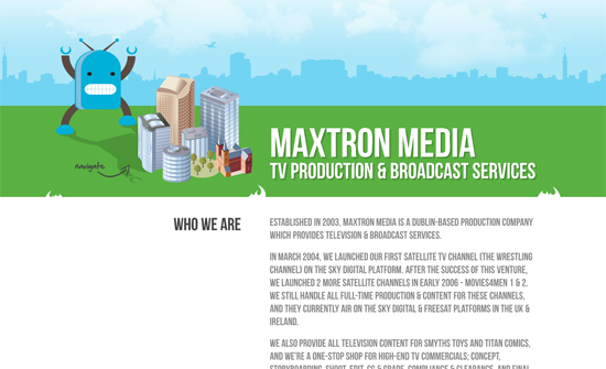
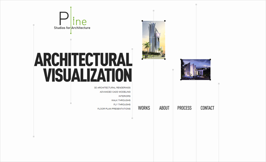
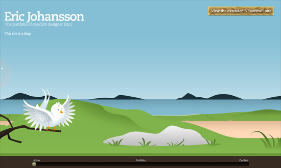
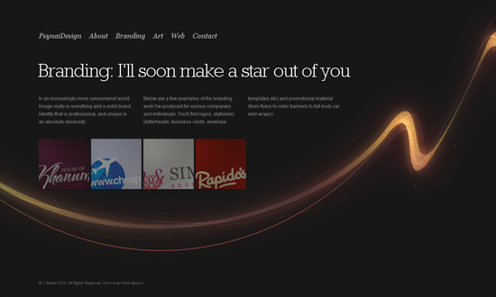
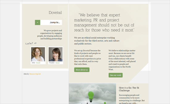
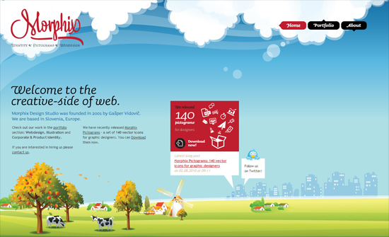
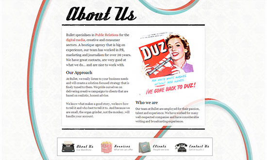
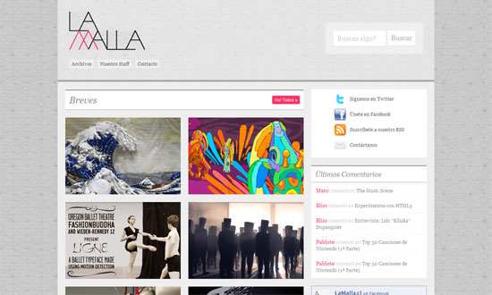
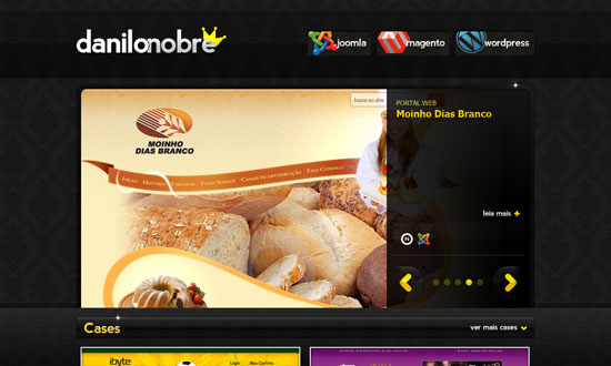
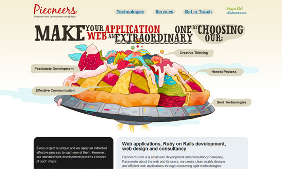
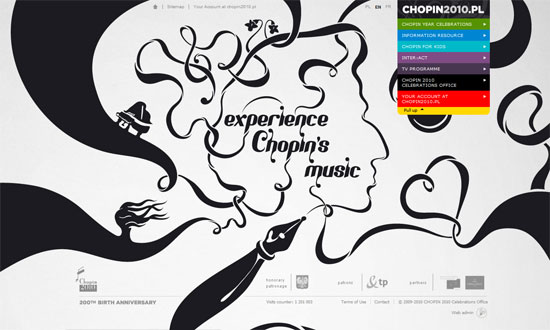
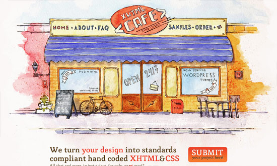
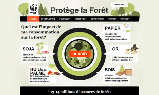
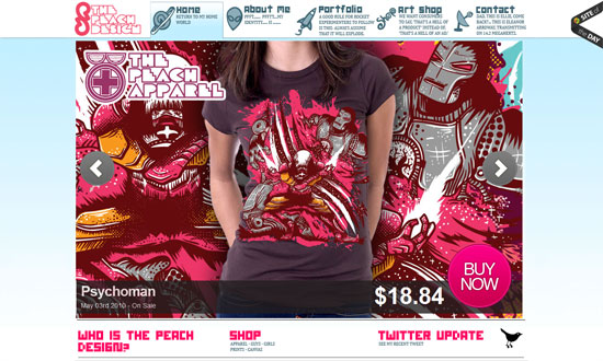
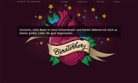
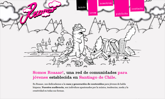
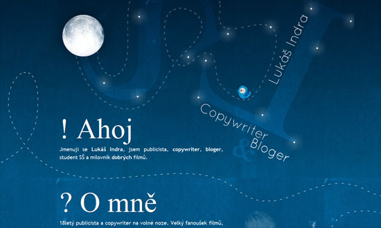
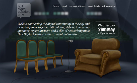
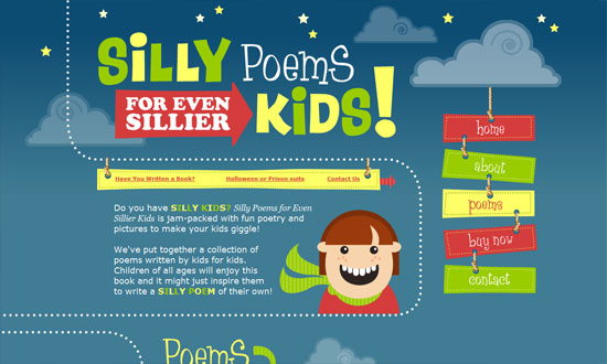
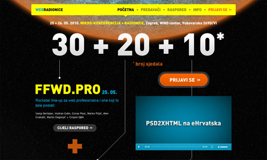
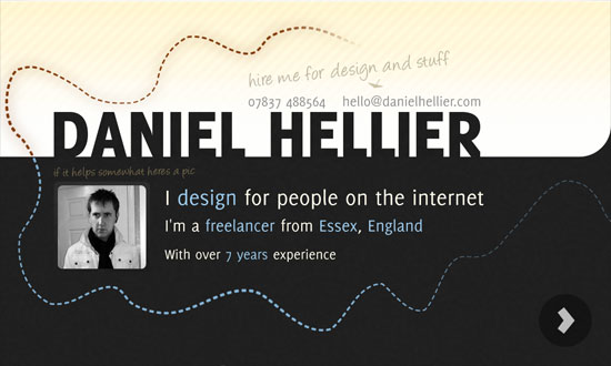
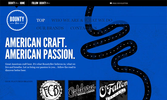
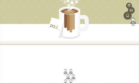
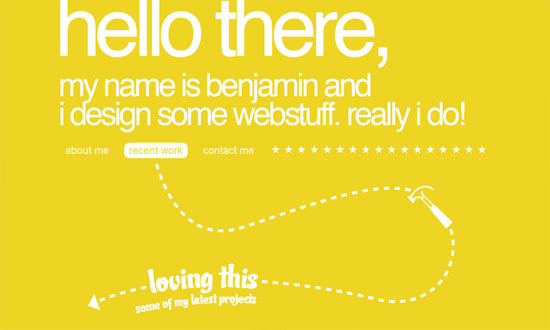
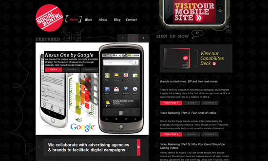
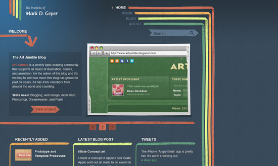
These sites feature prominent lines that steer your way of reading and browsing the page.
Designs of the Week
Want your site to be as good-looking and inspirational as these? Start by choosing a well-designed theme from ThemeForest.

Lovely illustrations in an orange and navy palette, with full-screen popups that appear when you click on the ‘info’ icons.
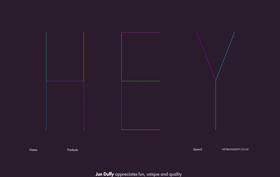
It probably isn’t appropriate for other online shops, but the freeform arrangement of the products as you scroll down is a welcome change from the rigid grid that defines majority of e-commerce. Hover on one article of clothing and short wiggle animation.
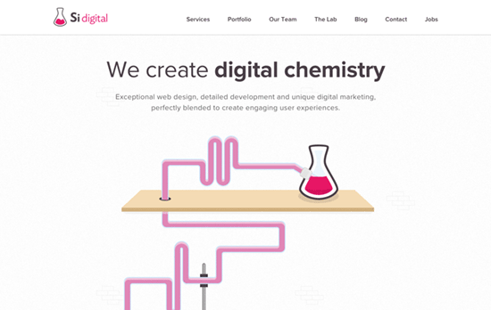
I always enjoy a mad scientist lab motif in the design, and this one even has a robot that lets you shoot Walter White.
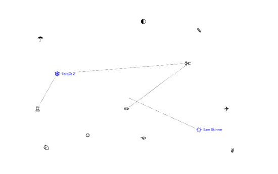
A super simple design that only makes use of icons (is that Wingdings?) and dotted lines that are drawn as you hover on one glyph and move to the next. Clicking loads the project description, and all the icons’ switching from one glyph to another that act as the loading “spinner gif”.
Social Media Weekly
Build on DIYThemes’ Thesis Framework for rock solid SEO and great layout customization options.
Web Typography – Seriously, Don’t Use Icon Fonts
“If you won’t stop using icon fonts for people with screen readers, people with dyslexia, people with browsers that don’t support @font-face, people who randomly didn’t load the icon font once for some reason, or designers who just want their icons to look right on-screen…”
Development – Key Considerations For Designing A Cross Platform Application
“To help you streamline your app design in an optimal fashion, here, is a list of noteworthy aspects that must be kept in mind while designing cross platform application.”
Design – Designing destinations at Lonely Planet
“We want to place an emphasis on organization, tools that help people quickly find the top things to do in each location, and a curated set of places and experiences that help people get to the heart of a destination.”
