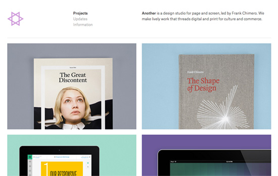
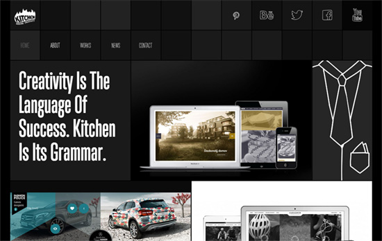
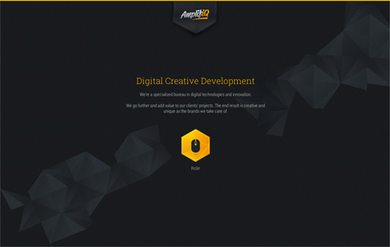
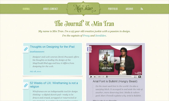
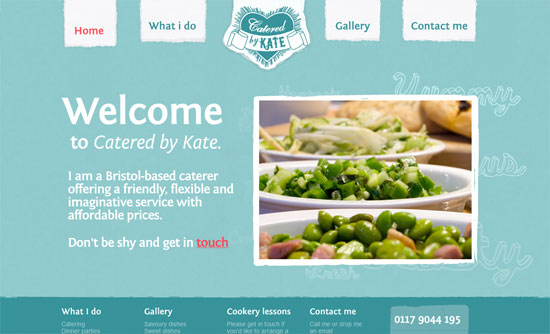
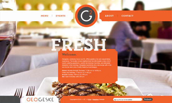
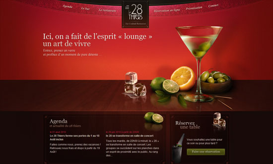
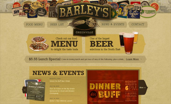
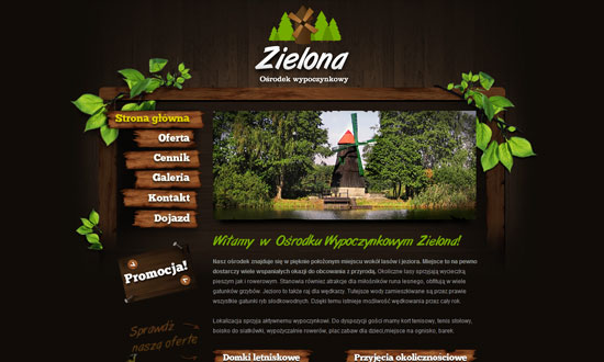
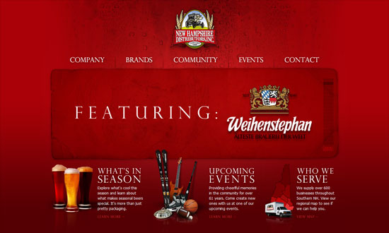
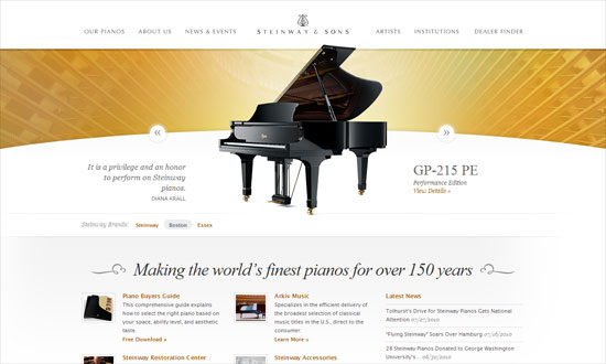
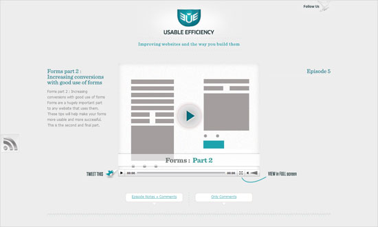
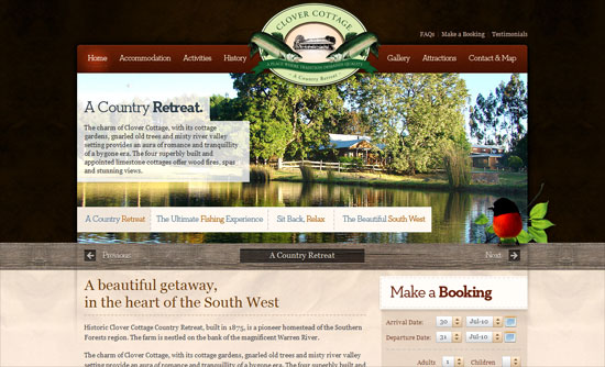
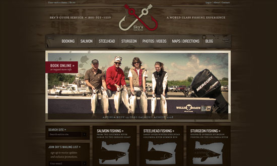
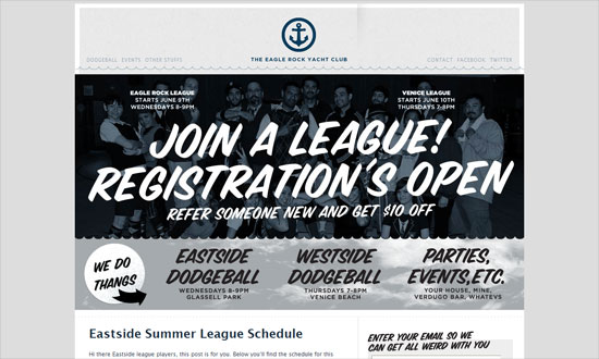
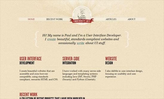
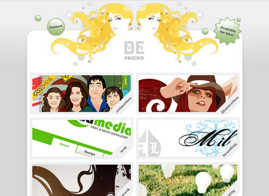
If the previous featured designs were practically wordless and filled with imagery, this week it’s all about the branding and their huge wordmarks splashed on the first screenful on their websites, above the fold. Is this web design trend more effective than the other one?
Designs of the Week
Want your site to be as good-looking and inspirational as these? Start by choosing a well-designed theme from ThemeForest.

The triangular area is made up of several video clips, and as you scroll below the shape is retained to frame the images defining each section.
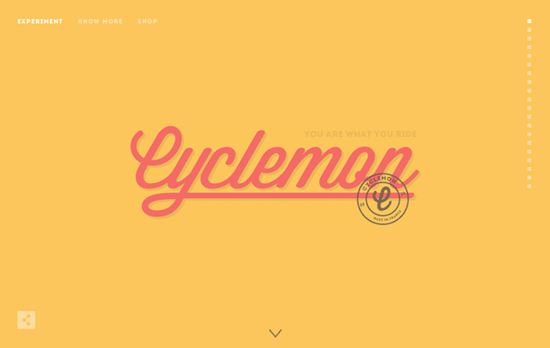
Love the different pastel palettes and background illustrations (save for the “night rider” one) as they are uncovered slide by slide.
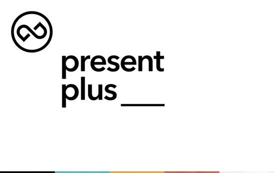
Interestingly, no navigation until you reach the footer. Also, the first screen is left-aligned while the rest is more center-oriented.
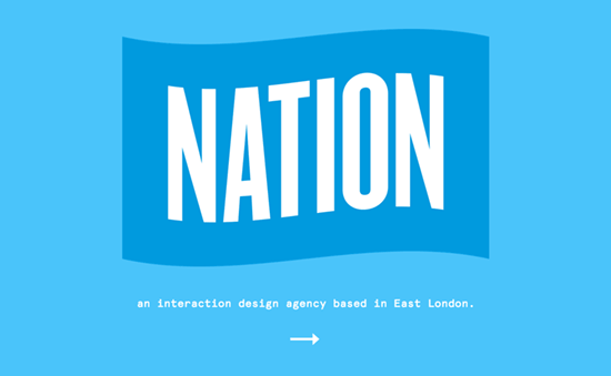
The logos just keep getting bigger. I think they’re going for a flag feel here? It’s cute how the arrow pointing right suddenly curves down when you hover. This one’s layout is also very centered, and every screen is made up of a photographic background, a short description in a monospace font, and an outlined button.
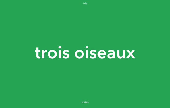
Another site that has the contact information sliding from the top, and that green is nowhere to be found after you scroll down.
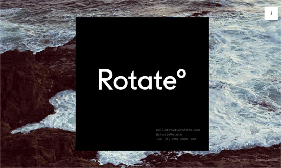
There’s that monospace font again, but when you click on the “i”, the black box becomes a cube and “rotates” to the left, revealing a description on serifs. That’s all there is to the site, but I quite like it.
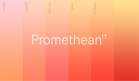
I’m digging this vertical navigation trend as well, not to mention the use of those gradients. Inside there are irregular polygons to accentuate the content. The white text and thin font weight might be hard to handle for some though.
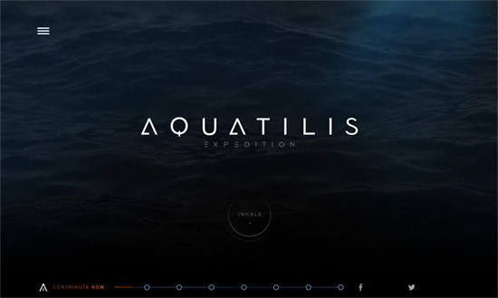
Effective mood-setter, and I like the stylized button below. I also really like that the sea creatures are bright and colorful against the dark background that almost looks like outerspace instead of undersea. Also, the use of more aquatic textures in the Squad section, I really like.
Love the little wink that the owl gives. There’s also some lovely subtle texture going on in the logo. Below the text uses much more delicate weights and colors, with “witty” easter eggs here and there.
Social Media Weekly
Create unique, extraordinary websites with Squarespace. No experience necessary!
Mobile Web Design, CSS – Mobile-first CSS
“You should use that to target the smallest devices with your default styles and override from there as your content demands it.”
JavaScript – A JavaScript Build System Shootout: Grunt vs. Gulp vs. NPM
“Deciding on a technology is always hard. You don’t want to make commitments you won’t be able to back out of, but eventually you’ll have to make a choice and go for something that does what you need it to do.”
