Design usually means arranging things in an orderly, meaningful manner, but this week we’re throwing that out of the window and going for chaotic and whimsical sites. Happy 4th of July weekend, everyone, and welcome to this week’s Friday Focus!
Designs of the Week
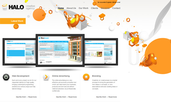
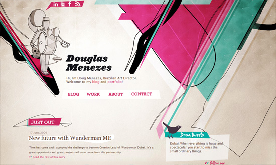
The left-aligned layout works well here. I love that in the inner pages, the background changes, but remains “chaotic”.
I’m not sure what this design style is called, but it always catches my eye. Another left-aligned design with a touch of opacity and great use of repetitive graphical elements.
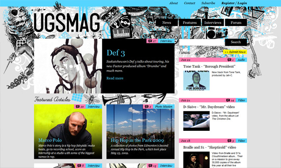
I love the header. And the custom illustrations for for each featured artist. And the bright color scheme—light blue, pink, and yellow for a hip-hop magazine? With a perfect-cursive font for the headers? Now that’s what you call adventurous!
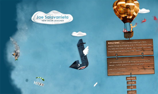
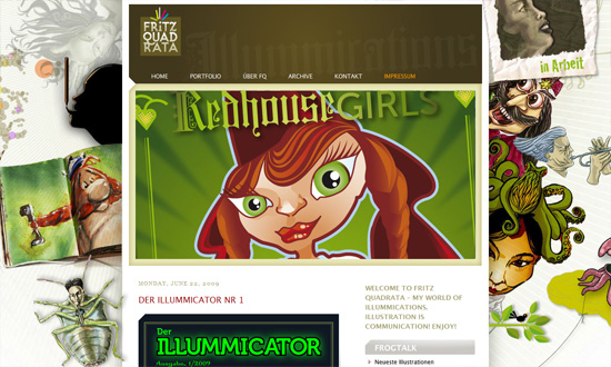
Here’s a one-page portfolio designed like it was a storybook. I particularly like the use of textures on the illustrations.
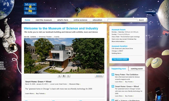
Now this site takes a similar approach, with the airborne objects found all over the place. It’s not quite as grand and playful as I would have liked, but a great look for a serious institution.
I love the crazy lines and color combination. It’s not a complicated layout, when you look at it closely, but it certainly looks extraordinary.
I’m not sure if this design is a result of cramming everything above the fold, but it works! It showcases the artist’s versatility and his portfolio’s diversity at one glance. And given that all the illustrations look whimsical and fantastical, it gives a very interesting personality to the website. What I’m not sure about is the big default image in the center, and whether it’s competing fiercely with the already strong background.
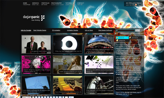
Another foreground-background competition here. I’m not sure if this design will sit well with everyone, especially since it’s already dark, but the background looks pretty interesting and it’s a quick way to add interest to your site.
Social Media Weekly
Programming – Maintainability Guide (Beta)
An interesting guide on how to write maintanable code.
Usability – Keep Users Updated During Long Load Times
Tips so they won’t just go away.
CSS – CSS cascade – a simple step-by-step presentation
A great tutorial on mastering the CSS cascade.
