This week’s Friday Focus features designs revolving around maps, both as embellishment and a tool.
Designs of the Week
There’s a fantastic crab sporting a hat and a monocle that follows the trail on the map and leads you through the one-page site, all while leaving useful notes, popping in and out of the sandy background, and of course, walking sideways! I think the tooltips should stay on a little longer though; if you scroll down continuously they quickly disappear before you get a chance to read the whole thing, defeating their purpose. I sure hope the mascot wasn’t eaten up by the shark though, as it seems that was implied by the animation, but for a design to effectively hook you like that with a small storyline in such a short span is just genius.
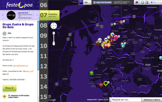
Nice night-time color scheme applied to a Google map to match the theme of the site, and a pretty good way to cycle through the list of events too. Instead of the usual calendar-based lookup, you go from day to day (or should I say night to night) by moving up and down, then check out the list of events for that date by moving left to right. You can do that both by clicking the arrows on your mouse and the arrow keys on your keyboard.
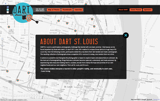
Straightforward techniques at work: grunge, patterns, lightboxes for displaying content, and matching the color scheme on the map markers.
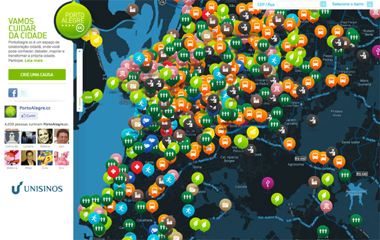
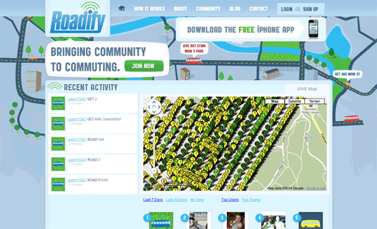
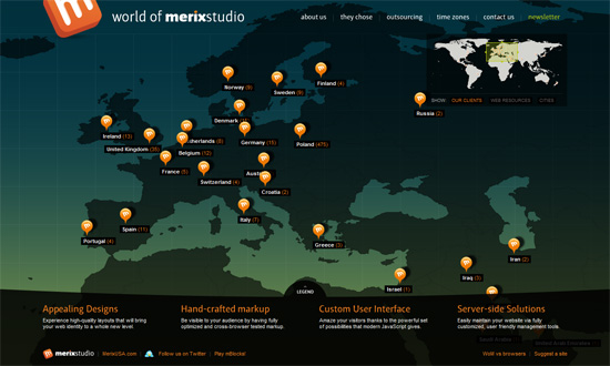
Also a custom colored-map, with some brightly colored icons and shapes, but one noticeable problem here is that if there’s too much on the map, the site becomes far less helpful. Reducing the marker sizes would help, but maybe filtering only one type of data at a time will be more effective as well.
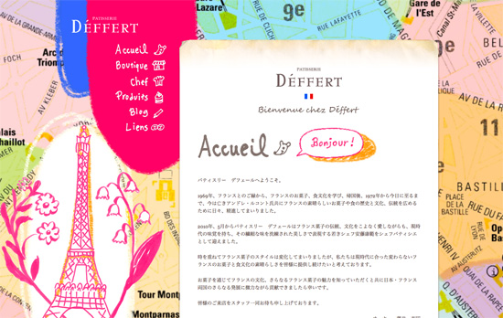
I like the collage and handmade feel on this page; even the tabbed content boxes use drawn-in borders. However, I think making this a one page site isn’t such a good idea mainly because of the number of items in the products section. There were at least a dozen rows there and it’ll take much more effort to scroll back up to switch tabs. They should have kept that section at up to the average height of browser screen and paginated accordingly.
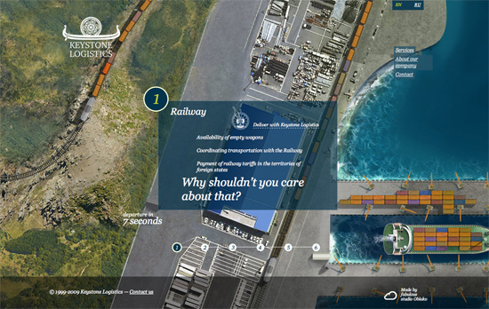
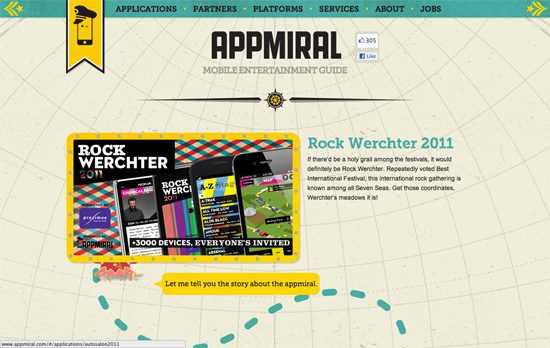
I love the idea of being able to demonstrate your company’s capabilities with an animation like this, giving you details every step of the way as the ship sails from port to port until it reaches its destination. The visuals are stunning. A more restless visitor would probably want more bells and whistles but I think this is dynamic enough for a corporate site. I think the only thing I have to make a note of is the excessive use of italics on the page and the underdesigned menus; this is a lot more glaring in the inner pages where the imagery disappears.
Social Media Weekly
HTML, CSS – Semantic Animation
Accessibility – Rocket Surgery and Accessibility User Testing
Web Standards – Future friendly, or Forward to Yesterday?
JavaScript – JavaScript Design Patterns Deconstructed
