08/08/08—what a date for today’s Friday Focus! Aside from celebrating the start of the Beijing Olympics, how about enjoying some user-generated goodness for our sites this week?
Designs of the Week
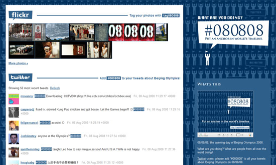
This mashup brings together all 08/08/08 content from all over the net, particularly through Twitter, Flickr, Technorati, and Google. This site is beautiful not just because of its catchy logo (which you can download and personalize), but because it also presents oodles of content from everyone in a well-organized manner. I only wish it auto-refreshed!
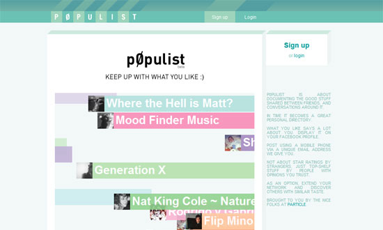
There are several different things I like about the interface of this site, but what I like most is the pseudo 3-dimensional look applied to the header and other elements.
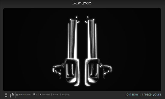
The variation in image sizes lead the visitors eyes effectively: there’s one big featured image that spans the width of the layout, then there’s the left column contains medium-sized images for more popular creations, and finally there’s the right column containing small images for recent creations.
Social Media Weekly
Design – 14 Design Retrospectives
A list of articles that describe the redesign process of their websites. This tip is twofold: you can get inspiration by reading them, and when you’re done with your redesign, be sure to write about it as well.
Programming – Facelift Image Replacement
An image replacement script alternative for those who want to use fancy fonts.


