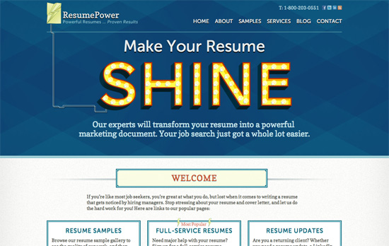
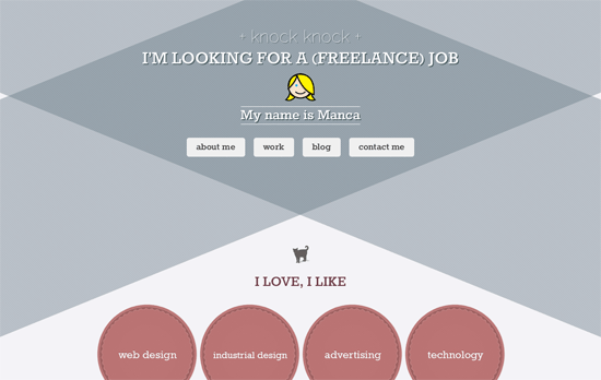
Using triangles in web design has been around for a few years now but it still has that edgy feel to it. Check out another round of sites where they figure prominently as graphic elements and a means of layout.
Designs of the Week
Get solid WordPress themes, plugins, and even design training from iThemes.
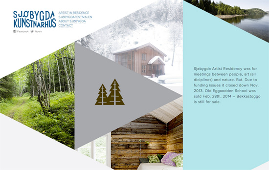
The triangles make for interesting cropping particularly in the featured artists portraits, although I would have loved to see more integration for the below-header parts of the site.
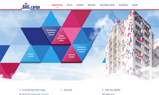
I like the way the sub-section navigation is arranged right in the middle, and how the graphic elements were inspired by the building design itself.
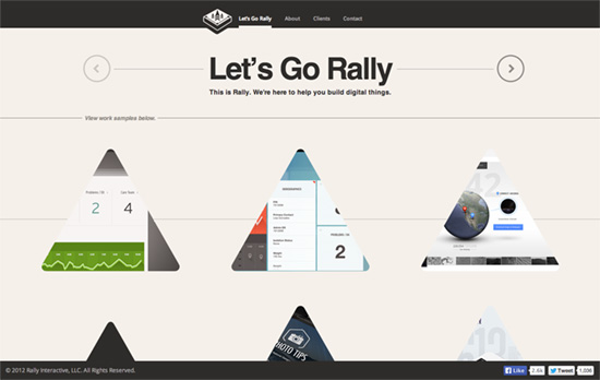
Cool hover effect that turns the triangle into a circle upon clicking. Another microtrend that’s cropping up is putting the meta or side information much higher up the page rather than in the footer. In this case, since the about, clients, and contact content are super short they are inserted dynamically right after top navigation.

I like that there’s a big weather panel on the top right, because that’s what their customers also want to know besides their products. Of course I also like how the cropped pictures in triangular frames are based on their logo, so it looks quite sporty. Most clever of all would have to be the silhouette of a mountain in place of the usual triangle-shaped marker for the current page in the menu.

There’s a mix of modern and elegant touches on this straightforward page and it works well.
Social Media Weekly
Create unique, extraordinary websites with Squarespace. No experience necessary!
Design, Programming – Why Developers Need to Learn Design
“The trope is often that designers need to learn to write code, but in working as a developer on the web, I’ve learned that the value of a design education pays dividends beyond being able to mock up a page in Photoshop.”
Design – The 12 Principles of Animation
