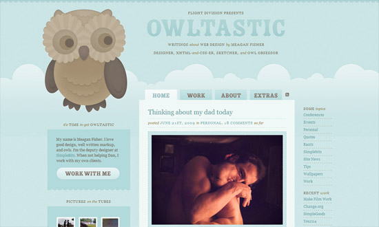
This week’s picks feature engrossing environments with stunning details and interactions. Design imitating real life is one of the oldest tricks in the book, but never goes out of style.
Designs of the Week
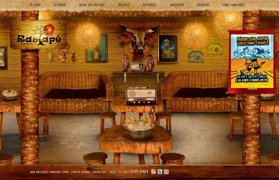
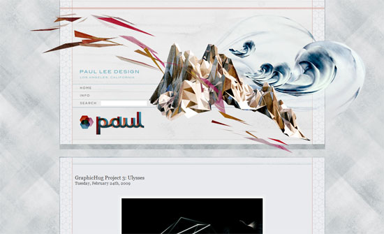
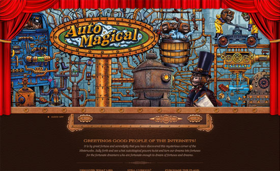
I like the use of custom textures and fonts everywhere, but the parallax effect that activates every time you move your mouse is a little dizzying.
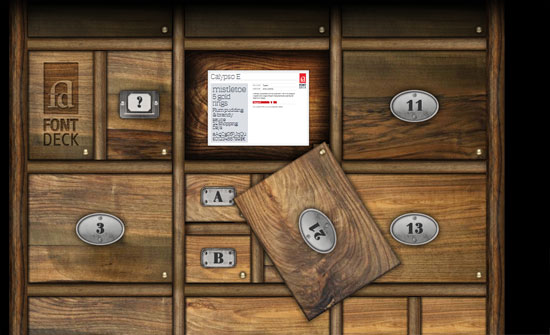
Fashioned after real-life type drawers, the diversity of the woodgrain and nameplates combined with the subtle animations makes for a fascinating microsite.
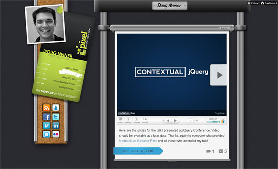
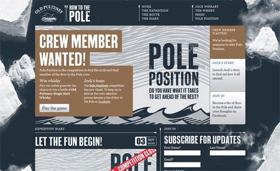
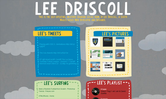
Since this is a tumblelog, it’s a good idea to have markers for the different post types. In this case they differ enough but remain subtle. The datestamps throw in splashes of color to the dominant grays.
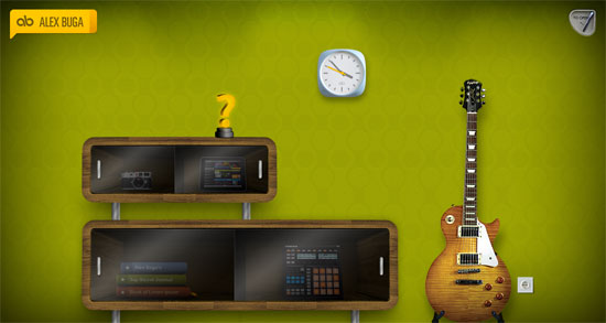
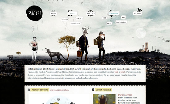
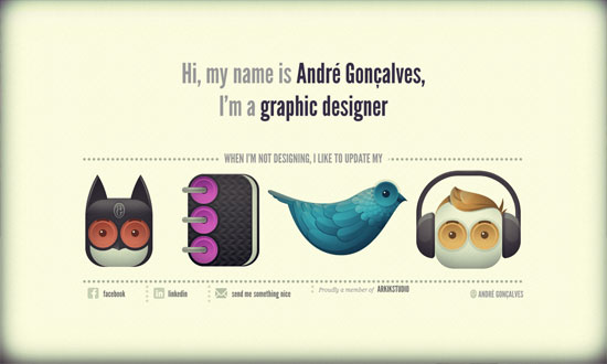
This site has all sorts of interesting design decisions everywhere you look. For instance, the portfolio is built like an iPad with matching user interface to boot. The photos section starts out as a stack of photos that sorts itself out once you click on it. The blog is literally a journal notebook. And so on.
Social Media Weekly
Typography – Eight Ways to Combine Typefaces
“While a lot of what goes into good typography is subjective, there are some guidelines that can point you in the right direction. From there, it’s up to you to experiment and try out different things.”
CSS – Current Color in CSS
“Borders always render with the current color when a border color is not specified, but, till recently, there was no equivalent term for that use – now we do: currentcolor.”
