Photographic headers are popular design elements, and few subjects are more utilized than mountain views. Is it because of the height and expanse that stir possibilities of greatness that are just waiting to be accomplished, or maybe already have been? We’ve featured illustrated ones before, but now you’re getting the real, picture-perfect deal.
Designs of the Week
Create unique, extraordinary websites with Squarespace. No experience necessary!
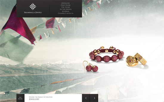
It’s a brilliant idea to combine the mountains and jewelry this way, and you can see there’s a story behind it. The horizontally scrolling layout on the Jewelry page is also an interesting study: everything is displayed at once, in one long queue. You can view each item one after the other, or scrub through quickly on the timeline, and select the marker to skip to a specific category. It would have been nice if there were tooltips or similar elements denoting what you’re clicking on, but they do provide the information in the Filters menu beneath. Each product is partially displayed under a layer represented by nothing more than a drop shadow, and the result is one product laid on top of another. Every other page is done in a similar fashion: sub-sections are laid out in vertical columns which appear side by side.
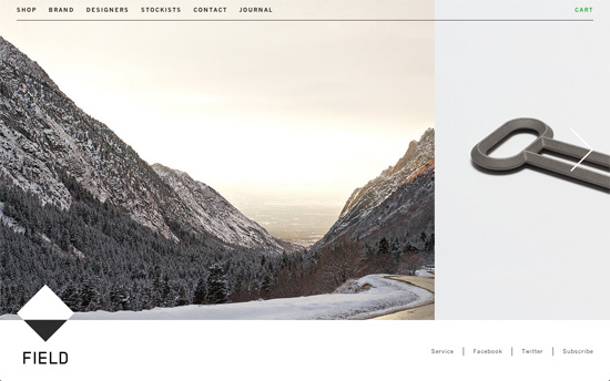
It looks really simple, but the way the photos are laid out feels different and new. Again, photos of mountains appear right beside the products for sale, and navigating is also done mostly in a left to right manner. You can see how the images speak much louder than the text on the page, which are in small type. Fixed footer navigation, where you can find the logo.
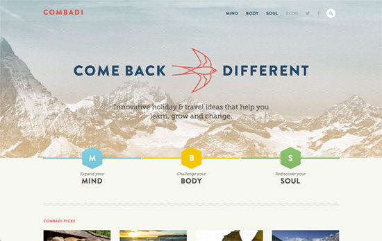
Again, simple looking design, but it’s the effortlessness and the small touches that should warm any designer’s heart. The three hexagons on the homepage slide out to reveal cards with descriptions of the main categories on the site. A short scroll below it and you’ll see the colors in the thin borders beneath each photo, sometimes side by side to indicate that an item falls under more than one category.
Social Media Weekly
Make Headway, make intuitive layouts, make it your WordPress theme of choice!
Web Standards – How did Internet Explorer up until version 9 get to be so bad (relative to Chrome, Safari, and Firefox)?
Web Design – Breaking Down The New York Times Redesign
“Instead of completely redesigning their distribution approach, they’re taking a more simple, elegant approach. With content taking the obvious spotlight, the entire article experience is getting a redesign.”
Optimization – How to lose weight in the browser
“And what if we got together a bunch of experts who work on large sites to create a definitive front-end performance guide?”
