Site layouts are filled with boxes and corners, but not everything has to be so straight-laced. These designs feature touches of something a little more organic: animated waves and curves that soften the look and can even make things more fun. [Read more…]
Design Focus: Sliding Backgrounds
This week’s featured designs are a new round of subtly moving backgrounds for the year. Check out how the trend has evolved here.
Designs of the Week
Build on DIYThemes’ Thesis Framework for rock solid SEO and great layout customization options.

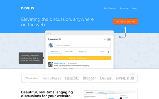
Not only is the animation as unobtrusive as possible—to avoid distractions or seizures, one hopes—what’s really great about this design is the product demo is right on the page: front, center, and live. As you interact with the comment box, new tooltips appear to highlight each function you can try out. Some people might not be too comfortable with the ultra bright blue, but since it’s mostly in the header and only sprinklings in the other sections, you can just scroll past that and focus on the other clean elements.

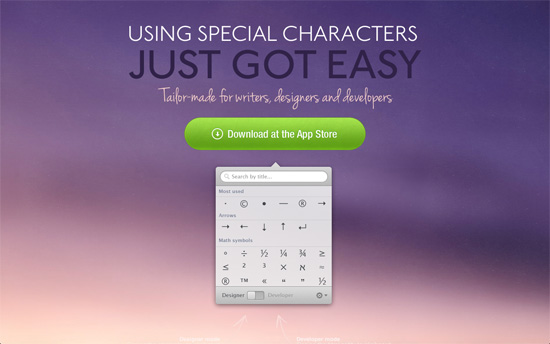
Most of the designs featured here animate a background with a wallpaper look: repeating icons, grayed out. This one’s an interesting exception; it appears to be a layer of “dust” sliding over a blush sky. Another good design that features the product although statically. This would have been a 10/10 if web fonts were used for the headings.

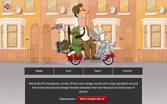
A fun little responsive effect when you change viewport sizes: the guy changes age and the scooter changes features depending on the width of the browser. It’s a kid on the narrowest one and full-grown man with lots of bags (and mirrors!) on the ride. The illustration also serves as a current page marker above the menu (except for the narrowest breakpoint).

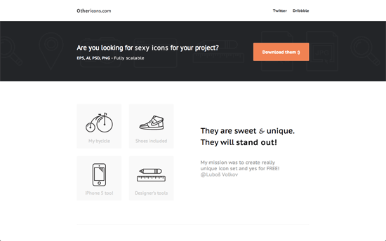
Neat, simple, black and white site that’s all about the icons. I’m wondering why the gallery at the footer uses a background image instead of an img tag but my best guess is to discourage theft.

Icon and illustration one page site that consists of a step by step survey/quiz. Although it’s a little long (around 22 items before you get your result), not a pixel is out of place and the visualizations—both icons and graphs—are lovely.
Social Media Weekly
Ready to go out and design your next website? Try building with the Catalyst Framework.
Mobile Web Design – Nine Ways to Improve User Experience in Mobile Design
“Here are nine tips from the book for optimizing your site for all those mobile site visitors.”
CSS – CSS Next
“There are lots of new and interesting features out there and it would be awesome if you could take the time to play with them and provide feedback.”
JavaScript, Optimization – Think First, Code Later
“By including strong engineering practices in your front-end, and trying to minimise technical debt, you’re at least giving yourself a decent safety net to guard against the “can we just…?” tendencies that are a fact of life.”
