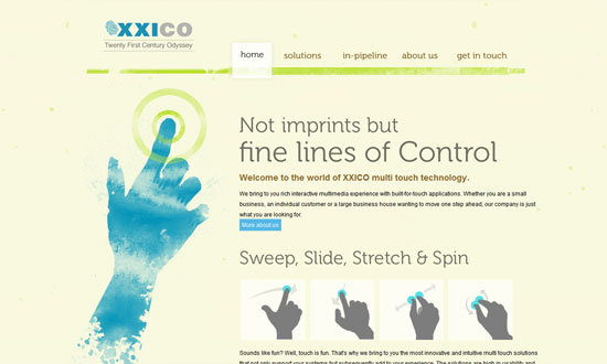
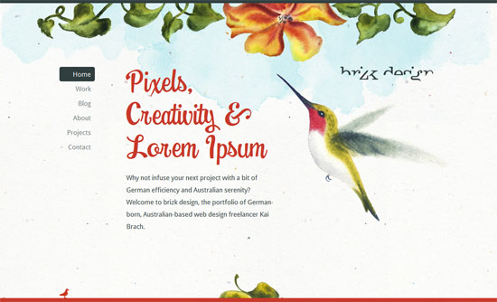
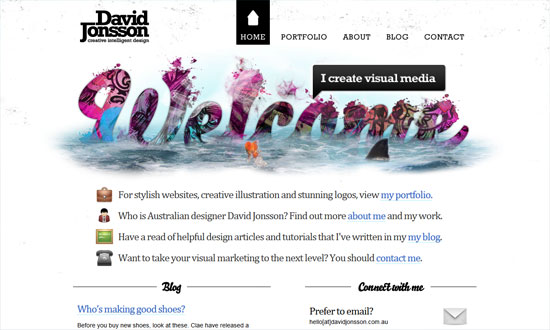
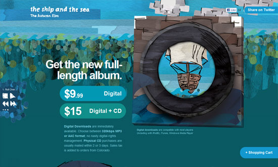
This week on Friday Focus: lovely scenery and similar eyecandy painted with a virtual brush.
Designs of the Week
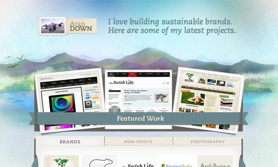
Beautiful, beautiful details; I wish there were more pages to explore.
I like the matching image thumbnails for the posts but I’m not sure strokes of paint have shadows.
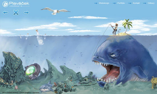
There’s a bit of disconnect between the content—which is contained only in the top right links—and the art, but it’s still interesting to look at for a portfolio site.
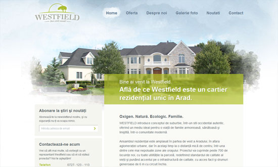
Elegant and airy. I like the blurring of the header image behind the blurb.
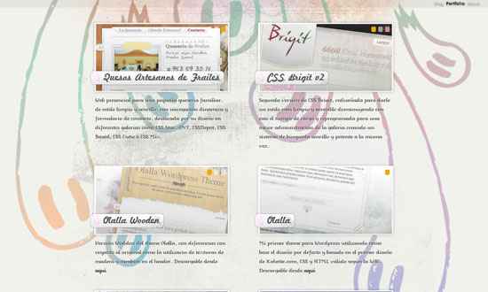
It’s a little ambitious to have all the text on this website in a non-web safe font and a script font. I think I’d be a little more okay with it if the text were larger.
I really like this look but I wish they didn’t just stick in the Wufoo form at the footer.
I like the specks sprinkled all over the page, but I feel a little iffy about the logo—it’s almost too cryptic!
Really like how the right blurb background blends from header to main content area. I also find it interesting that a sports-related site would choose this look.
The “Welcome” sign is so good I got a little disappointed to see the art in the inner pages didn’t carry quite the same style.
Completely eyecatching work, it just needs a navigation to the different sections of this one-page site.
Social Media Weekly
Usability – 10 Steps To A More Usable Ecommerce Website
CSS – How to use CSS3 Orientation Media Queries
Tools – 5 Mozilla Labs Projects You Might Want to Know About
Accessibility – Do we need a new game plan to make the Web accessible?
