• Home
  • About
  • Contact
  • Advertise

Devlounge

Design, Develop, and Grow

ateşli sevgilisi fantezisini yaşamak istediğini söyler porno ona arkadaşları varken onunla gizli saklı seks yapmak istediğini sikiş söyleyen kız hafta sonu için gelen arkadaşının görmediği bir sikiş açıdan sakso çekmeye başlayınca adamın yarağını bu altyazılı porno şekilde indiremez ve açık şekilde salonda sikişimeye sex izle başladıklarında misafir kızı da bu sekslerine rokettube konuk ederler seks yapacağını düşünmeyerek onun sex izle oyun oynadığını zanneder sabah olur ve herkes uyanır hd porno bu sırada yanında şişme mankenini de getiren sapık erotik hikayeler genç sınav haftası ders çalışan genç adam üvey annesinin sikiş eve gelmesiyle hayatının şokunu yaşar

  • Home
  • Code
  • Design
  • Design Focus
  • Interviews
  • Publishing
  • Strategy
  • Webapps
  • Extras

Friday Focus 01/13/12: Keeping It Trim

January 13, 2012 By Sophia Lucero

This week’s featured designs are staying fit and trim with these not-so-wide layouts. Happy Friday the 13th Focus!

Designs of the Week

BBQWar website
BBQWar

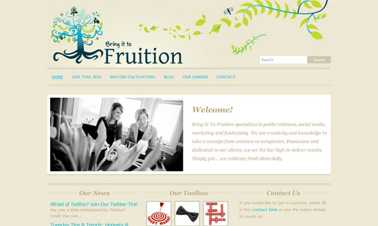
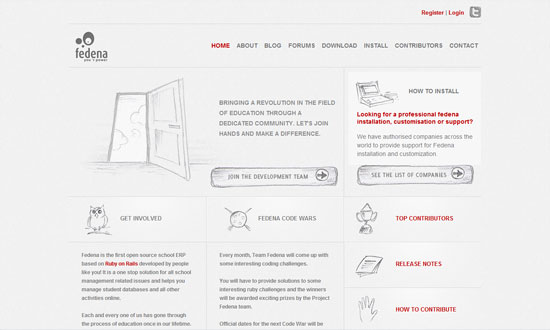
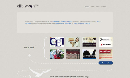
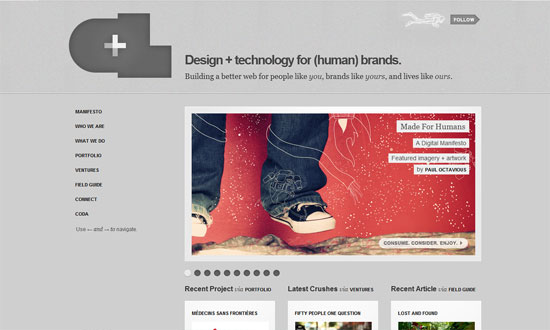
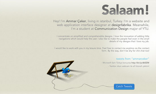
Having a one-column site champions focus. Blogs often get cluttered with unnecessary information (I’m not even talking about ads) so here’s it nice see that’s not the case. Dashed lines repeat everywhere, and so do the raw treatment to the graphics, from the bulls in the background to the rough borders running form top to bottom (neat idea to use tire tracks too).

SeaChange website
SeaChange

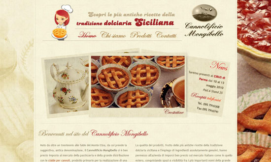
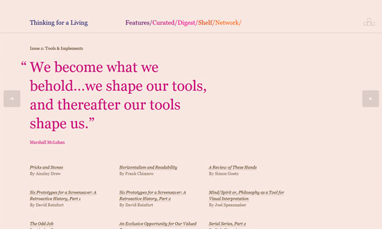
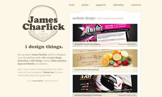
The right column illustrations appear in full color upon hover. I like the idea of cutouts in the “paper” to signify separate sections of text. You can also see flecks both in the background and foreground.

The Design Cubicle website
The Design Cubicle

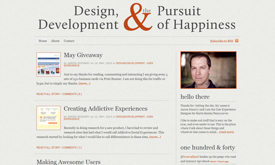
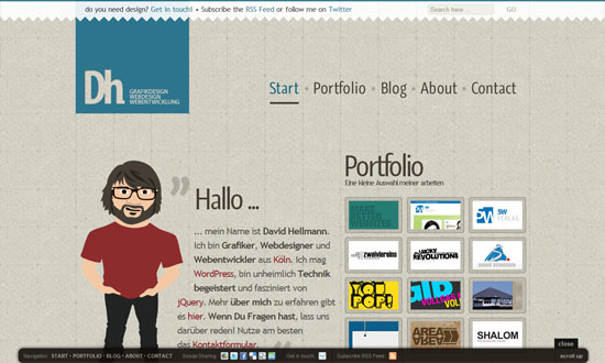
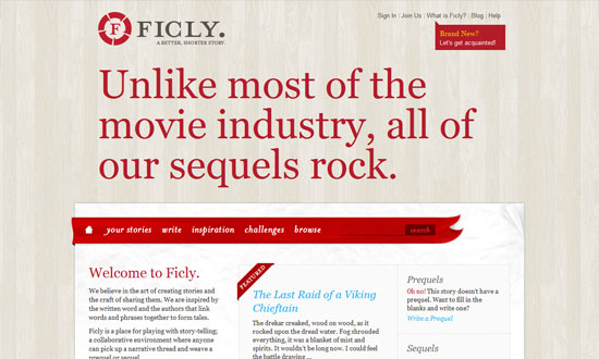
There’s also a bit of paper metaphors going on here, from the texture to the illusion of folds. I like all the tiny little patterns used on this page, both the linework and grainy ones. And then there’s a neat little ribbon for the monthly archives to the right side.

Matt Puchlerz's website
Matt Puchlerz

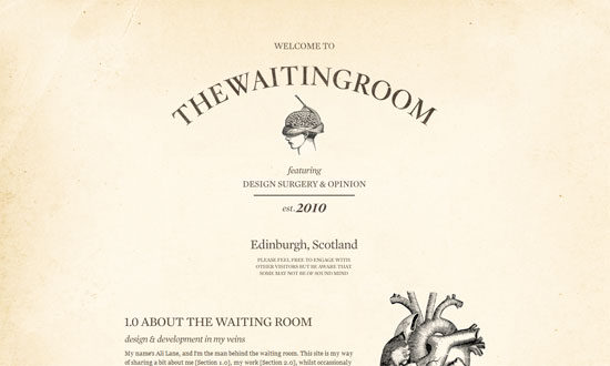
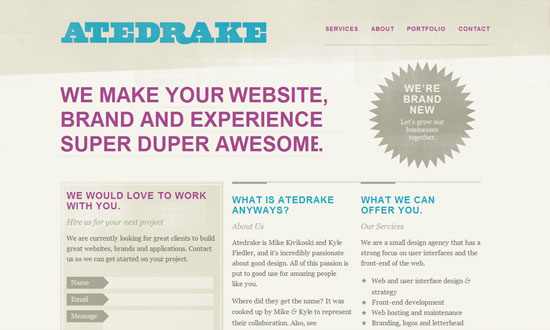
Notice how the background of the typographic heading and the background are both clouds. I also like how the four corners of the page are cut inward (a nice-to-have in CSS3 someday). There are also some stylings in the section headings and the contact form at the bottom. I guess the thing I wanted was an anchor navigation but perhaps one thinks that because it’s a one-page site, it’s no longer necessary?

Adrian Le Bas's website
Adrian Le Bas

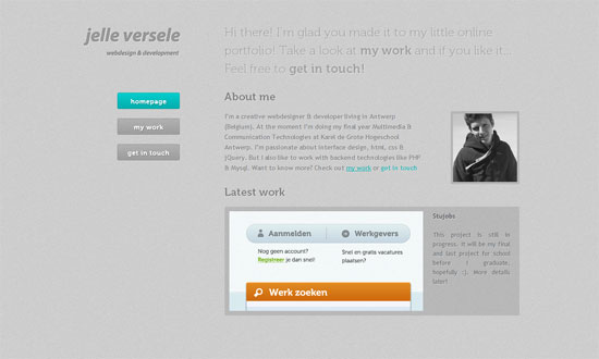
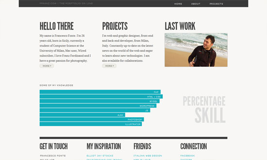
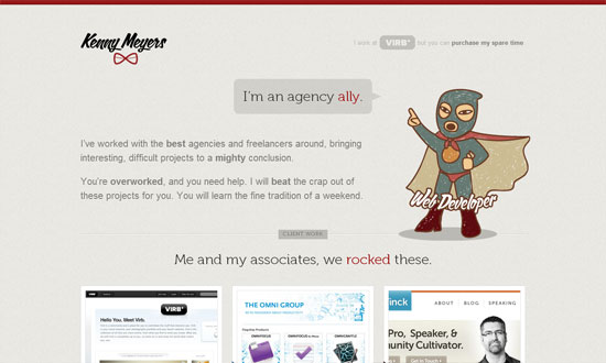
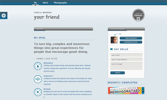
Moving your mouse around the page move the blue circle behind the logo. That box also contains more information on its “flip side”, like a business card. Below it are icons that AJAXically loads the other sections of his site. It’s also a responsive design: when the window becomes very narrow the background image disappears and the icons grow larger, becoming more touch-device friendly.

Rivers and Robots website
Rivers and Robots

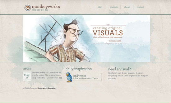
The combination of the blurred background and its lomo filter coloring topped with a subtle parallax effect makes this site for a calming browsing experience. I also really like the almost completely transparent background in the slide-out boxes under each button (not to mention the button style itself).

Want your site to be as good-looking and inspirational as these? Start by choosing a well-designed theme from ThemeForest.
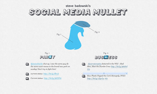
Social Media Weekly

User Experience – Stepping Out of Line
“Nature has no “visual design” phase. Why do we?”

Mobile Web Design – “Mobile first” CSS and getting Sass to help with legacy IE
“Even if you want to don’t want to use any of the Sass or Scss syntax, the pre-processor itself can help you to write your CSS in a “mobile first” manner (with multiple breakpoints), provide a “desktop” experience for IE 6/7/8, and avoid some of the performance or maintenance concerns that are sometimes present when juggling the two requirements.”

Ready to go out and design your next website? Try building with the Catalyst Framework.

Friday Focus 12/09/11: Hello, My Name Is

December 9, 2011 By Sophia Lucero

This week’s featured designs business card websites, some of them looking literally like cards containing contact information of their owners. That means very minimal layouts but still all compelling experiences.

Designs of the Week

Tim Van Damme's website
Tim Van Damme

First up, the site that started this trend. The design may be over a year old but the graphical details are still all the rage today. One of the most important features for this genre of a site are the vCard download link and the social media links, accompanied of course by the colorful icons for each site. No tabs here, but each section in the menu loads with a vertically sliding animation, while the hover effects use horizontally sliding effects.

Mehmet Aksoy's website
Mehmet Aksoy

The shooting star in the background is actually animated with Flash. So are the stars which twinkle. There’s a touch of the Aero (Windows Vista/Windows 7) interface in this design (particularly the avatar) but I feel it’s the custom font used on this page that gives a different look to the whole site.

Benjamin De Cock's website
Benjamin De Cock

This site greets you with the owner’s name then displays a closed box, which you click on so it pops open to reveal this card. The animation even contains accompanying smoke effects. Other visual treats to enjoy on this page: an icon-based website tooltip on the text link for “interface designer”, glowing hover effects on the bottom icons, and a slider for his three avatars.

Chris Rowe's website
Chris Rowe

Not the usual boxed in layout but it’s all only contact information in here. Hovering over the initials reveals the full name and occupation. Same goes for the links below it.

Margot Dowleska Dyer's website
Margot Dowleska Dyer

A nice earthy look with icons that blend in and a slideshow running in the polaroid frame to the left. There are some portions though where the graphics make the text a little difficult to read and are competing for attention with the foreground.

Maximilian Schoening's website
Maximilian Schoening

The closest thing to the business card metaphor translated to a webpage, complete with an animated flip done with CSS3 transforms when you click on the top right blue corner. The background uses another CSS3 property, radial gradients. The other side contains nothing but tiny social icons.

Social Media Weekly

CSS – The CSS profilers are coming!
“Back in August I talked about the lack of benchmarks or performance tools for CSS. In the meantime, the fine folk we call browser makers have been working hard on new developer tools to do just that: measure CSS performance.”

CSS – Truncating text using only CSS
“It works in IE 6+, Safari 4+, Firefox 7+, Opera 11+ and Chrome 10+”

Design, Business – Warm Gun: Design for Continuous Deployment
“In his Design for Continuous Deployment presentation at the Warm Gun conference in San Francisco, CA Randy Hunt shared how Etsy’s development process allows designers and developers to collaborate at scale on production code.”

CSS – Knyle Style Sheets
“Inspired by TomDoc, KSS attempts to provide a methodology for writing maintainable, documented CSS within a team.”

Friday Focus 07/02/10: Rocketships

July 2, 2010 By Sophia Lucero

This week on Friday Focus: a bunch of sites that use rocketships in their designs. Unfortunately not all of them take the metaphor as far as one would like, but carry interesting designs nonetheless. Ready of take off?

Designs of the Week

Launchlist

No doubt about it, this design is slick, and customizing form elements is no walk in the park. I just wish the narrow font wasn’t so narrow, and the submit button were blue.

MB Dragan

I want the green buttons to have bigger padding (Fitts’s Law), and the portfolio info text in the carousel isn’t so readable, but I quite like this site. Putting the designer’s face into an astronaut suit is clever, and what I meant by taking the metaphor to the next level.

Noel Design

I enjoy the mixed textures and playfulness here, but I think it could stand to be more playful. The footer looks completely different from the rest of the site.

Kupferwerk Blog

Love the scribbled-on-paper touches but I feel they blend into the background too much and one wouldn’t think to look or click there.

base6 Design

Applying a grunge texture to originally glossy illustrations? Not a very good idea.

Rocketlance

I like the overall look and feel of this site, but if you look more closely it needs polishing. It’s an 8.5, but not a 10.

HyperX Local

Lovely details, go check out the icons and other illustrations on the inside pages. My favorite part is the glass frame around the main content area.

Social Media Weekly

SEO – 5 Ways to Be an Ethical SEO Expert
“Today we’ll briefly look at how to engage in SEO in an ethical manner by pointing out five key techniques to avoid.”

Programming – Using Firefox’s Geolocation API
“One interesting aspect of web development is Geolocation; where is your user viewing your website from? You can base your language locale on that data or show certain products in your store based on the user’s location.”

UX – UX Myths
“Debunking user experience misconceptions”

Information Architecture – Card sorting: a definitive guide
“Card sorting is a great, reliable, inexpensive method for finding patterns in how users would expect to find content or functionality.”

Friday Focus 05/21/10: Neutralized

May 21, 2010 By Sophia Lucero

I’m seeing a lot of sites whose color palette consists almost exclusively of light grayish, brownish hues. Sounds boring? No such thing for a smart designer.

Designs of the Week

Bring it to Fruition

The Waiting Room

Cannolificio Mongibello

elegantweb

Atedrake

Precinkt

Marc Thomas

Monkeyworks Illustration

Project Fedena

Thinking for a Living

Jelle Versele

Dave Redfern

Elliot Swan Designs

Aaron Irizarry

The Theme Foundry

Francesco Fonte

Crush + Lovely

Kenny Meyers

David Hellmann

All for Design

Ammar Ceker

James Charlick

Chris Wronski

Ficly

Social Media Mullet

Social Media Weekly

CSS – 13 Pure CSS Techniques for Creating JavaScript-like Interactions
“Here are 13 tutorials that teach you how to push the limits of CSS and make it do things that we’re not accustomed to it doing.”

HTML – The Origins of the <blink> Tag

Typography – 10 Great Tips For Improving Your Web Typography
“Once a specialist occupation, the digital age has opened typography to computer users and web designers. When creating pages and laying out text with other content there are several guiding principles that designers should bear in mind.”

Bloggers – The History of Web Design Blogs
“Although the article may seem rather subjective to you, we hope that it will give you at least some basic understanding of how it all started and evolved into its current state.”

Friday Focus 05/14/10: Icon Parade

May 14, 2010 By Sophia Lucero

This week’s Friday Focus will tackle websites for a designer’s best friend: icons. Icon sites have been around for the longest time but we’re seeing a lot of sites pushing the envelope in interface innovation, both with their offerings and the website designs they’re found in. The latest trend so far? Websites created for a single icon set—now that’s a great way to promote work.

Designs of the Week

iconSweets

Excellent one page site with the letterpressed look. I wish the bottom gray area had its text a little more readable.

Goo-EE Icon Set

I really like how wide and open this design is. And custom typefaces are more rampant than ever.

Pictos

A subtle noise effect in Photoshop is popular for a textured effect. So is uppercase text—note the letter spacing for readability.

Glyphish

Even more subtle noise texture here, combined with a touch of woodgrain for extra elegance. I feel the text on the left sidebar is a little cramped compared to the amount of whitespace in the header. And the icon preview, which occupies a large amount of real estate, could be clickable.

Helveticons

Love the folded paper effect combined with a bit of blueprint. I don’t need to tell you how strong the grid is on this layout and the excellent Swiss design sensibilities at play here.

Android Icons

I’m enjoying the hand-drawn, torn effects from top to bottom. Even the arrows in the Services area aren’t overlooked. And scribbled down Android robots—what could be more fun than that?

We Love Icons

Sometimes a narrow layout just works better. Excellent integration of all the navigation tools from the search to the pagination. If the icons won’t make you lick your screen, the wooden panel probably will.

IconDock

Lots of content on the front page compared to the other sites listed here, but it’s not busy at all. Of course the drag-and-drop feature on this site is one of the best interface goodies out there.

Icon Drawer

I like how as you scroll down, it’s one major area, then two, then three.

Iconlicious

Really simple but it’s the details (typography, color, boxes) that stay out of the way that make the design work.

Icon Eden

There’s something compelling about the choice of fonts on this site but I have to say that the bottom half isn’t so refined. The blog post titles could use bullet icons and the sitemap seems to need a bit of serifs.

IconShoppe

We always enjoy Dan Cederholm and his impeccable work as we’ve featured at least one other iteration of this site’s design before. The current one? It just feels so harmonious even with various splashes of color from the different icon sets. I also appreciate a site that lets you scroll, scroll, scroll.

Feed Icons

I feel saddened by the ad placement here. Ads can look beautiful if you can help it, but here they just stick awkwardly out of place.

IconBuffet

I just have to include this site on the list, because no matter how long this design has been around, it still feels current.

Social Media Weekly

Design – Create Seamless Web Background Textures in Minutes
“Ever wondered how some web designers come up with such great background textures? It’s actually way easier than you might think.”

CSS – Sexy Interactions with CSS Transitions
“With all browsers except for IE being slated to have Transitions support in the coming months, more and more web designers are turning to this powerful technique as a means to enhance their website’s user experience.”

Optimization – Optimizing Your Website For Speed
“In the world of the Internet, you have mere seconds to capture a visitor’s interest before they leave and find your competitors. Can you afford to have them leave just because of your websites speed?”

Next Page »

Code & Tutorials

Which Front-End Development Languages Will Grow in 2017?

Your Guide to Leveraging APIs as a Developer

Bitcoin Processing Website Integration For Web Developers

Website Security For 2016 That All Developers Need To Know

5 Reasons You Need to Be Using jQuery

About Devlounge

Want to read more about Devlounge, or maybe you want to contact us, or even advertise? Oh, and don't forget to subscribe to updates!

The Best of Devlounge

Facebook Pages Design

Facebook Page Design and Tutorials

Search