• Home
  • About
  • Contact
  • Advertise

Devlounge

Design, Develop, and Grow

ateşli sevgilisi fantezisini yaşamak istediğini söyler porno ona arkadaşları varken onunla gizli saklı seks yapmak istediğini sikiş söyleyen kız hafta sonu için gelen arkadaşının görmediği bir sikiş açıdan sakso çekmeye başlayınca adamın yarağını bu altyazılı porno şekilde indiremez ve açık şekilde salonda sikişimeye sex izle başladıklarında misafir kızı da bu sekslerine rokettube konuk ederler seks yapacağını düşünmeyerek onun sex izle oyun oynadığını zanneder sabah olur ve herkes uyanır hd porno bu sırada yanında şişme mankenini de getiren sapık erotik hikayeler genç sınav haftası ders çalışan genç adam üvey annesinin sikiş eve gelmesiyle hayatının şokunu yaşar

  • Home
  • Code
  • Design
  • Design Focus
  • Interviews
  • Publishing
  • Strategy
  • Webapps
  • Extras

Design Focus: Dots & Circles

October 15, 2015 By Sophia Lucero

Emulating the circular form is always an intriguing exercise because of its technical and aesthetic challenges, especially on the Web. So every year it’s a delight to see designs that explore the “perfect shape” and take it to the next level.

Designs of the Week

Get solid WordPress themes, plugins, and web design training from iThemes.

Arc
Arc

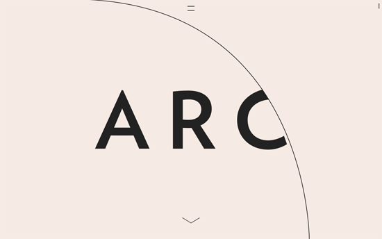
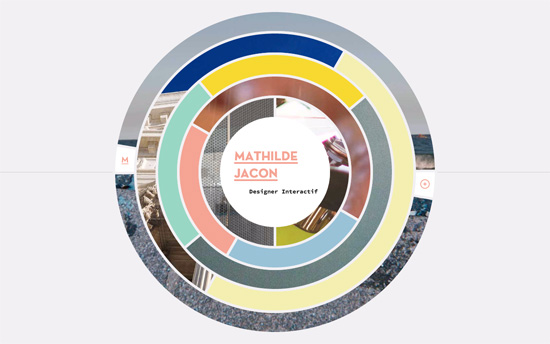
I love the way the arc of the circles shift as you scroll down and the text comes in, which are also laid out in a quietly elegant way. The “hamburger menu” does not sport 3 lines but two, which morph into a an “x” or close button once opened.

Seven Brief Lessons on Physics

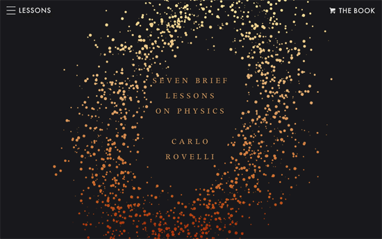
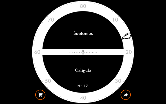
I don’t know if the book cover inspired the site design, or it was planned in sync, but this site is the perfect digital companion that interprets the scientific lessons in a dynamic, interactive way, from the illustrations & animations to the audio excerpts.

Junior
Junior

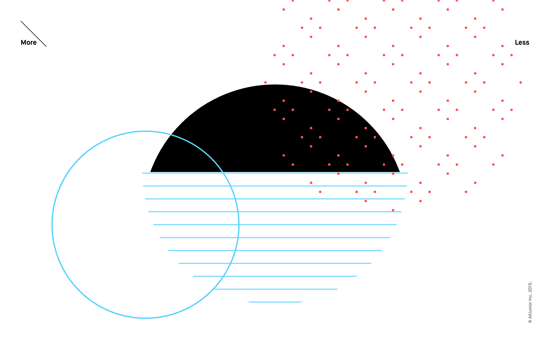
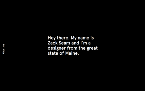
More mesmerizing animations in between messages the company believes in—interestingly this is the focus of the site, instead of the common sections like work and people. For the most part it’s black and white, with sprinkles of thin lines and small dots of light colors. Click “More” to dive into their background, or “Less” for the contact info.

Garbett Design
Garbett Design

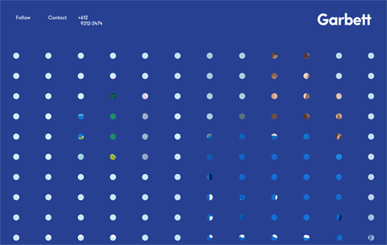
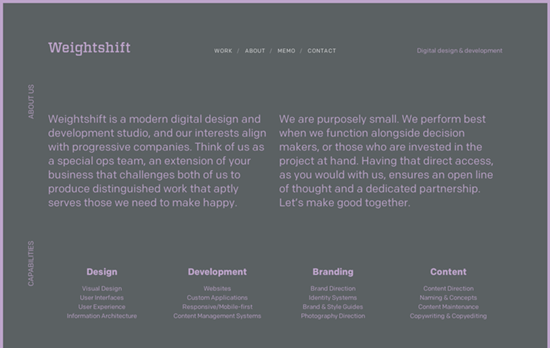
A sheet of transparent dots that slides up when you click, revealing two main sections: their selected work, and their studio. Bright, solid blocks of color match their geometric aesthetic in their portfolio. This site also also bucks the trend of placing their contact/social links at the bottom, and instead are readily visible at the top.

codedoodl.es
codedoodl.es

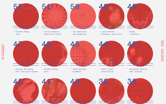
Hovering on the red circles transform them into diamonds and animates the thumbnails of the code experiments. The text blocks on the page also change into random character strings for the “Matrix”-y effect.

SolarBeat
SolarBeat

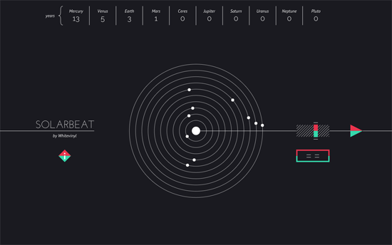
Another beautiful experiment combining science, visualization, and also music. The concentric circles represent both the paths of the planets and a vinyl record playing the notes based on the speed of their revolutions around the sun, with several parameters you can tweak.

Chris Wang
Chris Wang

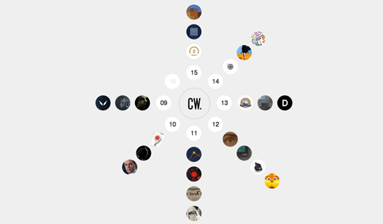
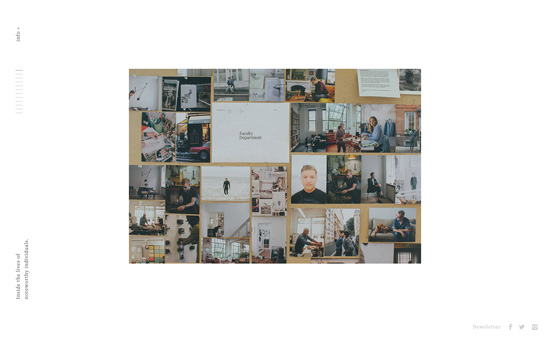
Icons of the designers’ projects are arranged radially around his initials and load in an overlay when clicked. What I find interesting is the NDA projects are also displayed—although the images are pixelated, some details about the work is still given so it’s a good approach to add it to one’s body of work.

Blackbox
Blackbox

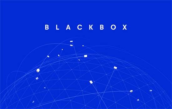
Beautiful animation of a 3D globe with animated “boxes”, representing their product, flying all over. This is contrasted with friendly drawings of their team in the bottom half of the page.

Social Media Weekly

Pagelines lets you build WordPress websites and it’s as easy as drag and drop, go check it out!

User Experience – How to Run an Unmoderated Remote Usability Test (URUT)
“Usability testing is a super flexible technique that allows for the assessment of a variety of aspects of an interface including the broad product concept, interaction design, visual design, content, labels, calls-to-action, search and information architecture.”

CSS – Animation Advice from a CSS Master
“By using CSS for animation and transitions, you’re moving those tasks from the JavaScript thread to the graphics processing thread. When using JavaScript for animation, you run the risk of other JS operations being held up until the animation completes. With CSS, the JavaScript portion of your pages remain available.”

Design – The Salesforce Team Model for Scaling a Design System
“I believe that even the best systems need human guidance to succeed and survive. For us, that means helping and empowering designers to produce high-quality, brand-aligned, system-minded work.”

Design Focus: Circular Navigation

April 21, 2015 By Sophia Lucero

Circular motifs are very much alive these days, and your site will stand out even more when used as a navigational interface.

Designs of the Week

Search Optimized, Turn-Key Designs, Unlimited Everything. Start building with the Genesis Framework today.

Mathilde Jacon
Mathilde Jacon

Each concentric circular area with images masked in them lead to pages describing the particular project. On it, the column of website screenshots move quicker than the opposite one containing text. The circular elements continue with a button and arrow that leads to the live site, and a couple others that animate and highlight the currently loading and next/previous pages. On the overlaying list of projects, the circles also pop up as icons beside each name. You’ll enjoy the clever interactions all around.

GiftRocket
GiftRocket

There’s something that feels young about this site, and has this warmth you see a lot less of these days. A textured background, borders and backgrounds that clearly demarcate sections, and a subdued color palette. It’s certainly “flat”, but rounder and kinder around the edges.

Little Black Classics

This is essentially a list of books with corresponding quotes, but the way you interact with it via the famous penguin on the circumference of the white sphere, makes all the difference. You can either click on it and have it land on a random book, or drag it around. Clicking on the center area flips the black part to the reveal the quote, and even prompts you with an animation of a tap to do something in case you forget the initial instructions. The auxiliary orange circles bubble up additional ones for shopping and sharing.

Social Media Weekly

Pagelines lets you build WordPress websites and it’s as easy as drag and drop, go check it out!

CSS – How to Center in CSS

Typography – 100 Days of Fonts

Email Design – Email Lab: A Starter Kit for HTML Emails

Design Focus: Rotated Side Text

September 19, 2014 By Sophia Lucero

Another text-y trend this week: these ones appear on the edges of the page, either as navigation markers, or links to menus & subsections, all oriented perpendicularly. Is this an alternative to the hamburger menu in tucking away off-canvas navigation, a smart way in highliting important site features, or a cumbersome way of displaying text?

Designs of the Week

Make Headway, make intuitive layouts, make it your WordPress theme of choice!

Rogue Society
Rogue Society

Besides the text, you’ll see familiar elements like a centered logo and several graphics floating over others, while sliding in at a delayed pace. Vintage photos and illustrations are scattered all over the site, not to mention certain key words in bold.

Zack Sears
Zack Sears

Black, white, and bright green and blue. As you scroll down, the text on the left switches to describe the section of the page, whether it’s a project or contact info. Hover on and it reveals the next few links you can skip to—take note that it doesn’t show the whole menu, just the ones you haven’t scrolled to yet.

Weightshift
Weightshift

A relatively unusual color combination for this section, as the other top-level pages use neutral grays and creams. Each page also carries a slightly different layout to fulfill the functions the section needs, and that all happens with almost zero imagery. On the work page, you’ll find them as masked textures on the case study titles.

Make
Make

The scribblings in the center actually move according to your cursor movements, also in layers, while the rotated words on the side lead you to the rest of the site. Also another site that does not shy away from the purest shade of #0000FF.

Hunt & Co.
Hunt & Co.

On this site the sideways text span the entire height of the page and the whole area is clickable. To the left is the site menu, while the right side shows selected works. It’s only when you select a link from either side that the middle area gets filled, and it’s another approach to layout minimalism.

Faculty Department
Faculty Department

Accessibility-wise, I’m uncomfortable with the controlled scrolling (when the info section is revealed, you’ll still be scrolling the main content unless you use the scrollbar), the thin lines, the tiny text, but browsing this site feels like reading an elegant little book.

McColl Center for Art

Lots of clever things here: that M-shaped image continuing the main photo actually displays the institution’s logo when you hover, how the lower content scrolls over the header and footer, even the way the event headings on the sidebar are designed, with specially-designed icons for their “spheres of influence”.

Social Media Weekly

Ready to go out and design your next website? Try building with the Catalyst Framework.

Design – 13 Ways Designers Screw Up Client Presentations
“…and one weird trick you won’t believe works every time.”

CSS – Getting Started With CSS Audits 
“With these tools, you’ll be better prepared to clean up your CSS, optimize your site, and make the entire experience better for users.”

Typography – On Web Typography: Smart Quotes
“Punctuation is a system. That’s why proper quotation marks and apostrophes look like they’re part of the same family as commas, periods, colons, semicolons, and more, whereas straight quotes don’t.”

User Interface Design – The laws of shitty dashboards
“Hopefully, these anti-patterns can help PMs, designers and engineers reduce a bit the amount of time wasted building and looking at shitty dashboards.”

Design Focus: Building Navigation

May 17, 2013 By Sophia Lucero

This week we’re featuring designs that use buildings to represent parts of their site’s navigation. Does this interaction design technique make browsing around more effective? Let’s find out.

Designs of the Week

Create unique, extraordinary websites with Squarespace. No experience necessary!

Isis & Norma Ltd.
Isis & Norma Ltd.

The buildings at the top are layered and move with the parallax effect as your mouse cursor does. They also appear in a bottom up transition when you load the page, somewhat alluding to a structures being built from the ground up. I like the illustration style on this site—it’s a mix between chic and homey.

WalletMap
WalletMap

Nice isometric graphic going on here. It’s great how they represented each idea in the context of that space but I would’ve liked to see more interactivity with the illustrations (feels like that’s a minimum these days). It could even be an evolving landscape in one page.

Fifteen Robin
Fifteen Robin

Cool interaction from the top of the building to the bottom triggered by scrolling down: text slide in from left and right, images are uncovered with parallelogram masks, the same boxes for the content areas. Overall a very sleek look.

Visit Bruges
Visit Bruges

Here’s a time-sensitive landscape which you can also control. The featured landmarks change by hour, showing the visitor appropriate things they might want to check out at that time, or one can scrub through the possibilities in the horizontal slider. If you want a more organized way of navigating, use the dropdown at the top or scroll further down, and see the spots color-coded by category (including “Romance”).

Social Media Weekly

Build on DIYThemes’ Thesis Framework for rock solid SEO and great layout customization options.

Typography – Narrowing the Field: How To Bring Great Type Into Focus
“Choosing type is an exercise in understanding your subject and interpreting its meaning in a visual form. To paraphrase Robert Bringhurst: typography exists to honor the subject. Arriving at an appropriate choice depends on balancing how a typeface feels with how it functions.”

Design, Typography – Reconciling SVG and Icon Fonts
“I’ll explain how to set up a powerful design workflow, going from Sketch (my new favorite SVG editing app), all the way to the browser as Icon Fonts, all automated.”

Web Design – Common Patterns in Styleguides, Boilerplates and Pattern Libraries
“I thought there’d be more overlap between frameworks than there is. I recorded over 160 distinct patterns, none of them ubiquitous.”

Design Focus: You Are Here

June 22, 2012 By Sophia Lucero

Navigation is an essential element of websites, and this week’s featured designs have the responsive, clever kind that indicate which part of the page you’re currently at. Check out how these responsive navigation markers were integrated below.

Designs of the Week

Want your site to be as good-looking and inspirational as these? Start by choosing a well-designed theme from ThemeForest.

Jorge Rigabert's website
Jorge Rigabert

The bright hues repeat in different sets of categories across the page, including the color scheme of each section, which in turn changes the fixed navigation to the left as you scroll along. Everything looks bright, crisp, and snappy with the mix of ribbons, colors, and illustrations.

Boulder Digital Works Class 3 website
Boulder Digital Works Class 3

The row of people in the footer is actually the navigation itself, which is clever. Then each person in that row actually designed the slide he/she is on. It’s a little chaotic at times and sometimes the transition from black and white to color on the navigation is drowned out but it’s you end up on a screen that’s just as clear as where you first started.

Authentic Jobs charity: water Campaign 2011 website
Authentic Jobs charity: water Campaign 2011

Instead of literal navigation this page uses a symbolic indicator of the projected amount of funds raised for the charity. The parallax design combines illustrations, photos, and abstract backgrounds to distinguish one slide from the next, all while a pipe runs through the “underground” background.

Collaborative Fund website
Collaborative Fund

There’s a running hexagon shape theme in this design, from the logo to the header background to the hover indicators. The marker on the right side is wonderfully done, especially the cut-out space for the label, much like a an automotive dial. I wish the menu items used anchor links instead of pure JavaScript though.

Social Media Weekly

Ready to go out and design your next website? Try building with the Catalyst Framework.

CSS – The open/closed principle applied to CSS
“With so much abstracted and shared CSS, simple changes to a base object can have massive ramifications across whole projects; how do you deal with that?”

HTML5, Accessibility – HTML5 Accessibility Chops: When to use an ARIA role
“There has been discussion of late on whether authors should be allowed to include an ARIA role value on an HTML element that matches the default implicit ARIA role as defined in HTML5.”

User Experience – Effective Presentation of a Website’s Navigation
“Browsing – moving through a multi-faceted content structure – is made easier when information architects present users with an intuitive navigation hierarchy. This article discusses two techniques to that end.”

Productivity – Desk exercises: 3 easy routines for designers
“Sit up straight, and pay attention! Designer boot camp starts now, and we’re here to put paid to poor posture, and ensure your remain in tip top condition at your desk.”

Next Page »

Code & Tutorials

Which Front-End Development Languages Will Grow in 2017?

Your Guide to Leveraging APIs as a Developer

Bitcoin Processing Website Integration For Web Developers

Website Security For 2016 That All Developers Need To Know

5 Reasons You Need to Be Using jQuery

About Devlounge

Want to read more about Devlounge, or maybe you want to contact us, or even advertise? Oh, and don't forget to subscribe to updates!

The Best of Devlounge

Cool Tools for Creative Blog Content

Search