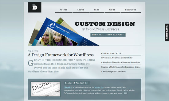
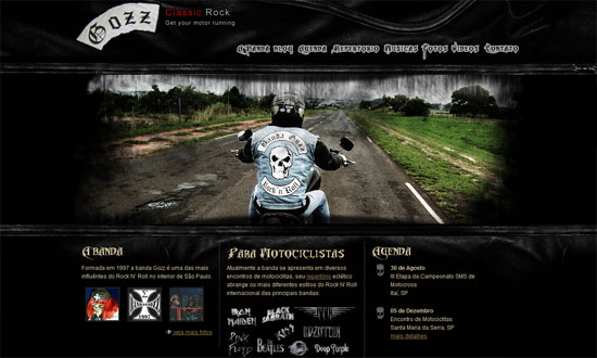
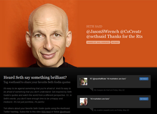
This week on Friday Focus, we’re featuring light on dark sites with little to no use of color, just the neutral gray, brown, and black.
Designs of the Week
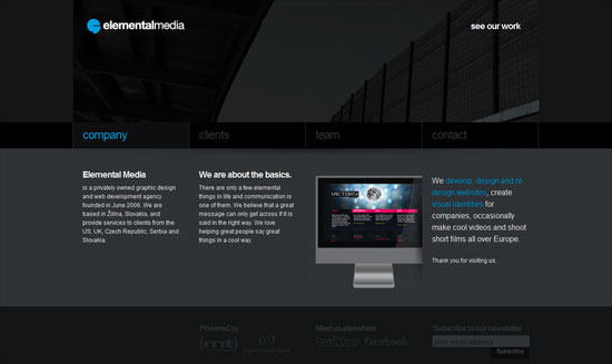
Clean, dark, blocky one-page site with just a touch of light blue for accents. I like it!
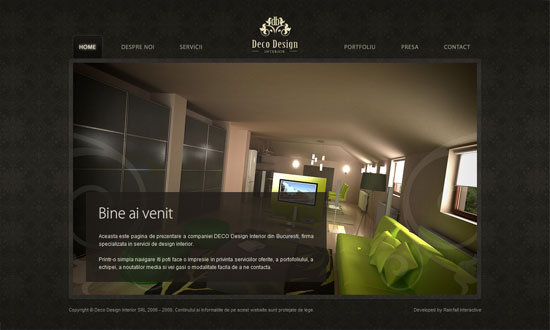
Nice use of photographs for blurbs, descriptions, and even navigation in the inner pages. And of course the background pattern reinforces the “interior decor” motif.
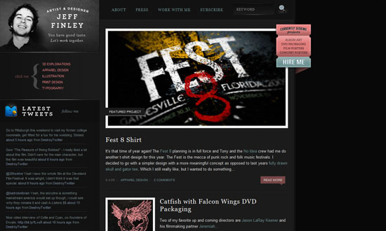
It’s really the details that nail this layout—typography, alignment, and the border effects. Plus, using gray and black is always a good idea for portfolios to let the works stand out.
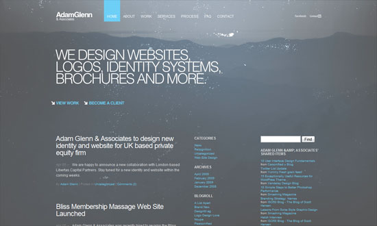
Another super simple design, but the splatter effect on the subtle landscape background is an interesting combination and contrasts with the minimalist type and layout.
You know how sometimes content just dictates what a layout should turn out to be? I feel this is one of those times.
Love the texture, love the fonts! Except for the slogan at the top left—the designer could’ve gotten away with something more ambitious for that little blurb.
Social Media Weekly
Design – Beautiful sets of environment and nature icons
Icons that’ll make you go green.
Design – 59+ Amazing (and jaw-dropping) web design-related lists with titles that will rip your face off, blow your mama’s mind, and make you cry under the crushing pain of their inspiration
A list of lists. Hilarious!
