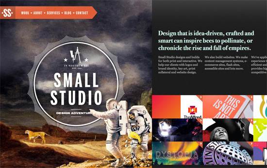
This week’s featured designs use the not-so-common method of horizontal scrolling to tell their stories, each screenful an idea to absorb on your way to getting to know them fully.
Designs of the Week
Create unique, extraordinary websites with Squarespace. No experience necessary!

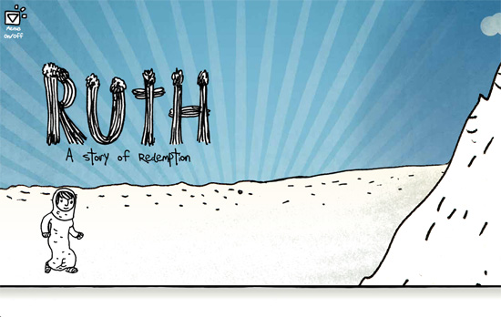
I love the illustrations, which fit the whole storybook vibe that most horizontal scrolling sites carry. Especially that wide panorama “painting” inside the frame—you don’t see that sort of thing online! There’s no ‘you are here’ indicator in the fixed top left menu, but it’s kind of a good idea that it fades in and out while in the process of scrolling, like a visual cue that you’re doing something. Even the way the site stops on the far right, with book spines, is pretty brilliant.

Walking animated character, flying in and moving objects, and subtle parallax effects—all token components of this design genre. I also appreciate that the text in each banner uses true webfonts.

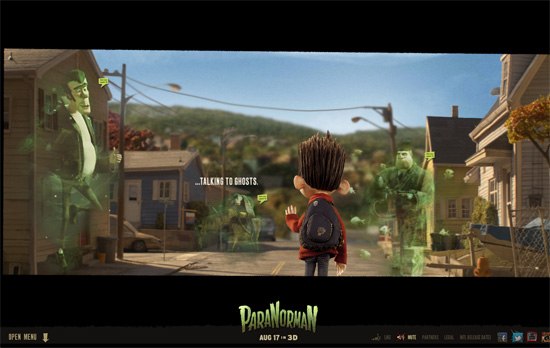
The whole look and feel of the movie touches everything here, even the social media icons on the lower right. The fly-out menu meanwhile slides vertically from the bottom, which isn’t too usual, and it’s one big collection of images, which also makes sense since the site is extremely visual and users will remember the pages better by the scenes they’re about.
Social Media Weekly
Search Optimized, Turn-Key Designs, Unlimited Everything. Start building with the Genesis Framework today.
Responsive Web Design, Email Newsletter Design – Responsive Email Design
“In this guide, we’ll look at why designing for mobile has become a necessary skill for email designers, cover the fundamentals of designing and building a mobile-friendly email and back it all up with some neat tips and techniques.”
SEO, Semantics, Web Standards – On web semantics
“Up until today authors were not always certain about what HTML element to use for what functional unit in their HTML page, though, and “living” specs like HTML 5 require authors to keep an eye on what elements will be there going forward to mark up what otherwise calls for “meaningless” fallback elements like div or span.”
CSS – Creeps and Weirdos in the CSS Spec
“So in this post, I’ll run through a bunch of things from the CSS specifications that you might not have heard of yet. None of this is even close to ready to use (unless it degrades really gracefully), but it will serve to get you familiar with some of the rounded corners and drop shadows of the future.”
Web Standards – A future friendly workflow
“User experience director Luke Brooker explains the thinking behind the Future Friendly initiative and how it can help adjust your workflow.”


