There are plenty of new designers who are still living in a cave on the latest in the web coding craze, known as valid code, which is the use of Xhtml & CSS. These new designers spend countless hours “in the dark” so to speak, and use prehistoric techniques such as tables to put together designs for themselves and clients who are also out of place in today’s web usability standards.
So how can any of these people, lost in regards to what xhtml is besides html with an x in front, ever be expected to catch up to the rest of us? Of course, they could go out and buy some books, and spend time reading instead of learning themselves. They could always steal source code, and eventually, after being hounded by the design community for doing so, maybe they’d pick something up. Or, they could learn for themselves – in fifteen minutes.
In fifteen minutes? You must be sitting there gasping for breath and splashing water on your face. Did I really say it was possible to learn xhtml in fifteen minutes? Because it is.
Course Introduction
Xhtml should never be looked at as intimidating. Once you learn it, you’ll find its leaps and bounds easier than using tables, particularly with more advanced layouts. The days of using tables for anything more than tabular data are over. Let’s start by going over the basics, including some vocabulary you need to know before we getting going. Get out a pencil and paper if you have to.
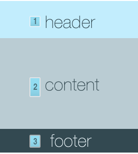
Sites for the most part are broken down into three main sections: the header, content, and the footer. The three main sections appear on about 90% of all sites, they can just be displayed in many different ways.
The header is usually the first thing to find its way into the body of a html document (between the < body > and < /body > tags). Headers usually hold such things as the logo, banner, site / page title, and navigation.
Next is the content. Call this what you want, this is where the bulk of the site is contained. A content area is generally flexible, because it tends to hold the entire contents of the page inside it. We’ll get into this a little bit more below.
Finally, there is the footer. Footers can hold “designed by” information, contact information, ads, and possibly anything else. The design setup for all this could be graphically represented like below:

You first have to understand where all this is located code-wise. Create a new html document in Dreamweaver or similar and you’ll start out with something like this:
[html]
[/html]
Now, that header, content, and footer mumbo-jumbo we just went over? Imagine these as tables. Just like how tables hold data in columns and rows, these three sections will be our base for building a site. Each section with hold smaller sections inside it, to in turn complete the entire site.
Get your cursor to between the < body > tags, and get your typing fingers ready. We’re going to type our first fully valid site, without using design view to we’re finished.
Initial Data
With your favorite html or text editor open and you’re cursor blinking between the body tags, we’re going to begin typing a few simple lines of code. Just three in fact. Follow along by copying what you see below.
[html]
[/html]
In just three lines of code, we have just built the skeleton of a valid site. Three lines! How easy is that? Let’s take a look at our messy table code that would have completed the same thing: (3 rows and 1 column.)
[html]
[/html]
Seems to me like xhtml works a lot better. If you’ve snuck a peek at a design view of what we’ve done so far, you’ll notice a whole lot of whitespace. In fact, that’s the only thing you’ll see! This is because our three sections have no content inside them, so all you see is blank white space. That is all about to change.

