Just because monitors have gotten bigger doesn’t mean we should jump into wide layouts all the time. See how these designs make use of narrower widths effectively.
Designs of the Week
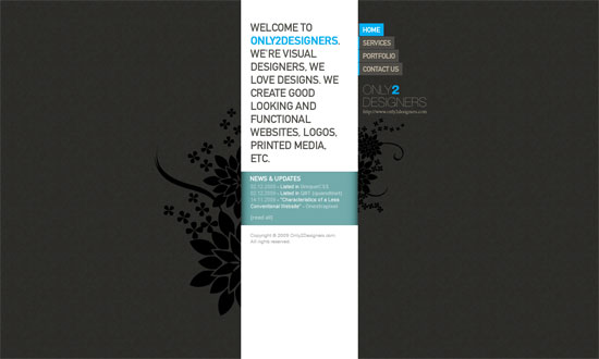
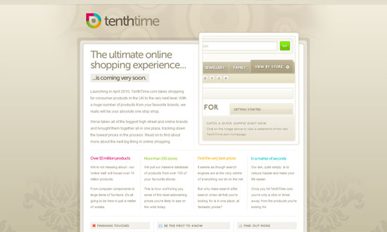
Even several years ago this could be one of the narrowest sites out there, and it stands out because of that. Yet the content isn’t sacrificed.
Needs a bit more refined type, but the overall look is quite pleasant.
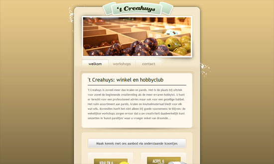
This one, on the other hand, mixes a lot of different typefaces and shades of yellow to brown. It may be a bit glaring to some but the detalis are lovely.
This business card-type site looks almost underdesigned but still looks crisp and clean. Again, it’s all in the custom type.
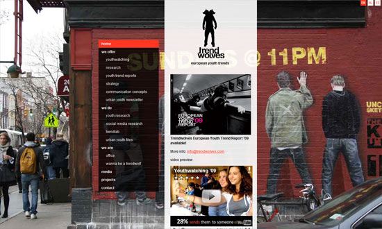
A narrow layout lets striking photo backgrounds define the look of the site. I like that the menu on the left shows the subpages for each link, not just the top-level navigation: instant sitemap.
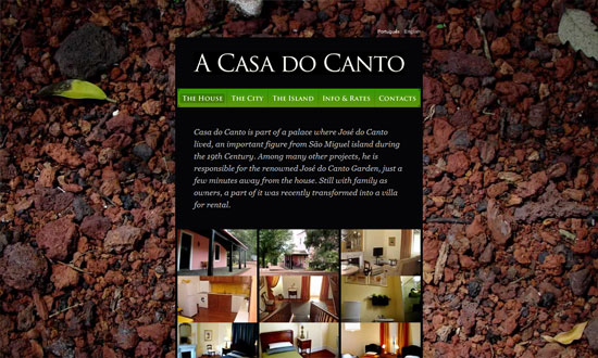
Same photo background treatment, except it doesn’t change per page.
Great graphic details everywhere, and a very restrained use of color.
Narrow designs seem to have minimalist tendencies too. This one hides away the clutter with a sliding box for the navigation.
A narrow layout can also influence you to do a one-column, one-page site that makes reading and browsing more convenient.
Social Media Weekly
Design – 4 Pixels or Less
“Having too much choice is one of the main obstacles for 21st century designers. With virtually unlimited tools and possibilities at our fingertips in the digital age, our creativity can become clouded very easily. Being inundated with thousands of photoshop brushes or fonts can push the very concept of a design from the forefront of your mind.”
Typography – The Future Of CSS Typography
“In this article, we’ll look at some useful techniques and clever effects that use the power of style sheets and some features of the upcoming CSS Text Level 3 specification, which should give Web designers finer control over text.”
CSS – !important is Actually Useful (in Print Style Sheets)
“So what you need is a way of specifying print styles that can override the inline styles. There’s only one way to do that: !important.”
CSS – Flexible Color Schemes in Layouts with RGBa
“This will be an experiment in transparency. CSS has come a long way over the years, and one of the biggest advancements is the integrated use of transparency.”
