Nature-inspired websites come by the dozen these days, but this week’s featured designs up the ante. They’re really lovely, I promise!
Designs of the Week
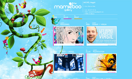
I love the illustration on the left side. Predominantly green but has lots of bright colors and interesting “characters” too. I would have wanted a bit more of them scattered throughout the one-page site, though.
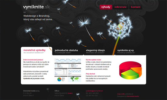
You know how nature-inspired websites look cliche because they use cliche types of plants and flowers? This isn’t one of them. There’s something about this design that draws me in. Simple, but quite memorable and effective.
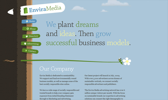
So many things to love about this design. First, that the “landscape” is tilted sideways, and the plants serve as dividers for the different blocks of text. Brilliant! Then you have the navigation links skewing every which way. Finally, the typography is fantastic!
Social Media Weekly
Business – The Value of Practical Personal Projects
CSS – All About Floats
Accessibility – Big Red Angry Text
Usability – 10 Tips to Create a More Usable Web


