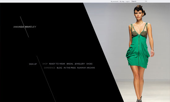
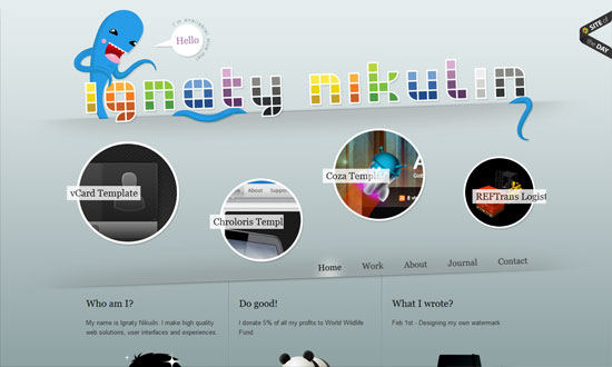
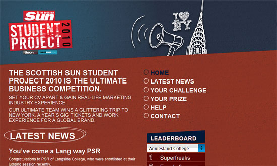
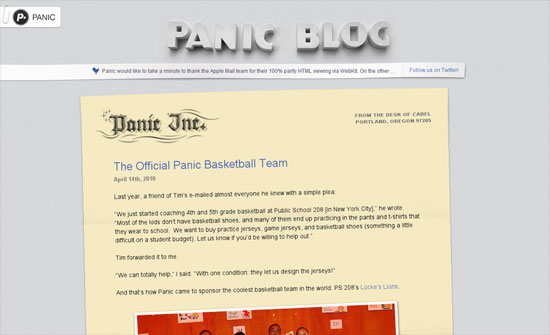
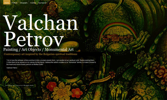
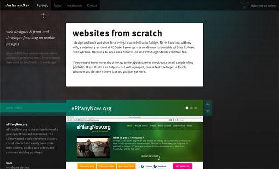
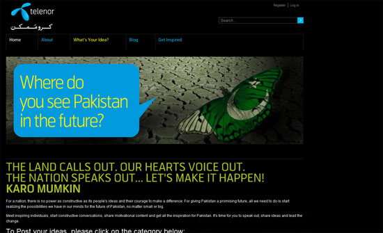
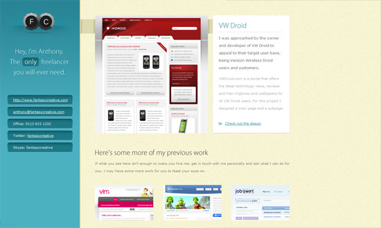
This week on Friday Focus: website designs that use strong lines to guide the eye in navigating around them.
Designs of the Week
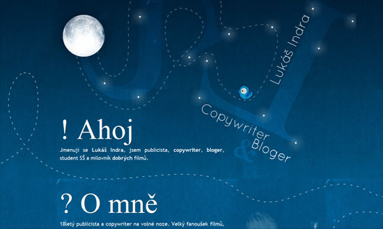
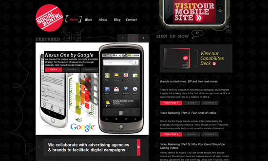
I enjoy the textured starry night look and all the rotated text.
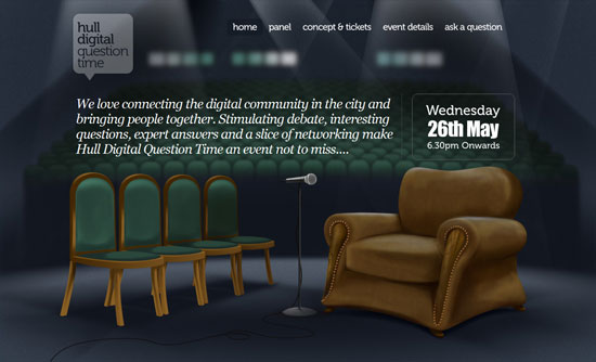
Not pictured here, but it’s the microphone wire that traverses the whole site, connected to the amplifier all the way in the footer—very neat. Beautiful illustration work, “Mad Libs” style forms, and typography.
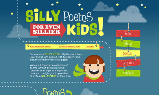
Colorful but not overwhelming. Love the dotted lines repeating everywhere, including the submit buttons, which is a great way to soften the corners up.
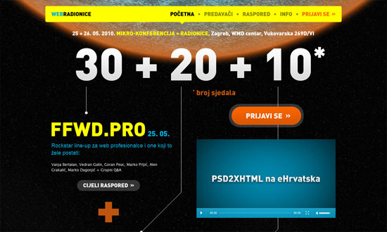
Other major design trends going on here: the outerspace look and bold uppercase text.
I like the subtle gradiation of color on the broken lines. But I’m not too sure why one uses <span>s instead of more meaningful tags like <strong> or <em>.
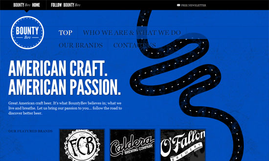
“Follow the road to discover great American craft beer.” Great concept. And the black road echoes the broken lines from the company logo.
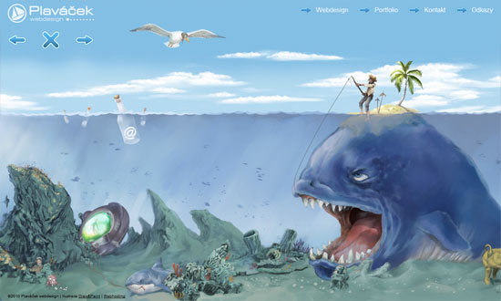
We’ve seen this masking effect before and here’s another take on it. Content styling needs a little more refinement (it screams Kubrick, the default WordPress theme) but it’s the illustration that shines.
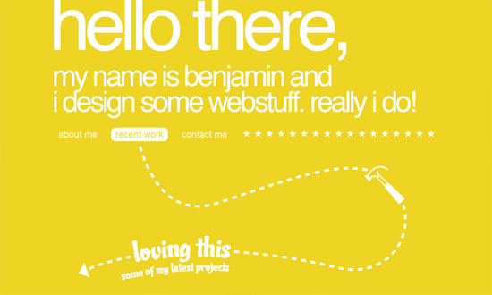
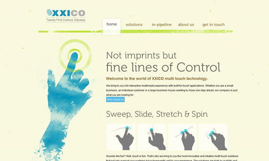
White on yellow is a little too bright for people, I think, and copy could be improved.
The rainbow stream of rain and the reuse of clouds in the flowchart is really nifty.
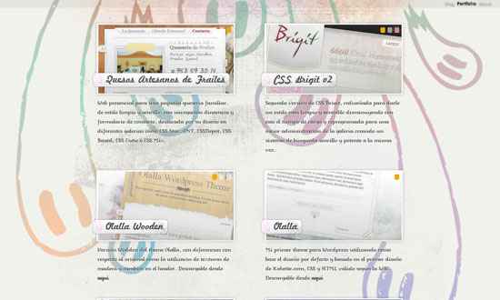
The hand-drawn touches here are a bit subtle, you almost want more.
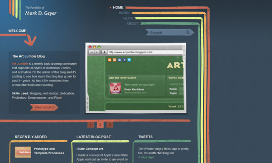
I like that the color-coded folded ribbons also serve as borders for different content areas.
Social Media Weekly
HTML – A Brief History of Markup
This is Chapter 1 of HTML5 for Web Designers by Jeremy Keith.
CSS – CSS Posters
“I decided to create some simple CSS3 posters based on designs that I’ve already created before.”
Design – Visual Hierarchy is the Art of Managing, Not Eliminating
“Visual hierarchy, the classification of elements according to importance and relationship to other elements, tends to be one of the most ignored and underutilized principles of design.”
