• Home
  • About
  • Contact
  • Advertise

Devlounge

Design, Develop, and Grow

ateşli sevgilisi fantezisini yaşamak istediğini söyler porno ona arkadaşları varken onunla gizli saklı seks yapmak istediğini sikiş söyleyen kız hafta sonu için gelen arkadaşının görmediği bir sikiş açıdan sakso çekmeye başlayınca adamın yarağını bu altyazılı porno şekilde indiremez ve açık şekilde salonda sikişimeye sex izle başladıklarında misafir kızı da bu sekslerine rokettube konuk ederler seks yapacağını düşünmeyerek onun sex izle oyun oynadığını zanneder sabah olur ve herkes uyanır hd porno bu sırada yanında şişme mankenini de getiren sapık erotik hikayeler genç sınav haftası ders çalışan genç adam üvey annesinin sikiş eve gelmesiyle hayatının şokunu yaşar

  • Home
  • Code
  • Design
  • Design Focus
  • Interviews
  • Publishing
  • Strategy
  • Webapps
  • Extras

Design Focus: Translucence

October 19, 2012 By Sophia Lucero

Our featured websites this week make clever use of opacity for that wonderful-looking layered effect.

Designs of the Week

Create unique, extraordinary websites with Squarespace. No experience necessary!
Driving Futures website
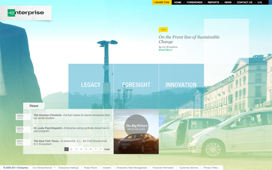
Driving Futures

Love the sky blue and fresh green color scheme and treatment on the background images to reinforce that clean, environmentally friendly feel. Another big running motif are the varying-size boxes for different content areas.
Agência Creative House website
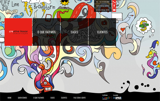
Agência Creative House

Wonderful explosion of colors, abstract illustrations, patterns, and that splashy fixed footer. There’s also a bit of play with dimensions in the folded corners and irregularly shaped boxes. The contact forms are a crazily bold shade of red by the way. You can see the big and ambitious feel they’re going for here.
Gokulam Doha website
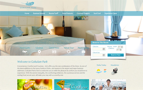
Gokulam Doha

I like how even the photographs match the color scheme of the website—although the reverse is probably what actually happened. It would be great if the menus could indicate the current page you’re on though.
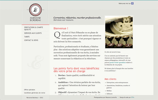
Marianne Bordreau's website
Marianne Bordreau

Beautiful typographically driven website. The fixed sidebars which have a translucent background at the top, and sit on the middle content area as you scroll produce a nice little effect. There’s also a live navigation marker on the side.

Social Media Weekly

Get solid WordPress themes, plugins, and web design training from iThemes.

HTML5, Games – The Complete Guide to Building HTML5 Games with Canvas and SVG
“I’m currently spending most of my time explaining to students, hobbyists, professional developers and teachers how to build games using HTML5. Then, I recently thought, rather than keeping all these details for small audiences, wouldn’t it be smarter to share it with you?”

CSS – Debugging CSS Media Queries
“Fluidity and adaptive behavior is a hot subject nowadays, and it’s perfectly justified when looking at today’s mobile browser landscape. We achieve this with CSS’s Media Queries. But sometimes it can be messy – I’m gonna share a quick tip for indicating (with pure CSS) which media query that has actually kicked in.”

User Interface Design – Login Screen – behind the scenes
“Here at GoSquared, we love to obsess over the little details that make the real difference in your experience of the site and Dashboard. The new login screen was no exception.”

Typography, Responsive Web Design – Grids, flexibility and responsiveness
“It’s about balancing measure with a readable font size and a readable font size should always win.”
Friday Focus 08/13/10: Let Your Garden Grow

August 13, 2010 By Sophia Lucero

This week on Friday Focus: vines, blooms, and other foliage that do a great job of framing your website.

Designs of the Week

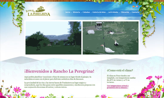
Rancho La Peregrina

When doing vines on a sky background, it doesn’t make much sense to have drop shadows, does it?

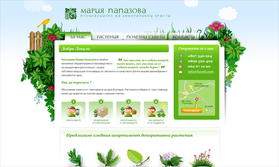
Мария Папазова

The gradient on the tabs are a little severe but the translucent ones look great. I kind of want more blue in the background though, feels too white.

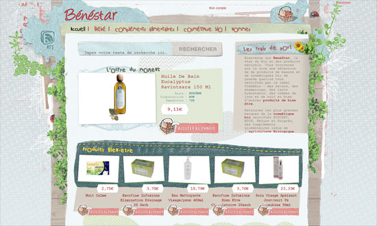
Bénestar

The use of fixed-width type is curious, but I like the mixed textures. The actual photo of a basket for a shopping cart icon is priceless.

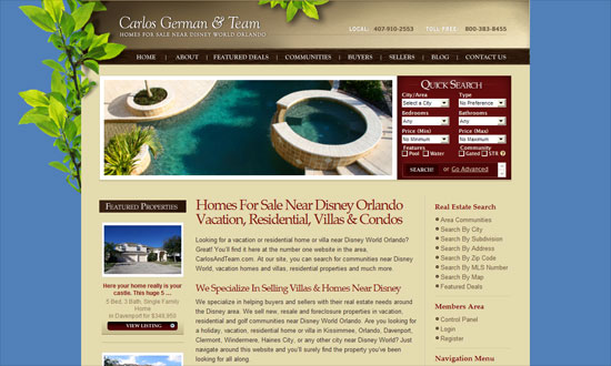
Carlos German and Team

The Quick Search box looks a little cramped; the Map Search could be more accessible.

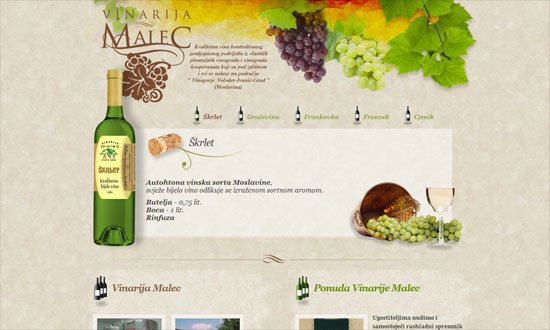
Vinarija Malec

Some nice watercolor textures here although again the shadows get to me. A little bit of a split layout going on below.

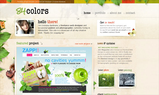
84Colors

The subtly moving leaves (and the squirrel’s tail) look great—they barely call attention to themselves so when you do notice them, they’re a nice treat. Attention to detail everywhere.

Sprouter

I like how the leaves are behind the large sign up button.

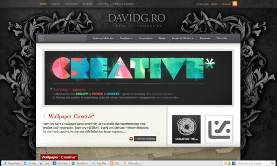
David Gheorgita

Something more ornate and abstract. I feel a disconnect between the gray-black top and the brown bottom, though.

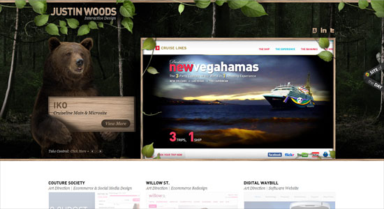
Justin Woods

Another disconnect here. The header is awesome—there’s a bear! carrying a sign!—but the bottom is just too light and doesn’t even carry any hint of nature in it.

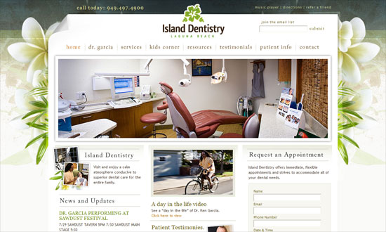
Island Dentistry Laguna Beach

Beautiful design. Not sure what a music player is doing on a dentist site, but perhaps they thought it would be a fun little touch.

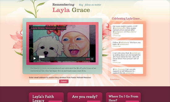
Layla Grace

The flowers look so pretty I they weren’t just in the background. The turquoise is a nice contrast to the floral hues of pink and peach.

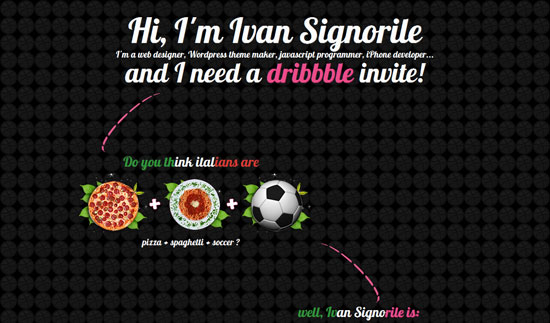
Ivan Signorile

I like how the leaves are used as frames for the circular icons here.

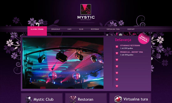
Mystic Club

Love the purple and fuchsia, it even matches the club photo on the front page. Centered logo alert!

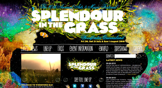
Splendour in the Grass

Make sure your eyes are well-rested before you view this site; every color of the rainbow seems to be on here. The content area could have used at least a translucent background to make the text more readable, which is already so small.

Social Media Weekly

UX – Designing with Paper Prototyping
“The basic premise of this method is that a paper prototype of a feature’s UI is crafted and then given to a user who will attempt to complete a task or a scenario. Evaluators record and analyze the results from these sessions, which are then used to create another prototype.”

Accessibility – Misguided accessibility: access keys
“These days, accessibility experts recommend strongly against the use of access keys, instead putting focus on accessibility enhancers such as “skip-to” links and clear navigation and layout, fully tested with assistive technologies like screen-readers.”

Accessibility – What should be the minimum / maximum length of alternate text?
“Putting undue length restrictions on alternate text can undermine the quality of alternate text, limit the amount of information conveyed to readers, and can affect the style of writing in a way that inhibits comprehension.”
Usability – Shlock and Awe: Little Things on Your Website that Drive People Nuts
“No website will ever be perfect (unfortunately), but we’ve compiled a list of little tweaks and changes you can check on your website to make sure you’re not irritating your visitors.”
JavaScript – Commonly Confused Bits Of jQuery
“jQuery brings to the party its own API, featuring a host of functions, methods and syntactical peculiarities. Some are confused or appear similar to each other but actually differ in some way. This article clears up some of these confusions.”
Friday Focus 07/16/10: The Many Faces of Paper

July 16, 2010 By Sophia Lucero

The many different textures, colors, and treatments for paper allow infinite possibilities for their use in websites. Not one of these designs look remotely alike, and that keeps things very interesting. Happy Friday Focus!

Designs of the Week

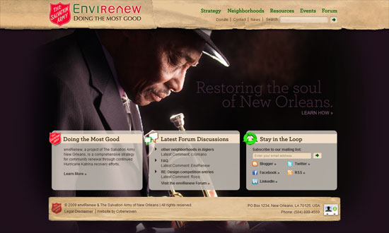
enviRenew

Great idea to do a slideshow that spans the whole background. Looks much less artificial that way.

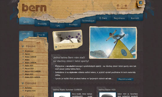
Helmy Bern

Everything looks impressively blended in: the logo, Facebook icon, drop-down navigation menu, and tabbed navigation.

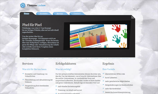
Thomas Lickes

Needs refining, but looks pleasant.

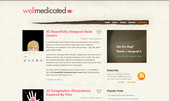
WellMedicated

Love the navigation background as a torn section of the paper, and you can see the brown wallpaper pattern peeking through.

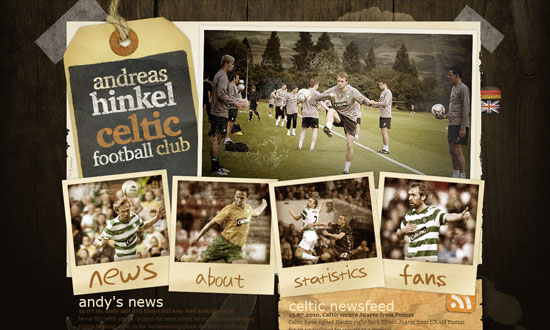
Andreas Hinkel - Celtic Football Club

Excellent hover effects and that overall “big” and “scrapbook” feel.

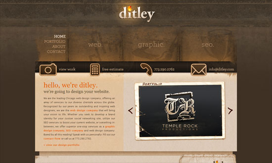
Ditley

Love the glowing flame on the logo and the large navigation. I just have some issues with the text padding in the inner pages.

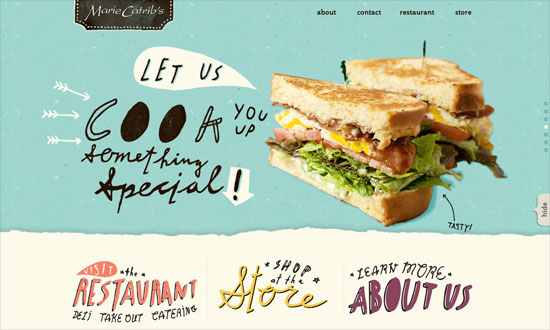
Marie Catrib's

Delightful, delightful details. Love the custom borders most of all.

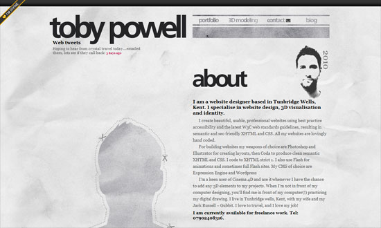
Toby Powell

I like the way the borders and section headers blend into the paper, like faded newsprint.

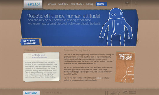
TestLab²

There are tons of paper textures, but few bother to design with corrugated paper. Especially this way, with the cutouts, layers, and shadows.

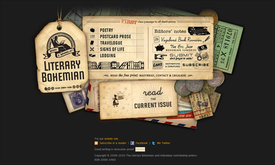
Literary Bohemian

A visual and literary feast!

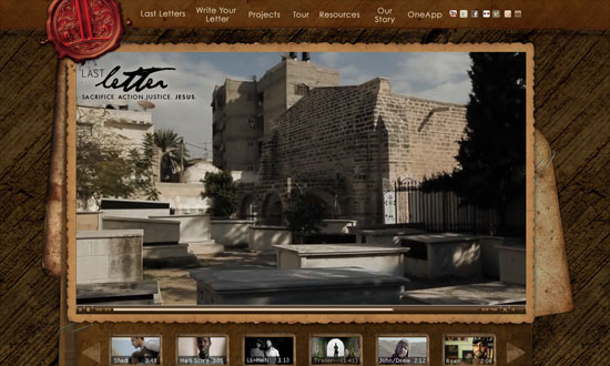
The Last Letter

I think it’s great that the video thumbnails have frames that echo the overall look, and the video player interface almost disappears from view.

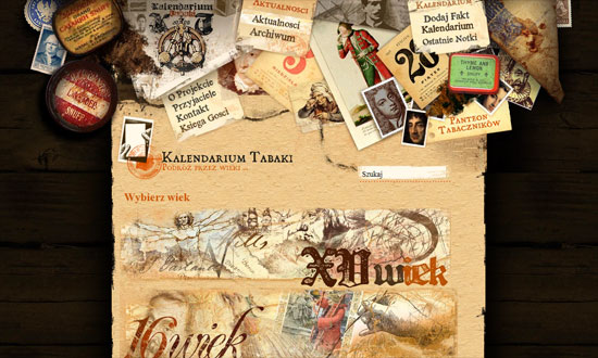
Kalendarium tytoniu ze szczególnym uwzględnieniem tabaki

The page title isn’t so prominent, and there are no visual cues for the navigation in the header, but all the collages look fascinating, if a little overpowering.

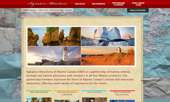
Signature Attractions

Some alignment problems here and there, plus the map background image is a little distracting (could be lighter or darker), but good call on the drop down menus.

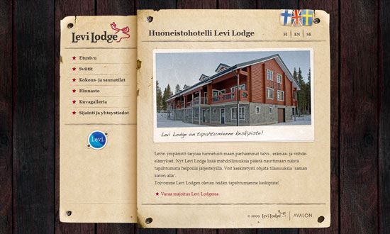
Levi Lodge

I really like the styled translation/localization flags! And pretty much every detail on this site—everything falls into place nicely.

Lendl Allen V. Trazo

The detail on this design is great, although the font choices for the headers are a bit tired. Not pictured but the animated thing going on in the footer isn’t as refined as the graphics above, looks awkward.

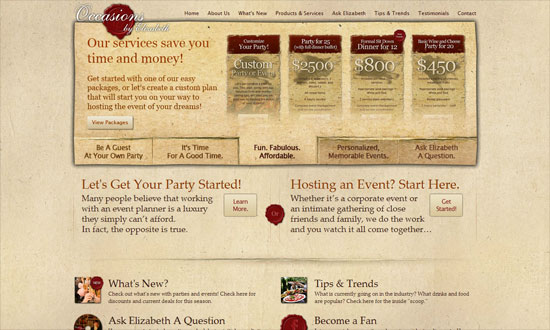
Occasions by Elizabeth

The shadow is a little too heavy, but the tabbed slideshow looks amazing, perfectly blended! Using the red wax seal effect for the social media icons is a good idea too.

Social Media Weekly

Design – Code an Email Newsletter from PSD to HTML

CSS – Vendor prefixes—what happens next?

Design – Zappos.com redesign case study

CSS – CSS Media Queries & Using Available Space

CSS, Typography – Font metrics and vertical space in CSS

Typography – FontShop Education

Friday Focus 04/16/10: Slanted

April 16, 2010 By Sophia Lucero

This week on Friday Focus: designs that tilt to one side and keep the perpendicular lines away.

Designs of the Week

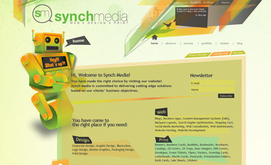
Synch Media

Love the warm hues, transparency, and even the tiny polka dots. Everything blends in nicely.

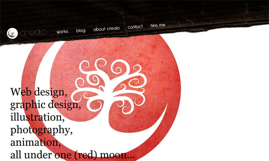
Crealo design

I like how the logo is used as a prominent design element, not just as a header. One thing you will notice with these slanting designs is how they usually mean they’re left-aligned too. More often than not that leaves a lot of whitespace on the right side, which may be a good or bad thing.

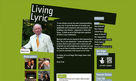
Living Lyric

Really simple design, but looks fresh with the bold colors changing in each page and the boxy look.

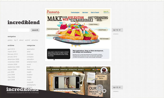
Incrediblend

The nice thing about a vertical user-generated gallery is you only have to browse from top to bottom and not from left to right. I really like how the fixed footer has the logo slashed out!

ASOS plc

Forget rounded corners, slanting edges is the next big thing! Love the subtle, translucent shapes in the background and behind the content area.

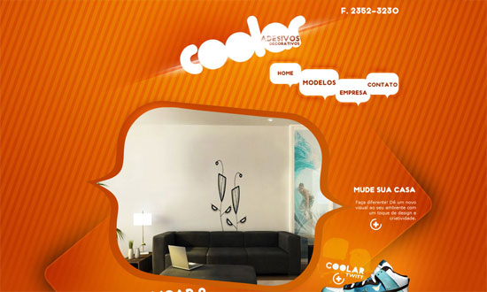
Adesivos Decorativos Coolar

An extremely fun-looking design with not one traditional design pattern in sight! Love how the plus icons turn into arrows.

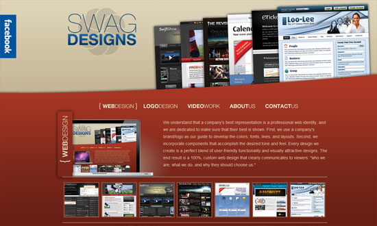
SWAG Designs

Instead of the usual horizontal lines to separate sections of a one-page site, this design slopes them upward.

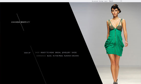
Amanda Wakeley

There’s something about slashes and slanted shapes that just fit with designy sites including fashion. Love the hover effect in the inner pages reinforcing this.

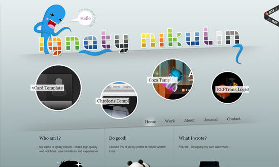
Ignaty Nikulin

That other trend that’s also getting popular, circles, is in here too, but there’s an animated twist. The rainbow-colored header breaks the gray-filled design.

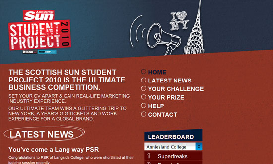
The Student Project

The hand-drawn effect is always a good way to add to slanting lines.

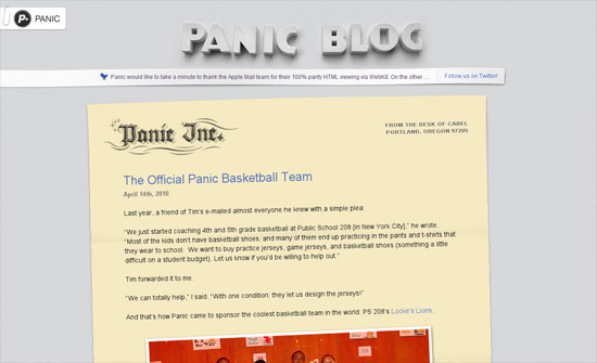
Panic Blog

And finally: the easiest, most modern way to implement the slanting look in your design? Use CSS3 transforms!

Social Media Weekly

Design – Holistic Web Browsing: Trends Of The Future
“The future of the Web is everywhere. The future of the Web is not at your desk. It’s not necessarily in your pocket, either. It’s everywhere.”

Design – Designing with Lenses
“A design lens allows you to view the user experience through the eyes of a single design principle. Lenses were originally created for game design but are just as powerful for user experience design.”

HTML – Introduction to HTML 5
“Are you interested in HTML 5 and what’s coming down the pipeline but haven’t had time to read any articles yet?”

JavaScript – RequireJS
“RequireJS can help you manage the script modules, load them in the right order, and make it easy to combine the scripts later via the RequireJS optimization tool without needing to change your markup.”

Friday Focus 04/02/10: Easter Spheres

April 2, 2010 By Sophia Lucero

Since it’s Easter next Sunday and I haven’t really seen egg-inspired designs yet, circles will have to do for now! More on this growing trend in this week’s Friday Focus.

Designs of the Week

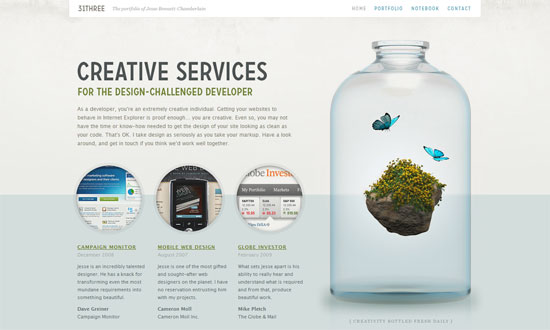
31Three

I first noticed the circles “trend” on this site, but it’s really the subtle beauty that draws you in.

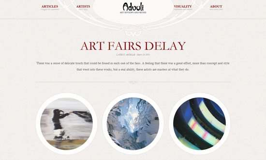
Advuli

Excellent typography and ornate details, and the use of circles for buttons reinforces is neat. I also like how strongly balanced the layout is and a lot of it is center-aligned, but not at the expense of legibility.

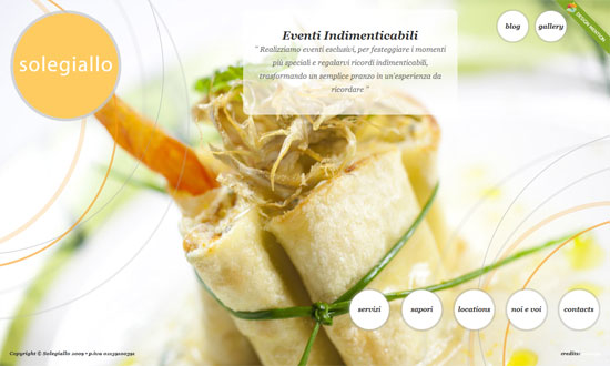
Solegiallo

The use of circles here isn’t so groundbreaking but the thin, translucent lines blending in with the photographs are the signature look for this design.

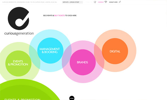
Curious Generation Group

Now this uses circles in every possible way—like bubbles floating to the top. Even the lightbox popup for the newsletter was modified into a circle.

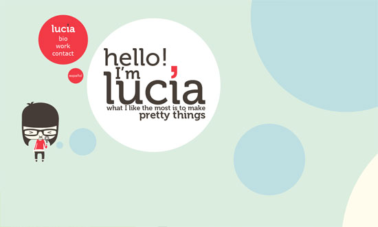
Lucia Soto

Now this one “bubbles” horizontally, and uses other forms to create seemingly animated transitions from one section to the next.

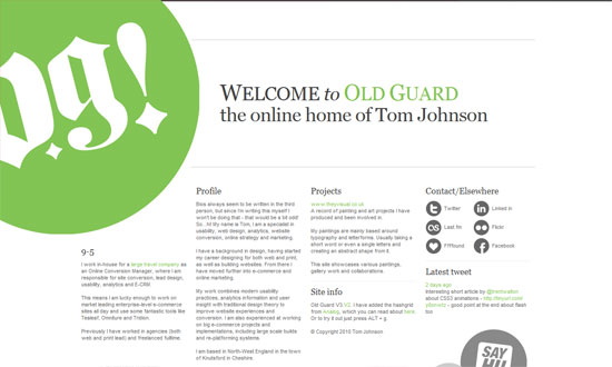
Old Guard

Very simple, but I like the idea of using circles with a grid.

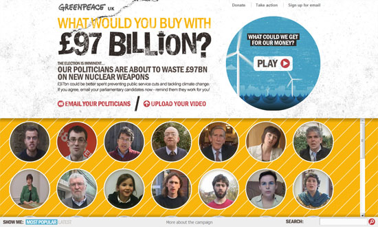
Trident Campaign

I have some alignment issues with the bottom area but the way you play videos on this site is clever (click on a face, video shows up on the top right circle).

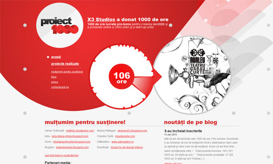
Proiect 1000

Also clever: spin your mouse around the middle wheel to view different project thumbnails. Using circles as arrows on the left menu is also a nice trick. Finally, I like to overall vibe here: abstract shapes based on but not limited to circles.

Social Media Weekly

HTML – HTML5 Forms Are Coming
“HTML forms have been, to date, quite simplistic. We’ve had limited options: the text field, the checkbox, the radio button, the textarea and finally the select drop down. Any complex data like phone numbers, email addresses or dates had to be checked by JavaScript.”

CSS – CSS Specificity Part 1: Weight, Specificity and Overruling properties
“This article will do its best to map out the problem and will hint at several fixes and workarounds. None of them fool-proof or particularly implementor-friendly. A follow-up article will then take a closer look at the core issue we’re dealing with, diving into the depths of the human mind to uncover the true problem at hand. Sounds exciting, no?”

CSS – CSS Specificity Part 2: Lacking Proximity
“In last week’s article on fuzzy css specificity I presented a case that illustrated the difference between regular specificity and css specificity. While it’s interesting to review these cases, it’s even better to get to the very core of them. This article will do just that.”

UI – An Accessible Pagination Pattern
“Pagination is a basic building block of the web, appearing practically everywhere content is displayed. From a UI perspective, a pagination widget generally ends up being presented in a very straightforward manner as a horizontal list of links, framed by “previous” and “next” links to give the user clear calls to action.”

Next Page »

Code & Tutorials

Which Front-End Development Languages Will Grow in 2017?

Your Guide to Leveraging APIs as a Developer

Bitcoin Processing Website Integration For Web Developers

Website Security For 2016 That All Developers Need To Know

5 Reasons You Need to Be Using jQuery

About Devlounge

Want to read more about Devlounge, or maybe you want to contact us, or even advertise? Oh, and don't forget to subscribe to updates!

The Best of Devlounge

5 Ways to Use Social Media to Make Money

Search