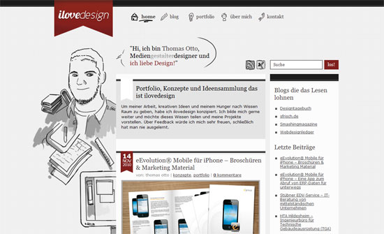
This week on Friday Focus: designs that reveal the face behind the portfolio, in an illustrated way.
Designs of the Week
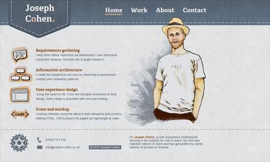
I like the treatment on the icons and bullets, but the left alignment not so much.
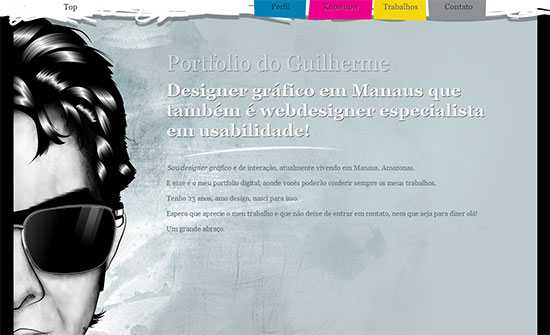
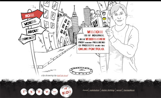
Wonderfully bold, not just with the colors but with the content layout.
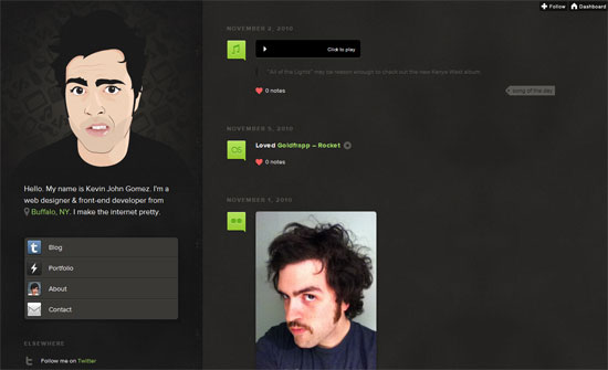
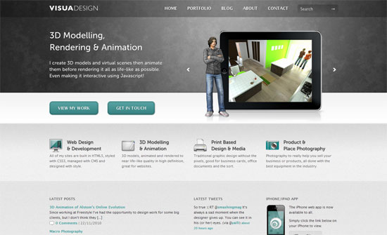
A better left-alignment implementation. Nice subtle textures and bright accent icons.
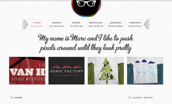
Favorite part’s the footer. Not sure what that repeating icon is but it looks nicely retro-modern.
There’s a nice little animation with the traffic light but too bad it’s not CSS3. The hover effects make up for it though.
Illustrated figures usually influence how the rest of the design looks, but here it clearly doesn’t. I like the clean, professional look and the icons are impeccable, but I feel like there should be more people in it!
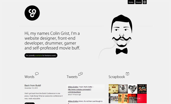
The spinning bowtie is cheeky but not the only clever thing on this page: check out the fly-out colophon that switches the logo coloring.
Love the consistent use of the scale guide graphics you find in Adobe’s suite, especially in the contact form. Everything’s just well-organized.
I like the contrast of the hand-drawn effect with the thick lines and grid background.
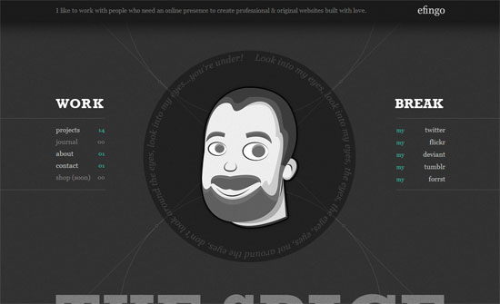
Totally makes sense to put all the social icons around the head like that! Maybe the names should be in scribble form too.
Social Media Weekly
Design – Ageism
“One of the most difficult things I’ve had to deal with since I started working in this industry is my age. I experience age discrimination much more than I experience any form of sex discrimination.”
Web – Long Live the Web: A Call for Continued Open Standards and Neutrality
Usability – Mega-Menus Gone Wrong
