• Home
  • About
  • Contact
  • Advertise

Devlounge

Design, Develop, and Grow

ateşli sevgilisi fantezisini yaşamak istediğini söyler porno ona arkadaşları varken onunla gizli saklı seks yapmak istediğini sikiş söyleyen kız hafta sonu için gelen arkadaşının görmediği bir sikiş açıdan sakso çekmeye başlayınca adamın yarağını bu altyazılı porno şekilde indiremez ve açık şekilde salonda sikişimeye sex izle başladıklarında misafir kızı da bu sekslerine rokettube konuk ederler seks yapacağını düşünmeyerek onun sex izle oyun oynadığını zanneder sabah olur ve herkes uyanır hd porno bu sırada yanında şişme mankenini de getiren sapık erotik hikayeler genç sınav haftası ders çalışan genç adam üvey annesinin sikiş eve gelmesiyle hayatının şokunu yaşar

  • Home
  • Code
  • Design
  • Design Focus
  • Interviews
  • Publishing
  • Strategy
  • Webapps
  • Extras

Design Focus: Bike Sites

June 15, 2012 By Sophia Lucero

It’s time to get fit and go on an adventure with these cycling sites. Are they as sleek and smart as the wares they’re peddling? Let’s go find out!

Designs of the Week

Pagelines lets you build WordPress websites and it’s as easy as drag and drop, go check it out!

myownbike website
myownbike

The color schemes the chrome and yellow finishes of the featured bikes. The interface for building a custom one is also quite useful. Another good call is using different layouts for displaying photos in each section, slideshow, boxes of varying sizes (yes, bento), and so on. Not to mention, featured bikes are at the bottom of every page, so they don’t stop selling their products whichever part of the site you’re browsing.

Bike Nation USA website
Bike Nation USA

First of all, the Jobs link in the navigation looks out of place. Plus I think the Latest News items could stand to be expanded instead of all truncated, where all you see is a long stack of “More” boxes and look a bit confusing. I do like the use of textures on the different illustrations though.

Deaf Pigeon website
Deaf Pigeon

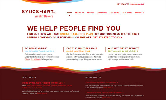
Clean and wide, but unfortunately not fluid! Not sure how effective the color-coded navigation links are on the the left half, but they are a nice pop of color to the design. The divisions also seem to be in even numbers (2, 4, 8) instead of the more common by-thirds. The site also benefits greatly from beautiful photographs and their smart locations on the page.

Alien Bikes website
Alien Bikes

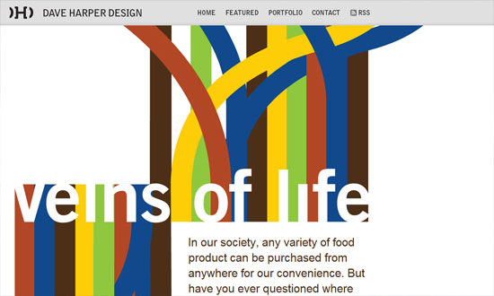
Now this one’s a fluid layout all the way to the 800-pixel browser width, but unfortunately not all the way to mobile sizes. I like the freeform feel going on here, then the pricetag gets a nice big block of yellow as the perfect rhythmic accent. Also interesting to see that small fonts still rage on—not necessarily a good thing for readability, but there’s a good contrast to the headings.

Social Media Weekly

Get solid WordPress themes, plugins, and even design training from iThemes.

CSS – Coding Q&A With Chris Coyier: Box-Sizing and CSS Sprites
“Pre-optimization is quicksand for developers: you spend a lot of time flailing your arms but not getting anywhere.”

User Interface Design – A huge list of Style Guides and UI Guidelines
“If you are a graphic designer or an interaction designer and have ever been tasked with creating a style guide or UI guidelines document (both are different and I’ve had the pleasure to work on both of them creating templates and the actual documents for brands and products), this list should help you out as a consolidated list of references.”

CSS, Optimization – One, Two, or Three
“That’s how many CSS files should be loaded on any website.”

Accessibility – An alternative to select elements as navigation in narrow viewports
“Form elements are simply not meant for navigation. So here is an alternative way of solving the problem.”

Friday Focus 06/17/11: Owly

June 17, 2011 By Sophia Lucero

This week’s Friday Focus features not just any kind of bird, but owls. They’ve been used everywhere from personal portfolios to mainstream portals and we’re going to check them out.

Designs of the Week

Joe Nyaggah

I remember this site having a different owl a year or so ago, but this guy’s whole brand revolves around them. I like the detail of the RSS ribbon at the top right—it actually looks like felt to me. I also like how the fine borders cross and run from top to bottom.

The Stuffed Owl

Lovely illustrations, and it’s nice that they’re on a textured paper background. Not too fond of the Times New Roman font choice but it seems a bit popular on author sites. Just one little quibble: it appears that body text and link colors are used interchangeably throughout the site, and that makes for a very confusing experience!

Owl & Fox

I like the uneven gradient of the navigation, looks randomly generated. Nice copy and tooltips as well. I wish there were more orange in the rest of the site though.

AOL.com

In sites like these, there will hardly be integration with a a graphic and the layout and design concept, so colors are the bare minimum way of coordinating. Clean solid lines all around.

Owltastic

Probably the poster child of this week’s bunch and one we’ve actually featured before, but’s been redesigned since. Not drastically though. There’s a new owl illustration, but the color palette, soft shadows, scallops, and clouds remain.

Social Media Weekly

CSS – A Whole Bunch of Amazing Stuff Pseudo Elements Can Do
“For every element on the page, you get two more free ones that you can do just about anything another HTML element could do. They unlock a whole lot of interesting design possibilities without negatively affecting the semantics of your markup.”

Accessibility – Accessibility and HTML5 Block Links
“HTML5 has many new elements and features. One of these is block links—we have the ability to wrap a link around block level elements. Here we take a look at the impact that this can have on accessibility.”

Javascript, Optimization – One script, seven ways
“Refactoring is also an effective way to share knowledge, particularly if you pair with someone more experienced while you do it. The goals are already defined and understood – you can see how it works, so you’ll know when the new version does the right thing.”

Friday Focus 05/14/10: Icon Parade

May 14, 2010 By Sophia Lucero

This week’s Friday Focus will tackle websites for a designer’s best friend: icons. Icon sites have been around for the longest time but we’re seeing a lot of sites pushing the envelope in interface innovation, both with their offerings and the website designs they’re found in. The latest trend so far? Websites created for a single icon set—now that’s a great way to promote work.

Designs of the Week

iconSweets

Excellent one page site with the letterpressed look. I wish the bottom gray area had its text a little more readable.

Goo-EE Icon Set

I really like how wide and open this design is. And custom typefaces are more rampant than ever.

Pictos

A subtle noise effect in Photoshop is popular for a textured effect. So is uppercase text—note the letter spacing for readability.

Glyphish

Even more subtle noise texture here, combined with a touch of woodgrain for extra elegance. I feel the text on the left sidebar is a little cramped compared to the amount of whitespace in the header. And the icon preview, which occupies a large amount of real estate, could be clickable.

Helveticons

Love the folded paper effect combined with a bit of blueprint. I don’t need to tell you how strong the grid is on this layout and the excellent Swiss design sensibilities at play here.

Android Icons

I’m enjoying the hand-drawn, torn effects from top to bottom. Even the arrows in the Services area aren’t overlooked. And scribbled down Android robots—what could be more fun than that?

We Love Icons

Sometimes a narrow layout just works better. Excellent integration of all the navigation tools from the search to the pagination. If the icons won’t make you lick your screen, the wooden panel probably will.

IconDock

Lots of content on the front page compared to the other sites listed here, but it’s not busy at all. Of course the drag-and-drop feature on this site is one of the best interface goodies out there.

Icon Drawer

I like how as you scroll down, it’s one major area, then two, then three.

Iconlicious

Really simple but it’s the details (typography, color, boxes) that stay out of the way that make the design work.

Icon Eden

There’s something compelling about the choice of fonts on this site but I have to say that the bottom half isn’t so refined. The blog post titles could use bullet icons and the sitemap seems to need a bit of serifs.

IconShoppe

We always enjoy Dan Cederholm and his impeccable work as we’ve featured at least one other iteration of this site’s design before. The current one? It just feels so harmonious even with various splashes of color from the different icon sets. I also appreciate a site that lets you scroll, scroll, scroll.

Feed Icons

I feel saddened by the ad placement here. Ads can look beautiful if you can help it, but here they just stick awkwardly out of place.

IconBuffet

I just have to include this site on the list, because no matter how long this design has been around, it still feels current.

Social Media Weekly

Design – Create Seamless Web Background Textures in Minutes
“Ever wondered how some web designers come up with such great background textures? It’s actually way easier than you might think.”

CSS – Sexy Interactions with CSS Transitions
“With all browsers except for IE being slated to have Transitions support in the coming months, more and more web designers are turning to this powerful technique as a means to enhance their website’s user experience.”

Optimization – Optimizing Your Website For Speed
“In the world of the Internet, you have mere seconds to capture a visitor’s interest before they leave and find your competitors. Can you afford to have them leave just because of your websites speed?”

Friday Focus 12/04/09: Swashes, stripes, swirls

December 4, 2009 By Sophia Lucero

This week on Friday Focus: websites adorned with colorful, abstract flourishes that give movement and energy to the designs.

Designs of the Week

SyncSmart

No boxes, barely any straight lines. Just areas of content and the graphics to distinguish the header and footer areas.

Dave Harper Design

The striking graphics here aren’t really part of the overall design but of a specific featured article, and you can expect things to change when the site author publishes a new one. This “art direction” trend/idea is really popular now and a great source of new, ever-changing site designs.

Webfoo

The design needs just a little bit of refining but overall, fun to look at! Check out the icons in the inner pages.

At the Helm of Milwaukee's Freshwater Future

A great photo, a color you can’t go wrong with, and some wavy silhouettes to soften things up, and voila. Stunning.

Pixelbleed

What I really love here is the way the right-side menu was designed. Which is why I’m disappointed the left-side menu doesn’t match. Or why there are two menus on either side like that. Also, there are several fonts used on the site; it can stand to be a little more consistent.

allcreatives.net

The spacing is a little too tight, and the custom font in the pullquote is not very readable, but other than that I like it.

Marcin Dziewulski

I love how there’s exactly one decorative graphic in the foreground, like a sculpture of sorts. The background pattern is strong too, but not to the point that it’s distracting.

Social Media Weekly

Design – Oldest Design Galleries

Optimization – The real world costs of an heavy website

Business – Contracts 101 – Part 1: Outline

Friday Focus 08/14/09: Sewing & Crafts

August 14, 2009 By Sophia Lucero

It’s Friday once again and this week on ‘Focus we’re looking at very “domestic” looking sites, like they were put together with fabrics, thread, and craft supplies!

Designs of the Week

FeedStitch

This site is a prime example of a successful collaboration from concept to branding to execution. “Stitching” together a feed is a great metaphor, and consequently a great brand name, and now a great site design. This site is cheerful, has the right amount of texture, and will leave a good impression on those who visit.

Show & Tell Consignment Sale

Beautiful typography, color combinations, and graphic details. The etched text effect here doesn’t look forced as it fits the look perfectly. Perhaps the only thing I’m not 100% keen about (just 99%) are the icons used. They’re a bit impersonal and out of place considering how homey and crafty looking this site is.

Kreativa Unlimited

Now this is what you call coming up with an idea and running away with it! The use of real fabrics, embroidery, and other sewing materials are just a joy to look at.

Elegant Themes

Great use of whitespace in the header. The image carousel is great too—gives a nice, 3-dimensional feel to it, even if they’re just images. And the zigzag edge effect (like they were cut by pinking shears) found at the top and bottom keeps the look consistent.

Fabrik Agency

I very rarely feature Flash sites here, but this one’s nice enough: it has permalinks, which makes inner pages more accessible and navigable. Aside from the background and broken line borders, the animated transitions for each section of the site look like you’re flipping through a collection of fabric swatches, completing the metaphor.

Owltastic

The subtlety of the site’s design—subtle hues, subtle gradients, subtle edges—is what makes the look so delightful. And it pays to have a mascot, especially ones that interacts with you. Hoot!

Social Media Weekly

Design – The evolution of web design
The kind of history lesson us web designers need.

CSS – Away With Widths / Use and Abuse
An in-depth discussion about the right way to declare widths in CSS.

CSS – CSS Deconstruction: Atebits
Take notes on all the little details used to built Atebits.com.

SEO – Optimize your crawling & indexing
Google gives advice on optimizing website URLs

Next Page »

Code & Tutorials

Which Front-End Development Languages Will Grow in 2017?

Your Guide to Leveraging APIs as a Developer

Bitcoin Processing Website Integration For Web Developers

Website Security For 2016 That All Developers Need To Know

5 Reasons You Need to Be Using jQuery

About Devlounge

Want to read more about Devlounge, or maybe you want to contact us, or even advertise? Oh, and don't forget to subscribe to updates!

The Best of Devlounge

The Marks of a Minimalist Blog

Search