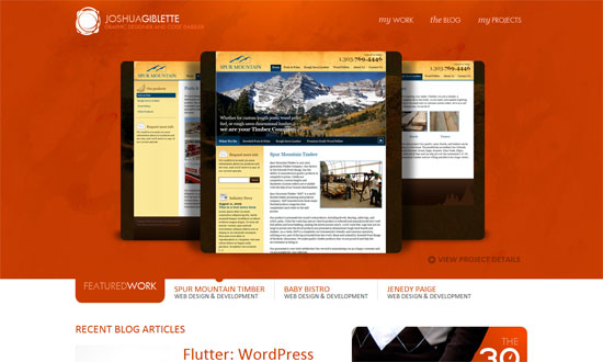
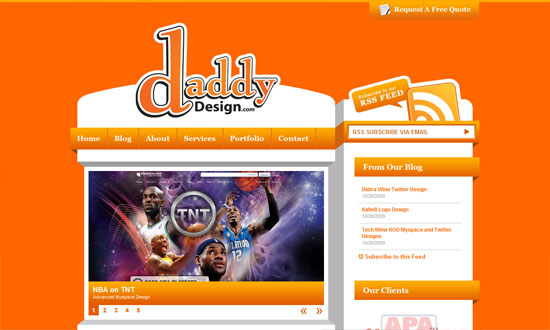
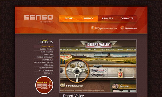
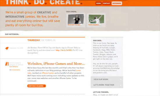
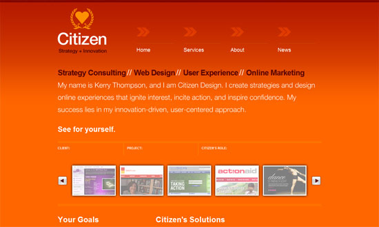
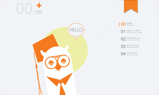
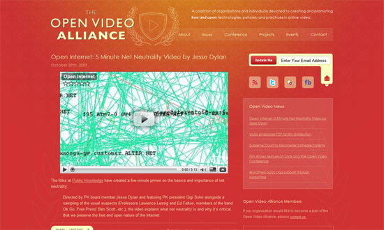
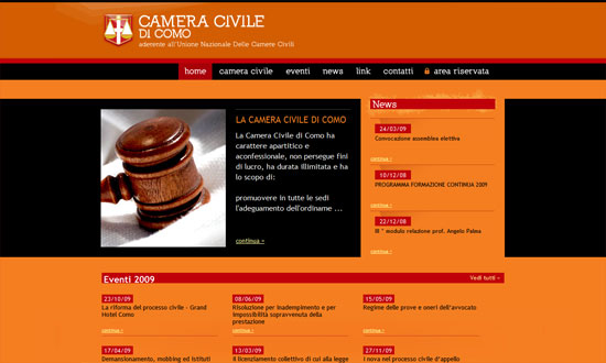
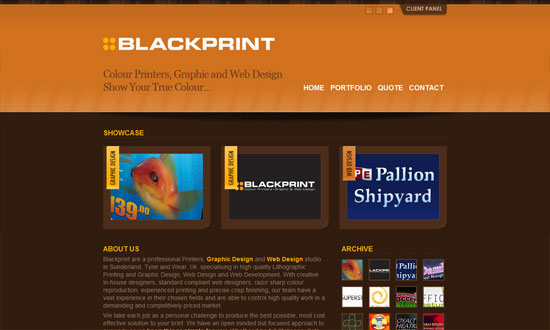
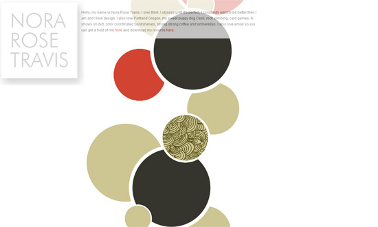
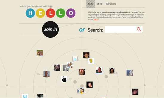
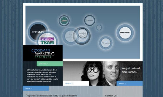
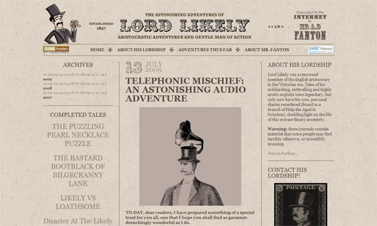
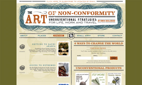
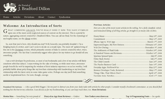
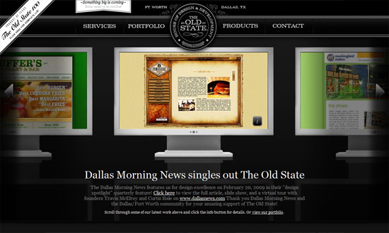
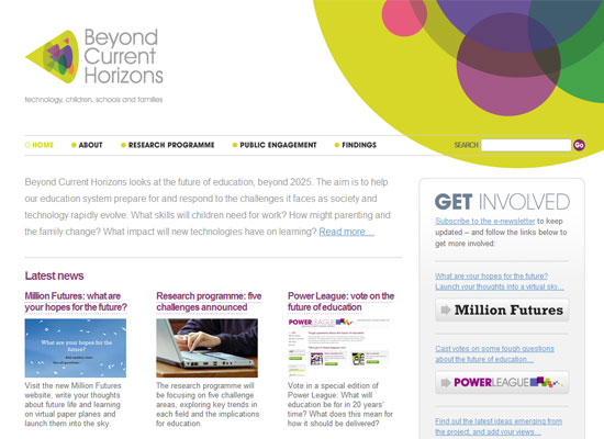
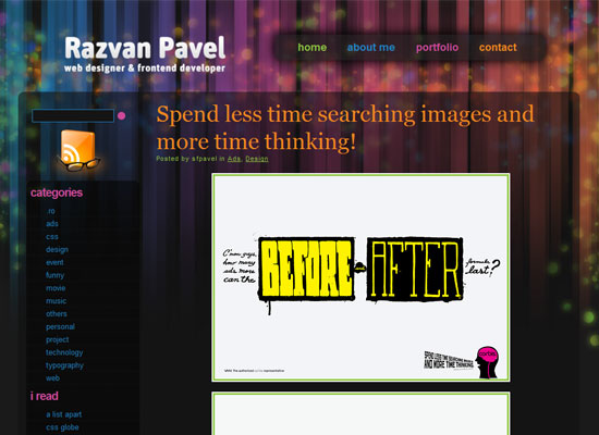
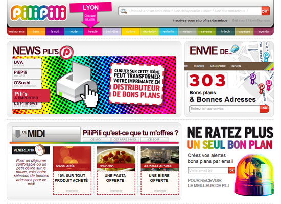
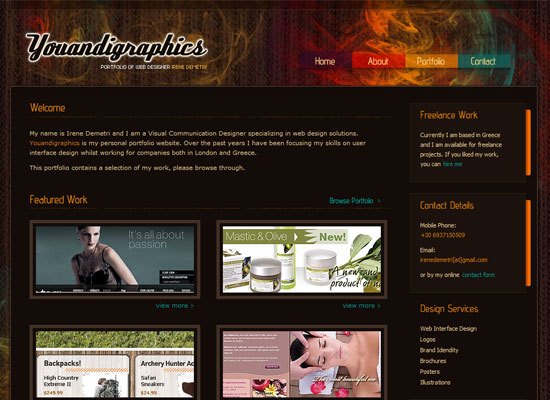
A certain shade of orange is huge these days, almost as huge as and goes hand in hand with the flat design trend. Less of the zesty citrus, more of the corals and roses in what appears to be an extension of the warm, handcrafted feel, while still being bright enough to catch your attention.
Designs of the Week
Want your site to be as good-looking and inspirational as these? Start by choosing a well-designed theme from ThemeForest.
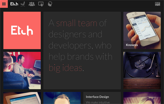
Responsive bento/masonry-style layout, beautiful photographs, and the thinnest Lato for headlines on a dark, moody canvas.
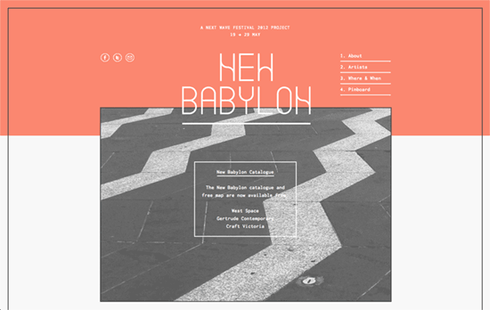
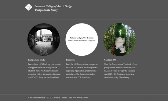
This border and layering look looks very familiar.
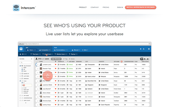
Wonderful to see how a product works straight up, just start clicking away on the guide circles.

Pairing this color with a bright blue appears to be a thing too. This site goes even further with a busy background pattern. We’ve seen the diagonal lines and folds before too.
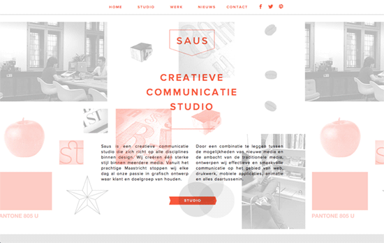
Some parallax with a twist – the top left and right photos are actually moving pictures. Portfolio items presented as real objects in the next screen.
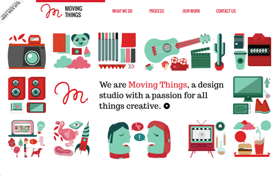
Animated logo in the midst of some pretty illustrations, breaking apart as you move down. Scroll down to see the rest of the animations.
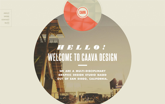
There’s a cool little effect with the diagonal arrow and some wavy patterns that move shoot down or up to highlight the section headings as you browse down. Pretty much all of the text, set in Futura, is in coral, if not tan, which gives a print publication feel.
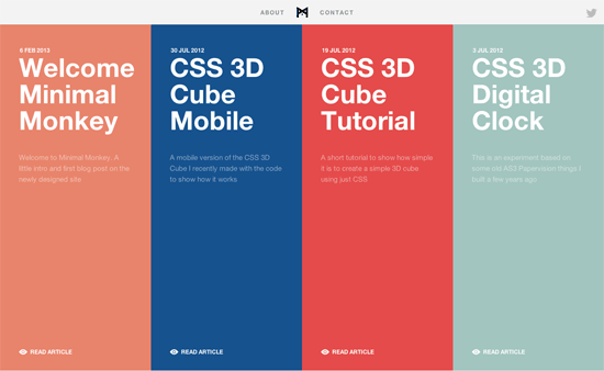
I’m liking the “brochures laid out side by side” look to this site, with some subtle transitions when you hover. Also, keyboard navigation is always a great feature.
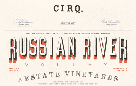
This one also looks completely like a vintage printed poster that somehow landed in your browser window, but when your mouse moves over that large title, the shadow shifts position. I only wish these were all true text with webfonts, and maybe someday, textures using web filters.
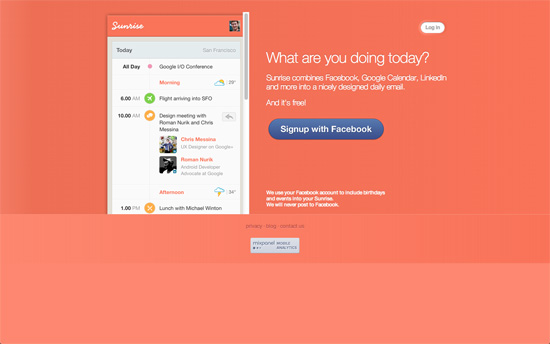
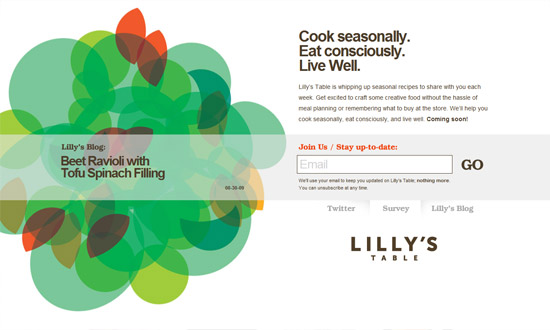
Interesting choice not to use a gradient but solid strips of color in the background.
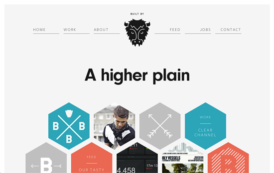
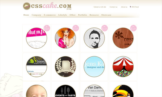
A happy mix of aqua, orange, and gray, not to mention shapes like hexagons and circles.
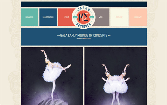
Posts are color coded by category, and the images are either full-width or half-width in a responsive layout. I find it very interesting how the work and the site palette seem to mix perfectly well with each other, but perhaps that’s because the designer made both.
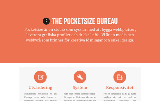
Super simple look with the content below the fold covering the top part. Clicking on an image expands a dark area with description of the work, a style Google Images employs these days.
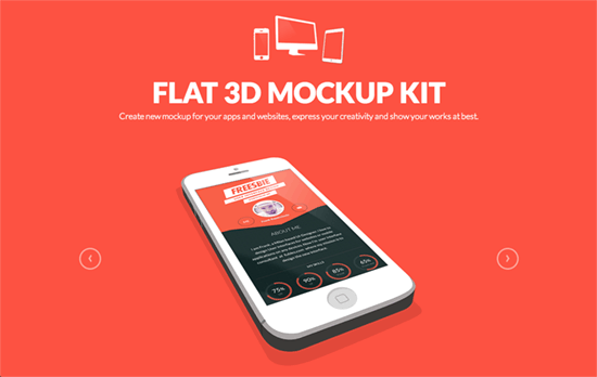
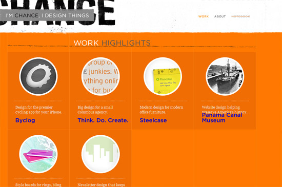
White and black illustrations on a orange background = compelling look.
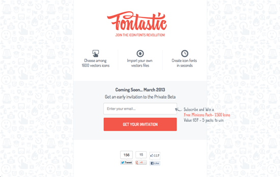
A little odd for an icon fonts site to be using images for the icons, but okay.
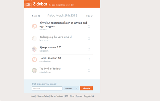
I like that this veers a little to the left instead of center.
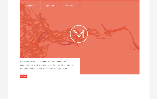
It’s cool combine your portfolio into a slideshow, header, and logo background at once.
Social Media Weekly
Get solid WordPress themes, plugins, and web design training from iThemes.
Web Design – Material Honesty on the Web
“So, contrary to what the detractors say—there is a place for decoration, and a place for material honesty. These two exist on a continuum, with decoration at one end and material honesty at the other. There’s no precise point at which a design becomes honest or dishonest. The web designer has the messy job of sorting it out.”
Design – Learning to See
“Learning to design is learning to see, an adventure that gets more and more captivating the further you go.”
Typography – Introducing Adobe Blank
“Invoking this font, as a temporary measure, prevents OS- or application-level font-fallback from kicking in before the intended font can be rendered.”
User Experience – Don’t Be Afraid To Teach Interactions.
“Don’t stifle innovation and interesting gestures. Explain them, and people will remember.”
Design – The Myth of Perfect
“While we take much pride in the craft of our professions, it causes a level of anxiety similar to what many of us feel on stage while hundreds of pairs of eyes are staring at us.”
