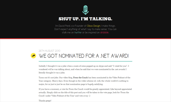
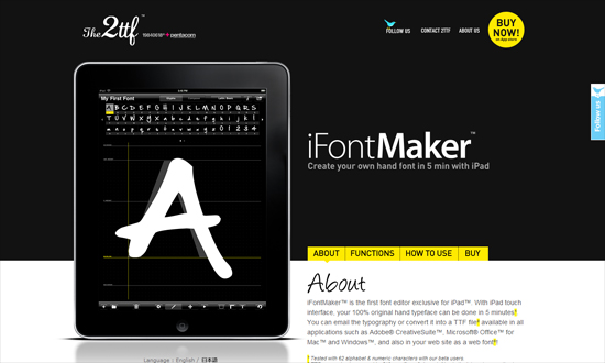
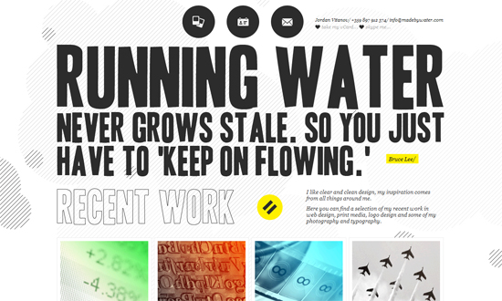
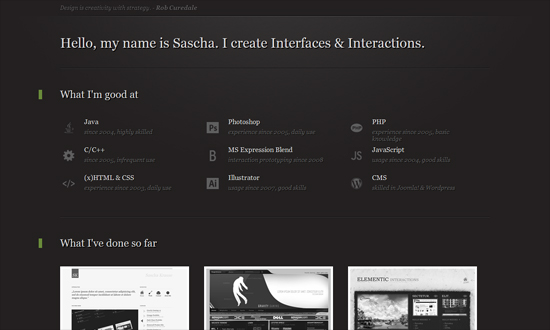
I’ve noticed a lot of designs with a mostly black and white color palette lately, and not just for site types you’d expect. Is the colorful, rainbow trend being phased out with something more classic? Are people tired of safe, middle-ground gray? Welcome to this week’s Friday Focus.
Designs of the Week
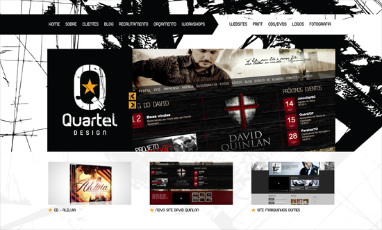
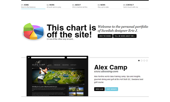
It’s interesting how even the background is a strong black and white graphic.
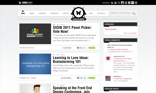
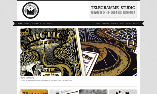
Lots of other trends here: folded ribbons, subtle noise texture, and centered logo. Note how the social buttons and feed subscriber count come before the navigation; guess that’s what’s more important on this site!
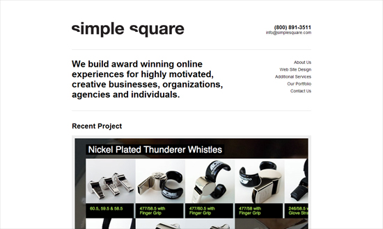
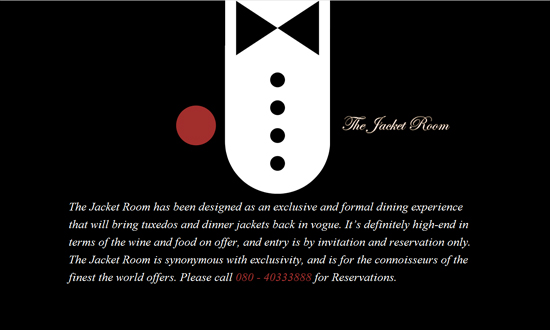
Just as simple and minimal as the color palette.
Love the hanger icon on the current navigation item, and the feather in the drop-down menu.
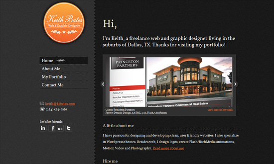
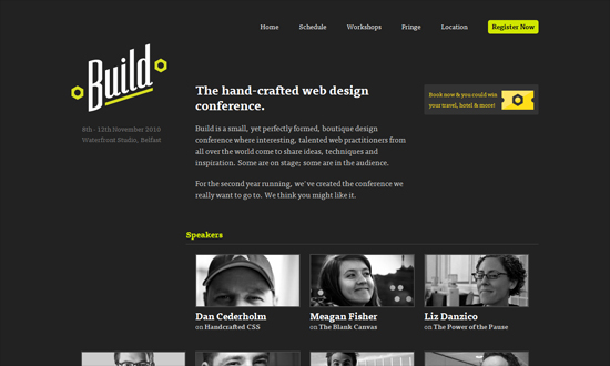
Yellow as accent for black and white designs start here. And are you for or against sidebars?
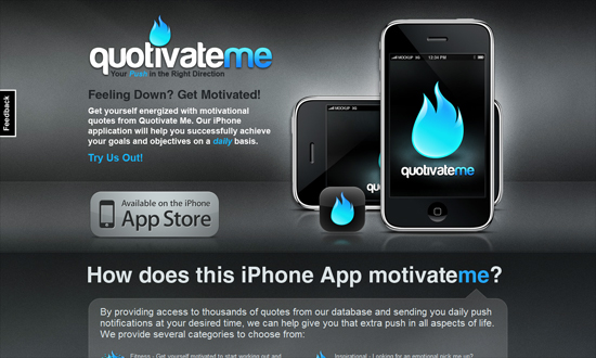
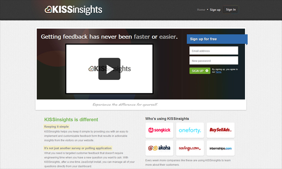
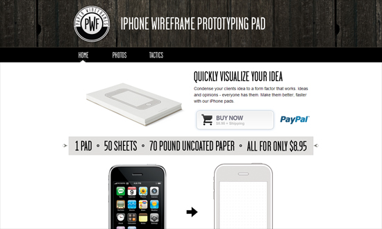
Screenshots and product shots are getting bigger and bigger. I vaguely remember them occupying one-third of the page but now it’s half.
I like how light and playful this looks, including the irregular pattern in the background, and the recurring circles.
Great breathing space between everything.
It’s so clever how when you hover over the a navigation item at the top, it also affects the navigation at the bottom (not pictured). Also note how the browser frame in the portfolio carousel is abstracted and black.
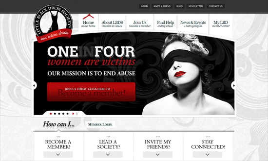
The amount of gradients here is a little strong but I think it works. Perhaps it’s just the text in the lower half that could be improved.
A little bit of alignment issue but as usual I love the whitespace.
Still not a big fan of the noise texture trend but it’s slowly warming up to me. Here it looks warm and fuzzy!
The post navigation here is a wonderful idea, but the arrows could be a little more obvious and closer to the center post.
What a nice idea to put the slideshow on the top right across vertical navigation, and place your name big front and center. Memorable branding.
I love how the nut on the logo repeats on the ticket icon.
The video area doesn’t really work for me but everything else looks nice.
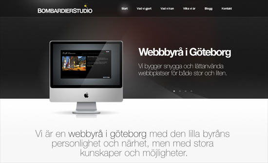
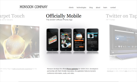
More and more I’m seeing a layout divided in halves instead of in thirds.
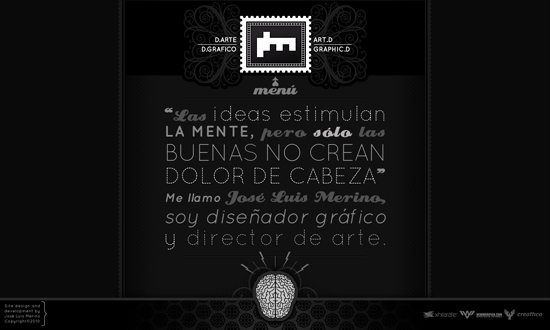
The design is compelling although as a website design, not so much. I would have loved to see more.
The mix of patterns and the interactions feels nice, but I don’t understand why you have to hover twice to navigation: first to make the designer name appear, then to make the menu appear.
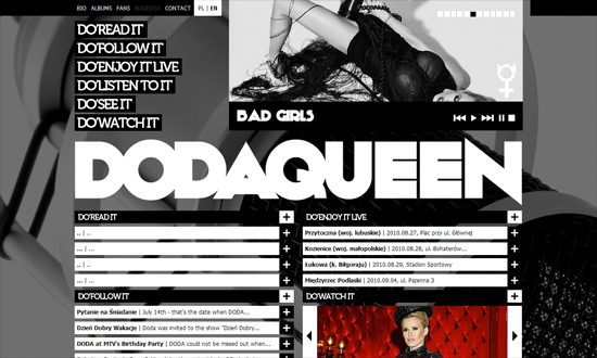
Big, bold, but still clean and easy to read.
Social Media Weekly
Accessibility How do we save longdesc?
“The longdesc attribute, although potentially useful, was removed from the HTML5 specification, despite recommendations to retain it from the HTML Accessibility Task Force.”
Usability – DarkPatterns.org
“This pattern library is dedicated to Dark Patterns: user interfaces that have been designed to trick users into doing things they wouldn’t otherwise have done.”
Usability You’re a failure: Deal with it
“Every website has points of failure. It is inevitable. The question is do you know what they are and are you doing something about them?”
CSS – CSS3 Playground by Mike Plate
WYSIWYG CSS3 code generator.
JavaScript – PaintbrushJS
“A lightweight browser-based image processing library”
