This week’s Friday Focus features designs that utilize the exploded view diagram technique. You could say this a more controlled approach to chaotic designs.
Designs of the Week

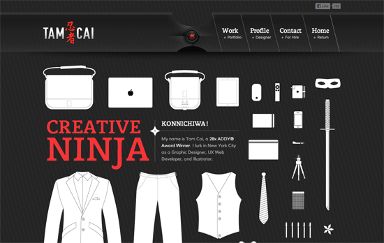
The first thing that strikes me here is that pinstripe look combined with the stylish header background: like a long swatch of fabric held together by a black button and red thread. This look repeats as you scroll below, and the background now looks like it’s the bottom of a tailored vest or jacket. While the white illustrations of the designer’s clothes and things aren’t as detailed and use only thin outlines, it actually provides a nice contrast to the more realistic and relatively heavier interface. Even the contrast between the “suit” and the “ninja” personas adds another layer of interest to the concept.
Another feature you have to check out on this one-page portfolio is the profile section, which uses concentric open rings to represent the designer’s skill levels. This just fits, if not enhances, the Japanese graphic details on the site. Using ninja stars as bullet points is another.
One last note about the Facebook like button: this designer’s technique was to lower the opacity so it wouldn’t stick out so much. I’d say it looks a little better this way, but I’m still hoping for a more flexible solution from the social network site itself.

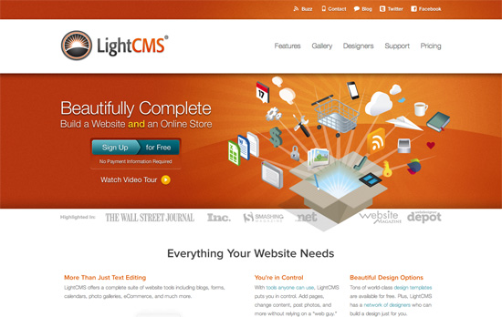
The “sign up for free” button has quite a different design for sure, although I don’t know if it adds any meaning with the split colors and the arrow pointing to the right, because on some level it looks more similar to the slider buttons popular on mobile interfaces nowadays, implying a choice between the two. The rest of the site displays impeccable typography and care with the product feature illustrations.

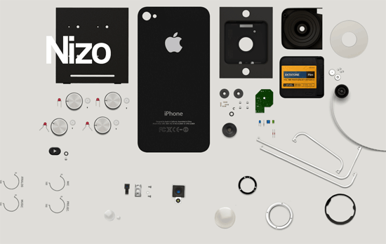
I guess sites that haven’t launched their products carry more pressure in keeping people interested with few details to give away, and this design solves the problem brilliantly with an out-of-the-box approach. What I assume to be user interface components of this mobile app fly into the screen and sit next to one another as you scroll downward. The reverse happens as you scroll back up. Then as a final touch, the email notification form pops up from below once the scroll completes. Next to it are completely unassuming Facebook and Twitter sharing buttons, which turn from squares into circles upon hover. It’s flashy without being flashy.
Social Media Weekly
JavaScript – Paper.js
“Paper.js is an open source vector graphics scripting framework that runs on top of the HTML5 Canvas.”
Mobile – Mobilizer
“Preview mobile websites, design mockups, and local HTML on Mac or PC.”
HTML – Simple Semantics With Microformats, Part 1
“What microformats are, their benefits and how to implement both rel-tag and XFN.”
Business – A website can’t be measured in pages
“Selling page-based website packages isn’t just an inaccurate way to gauge project scope, it is a questionable way to turn a profit.”
Tools – One Page Apps I Actually Use
“Of the probably-hundreds of these one-page apps that I’ve seen over the years, there are only a handful that find myself using on a regular basis. I thought I’d share those”
