If last week was all about the forest, this week we’re zooming in on the different textures they inspire.
Designs of the Week
Want your site to be as good-looking and inspirational as these? Start by choosing a well-designed theme from ThemeForest.

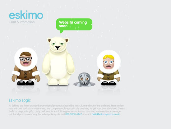
Love the mix of patterns and design elements here, along with the cartoonish exaggerations of the doors and frames.
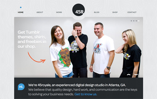
The woodgrain is relatively large here but it’s also subtle. On the Work page it goes dark with a nice glow behind each slider item. Every page, including the modal contact form, has a semi-circle cut-out from its top to express its proximity to the centered circular logo.
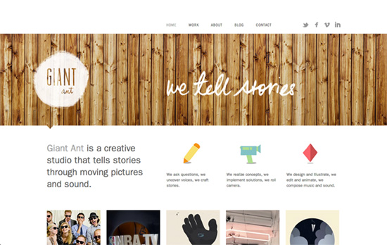
Another site with a dark circular logo. I have to say that I love everything going on in the About page: a “live” group photo for the header which runs on loop, and the chalk drawing backgrounds for their portraits, complete with a different pose on hover. The same looping video header concept appears on the rest of the sections.

Nice circular illustrations to represent competencies, and I like the texture interplay between the aerial maps and the wood pattern. Also, clever choice to put contact details at the top and bottom of the page, which covers and uncovers it.
Social Media Weekly
Get solid WordPress themes, plugins, and even design training from iThemes.
Programming – Interpreted Languages: PHP, Perl, Python, Ruby (a side-by-side reference sheet)
Debugging – Wait, DevTools could do THAT?
