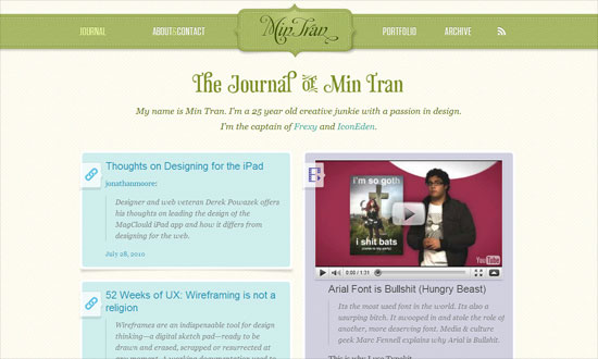
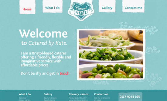
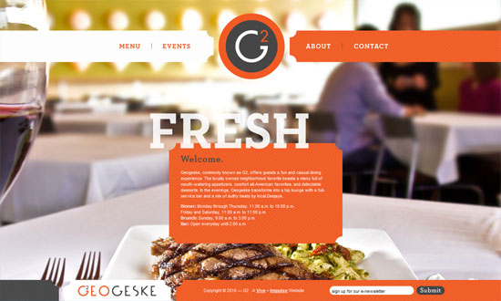
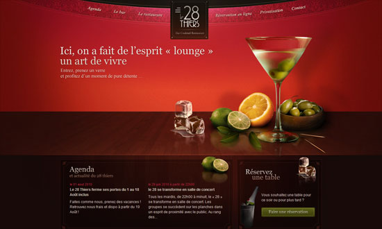
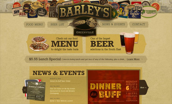
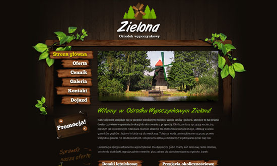
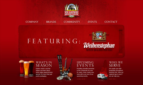
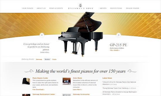
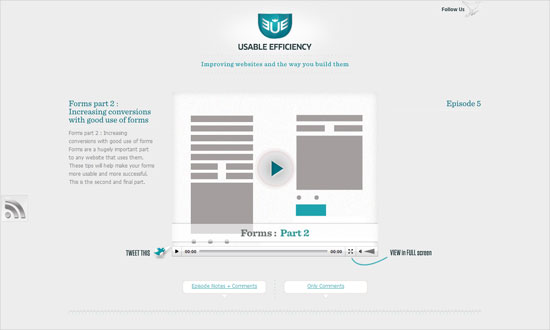
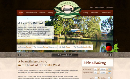
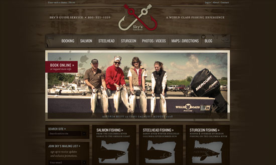
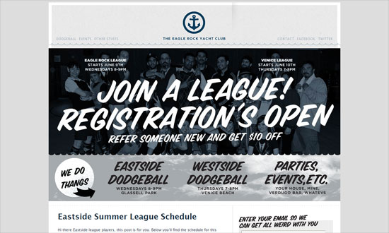
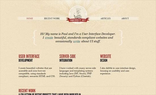
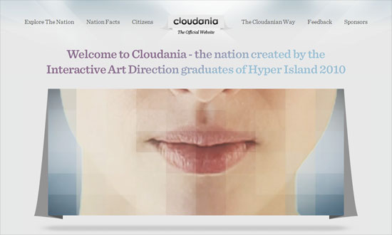
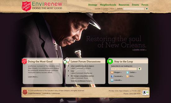
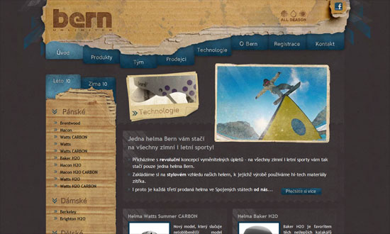
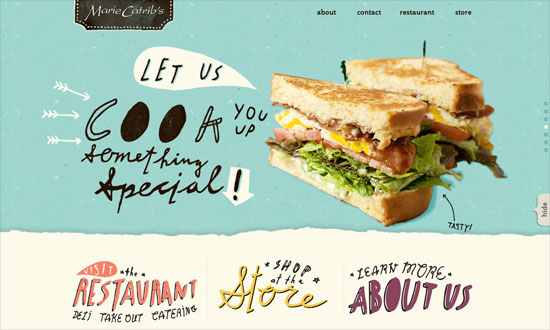
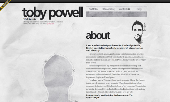
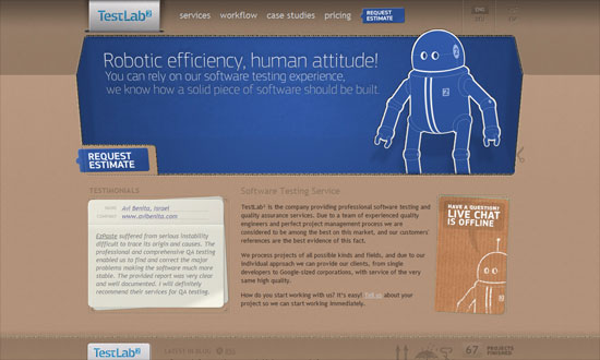
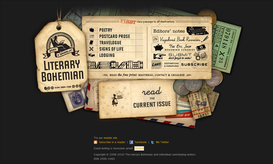
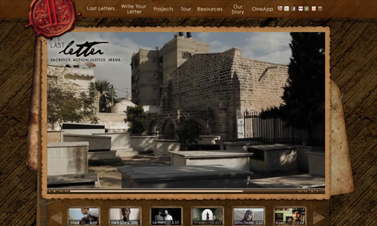
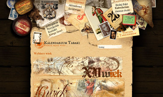
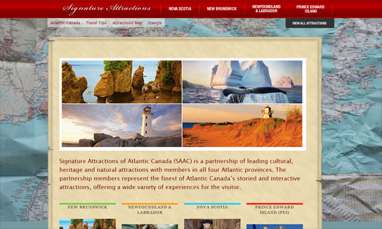
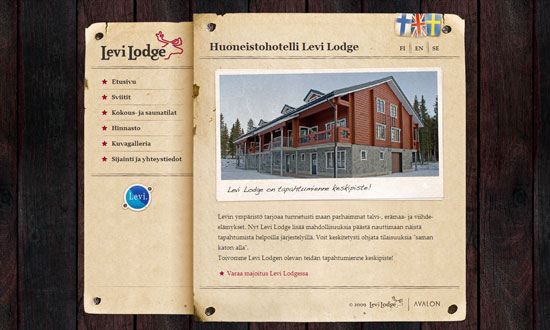
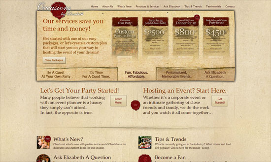
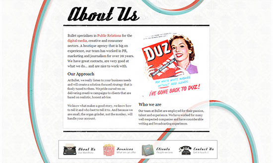
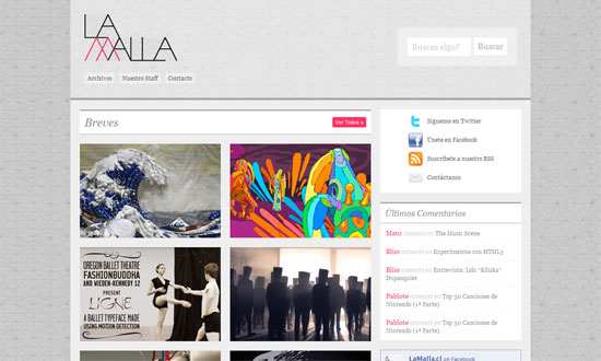
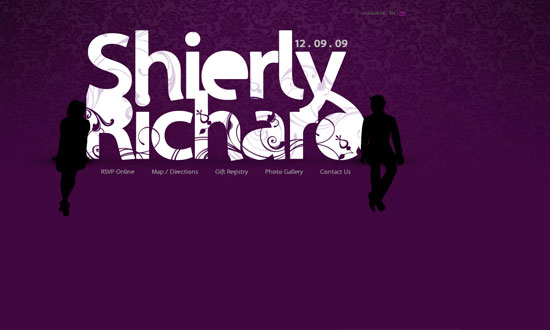
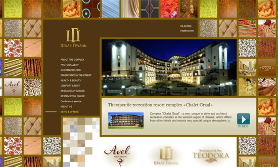
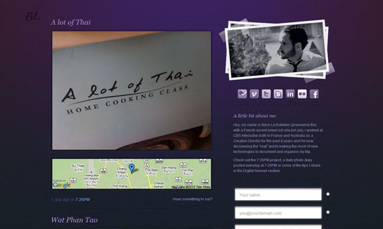
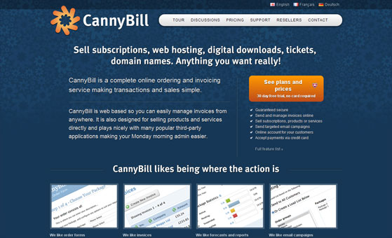
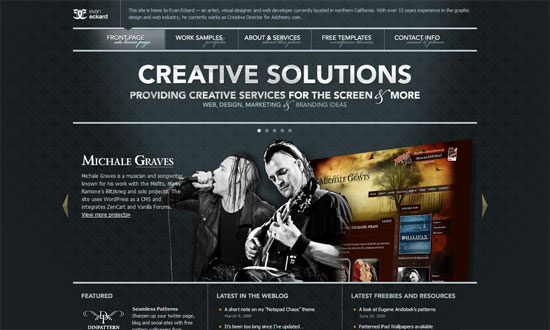
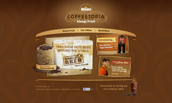
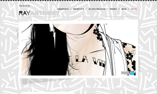
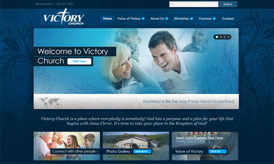
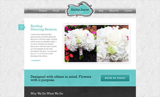
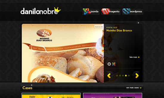
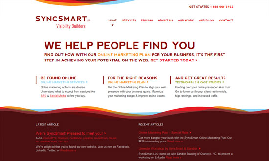
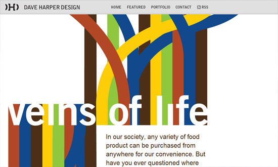
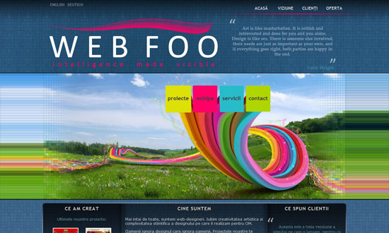
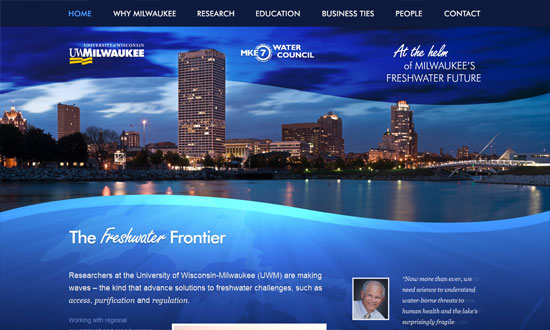
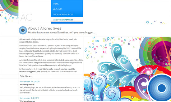
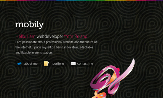
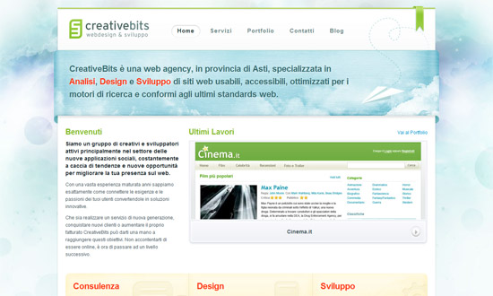
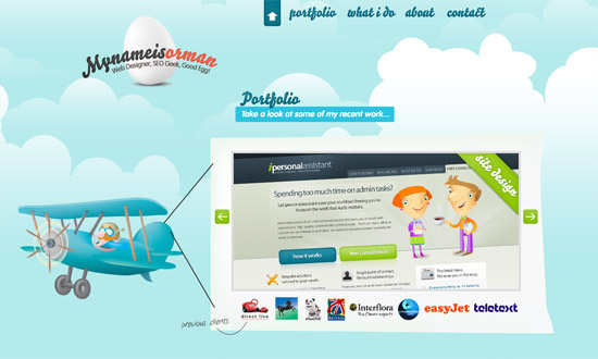
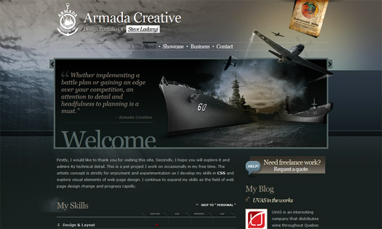
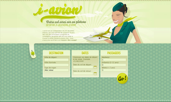
Sites usually place logos at the top left corner of the page, but nudge them to the center and it makes quite an impact, as a red wax seal does on a white letter envelope. Let’s check out sites with centered logos on this week’s Friday Focus.
Designs of the Week
Love all the patterns and pastels.
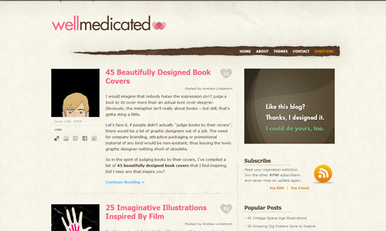
Nice torn effect on the navigation and echoed throughout the rest of the site. I also like the subtle adjectives in the background.
There’s some weird layering going on when you scroll up and down, but I like the impact of this look.
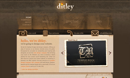
The text length in the inner pages is too wide, and the script feels a bit much. Still, I like the textures and the old style illustrations.
I like the curved header navigation coupled with an ornate background pattern. The boxes of text are nicely framed, and the buttons are equally elegant.
Interesting idea to put all the beer labels as a collage for the header. There’s also a bit of a split design going on, and the use of curly braces as arrows.
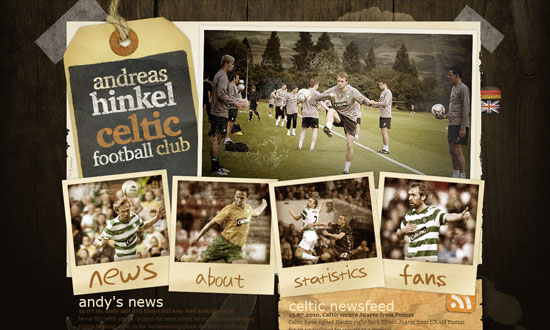
Not-too-distracting animations above the logo in the footer, and not-too-overwhelming use of wood including menu items and buttons.
I find the “featuring” slideshow highly effective. The use of red, on the other hand, may need more tints and shades. What I really like is the glowing hover effect especially in the three boxes below the slideshow—simple idea but it works.
Two things that grab me: seamlessly elegant carousel of featured pianos, and the use of piano strings in the background as a stylized sunburst effect.
I wish for a little more polish on the RSS and collapse/expand buttons, but I like the openness of this layout.
It’s great that the wood texture isn’t your typical bright brown but one that actually fits the theme of the site. The form elements in the booking box is excellent.
I really love the stylized buttons in the header navigation, and I wish it were applied to every other button on the site. Old style illustrations also used here, but what’s great with this site is that it explains (in a collapsible area) what the they symbolize.
I think the wood could be a little lighter to distinguish the red on the logo, but overall this site has an excellent design from typography to illustrations to form elements.
Using a wave pattern as divider is both whimsical and smart. I love the splashy sea photograph background in the footer navigation.
Subtly textured, clean, yet feels perky.
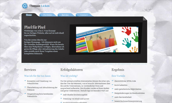
Nice gradient on the main blurb, which breaks the blockiness of the text and gives an ethereal effect. The floating folded paper background on the video, which is an echo from the logo, is a nice touch too.
Social Media Weekly
Accessibility – Ten Common Accessibility Problems
“This document outlines ten common accessibility issues I have encountered which could result in a site’s failure to fully comply with WCAG 2.0. The document includes links to some of the WCAG 2 advisory Sufficient Techniques provided by the W3C for addressing each issue.”
Design – Create Stunning 3D Text Free With SketchUp
“Today I’ll teach you how to create some awesome 3D text using only Photoshop and a free app from Google.”
Design – Tips for Designing for Colorblind Users
“We’ll take a look at what colorblindness really means and how you can tweak your designs based on a few simple principles.”
CSS – Start Experimenting With CSS3 Keyframe Animations
“For this reason they’re used sparingly, in a lot of cases for experimental purposes or as ‘hidden gems’, but that doesn’t mean you should shy away from getting stuck in.”
Programming –
