It’s flexible layouts on this week’s Friday Focus. I’ll be loose with the definition though, since 100% fluid width layouts are so hard to come by!
Designs of the Week
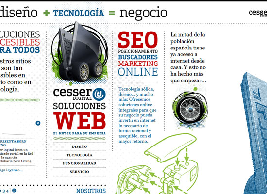
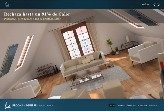
This is just a well-put together site. From the type to the colors to the images to the layout, everything feels like it’s in the right place. If it were a book or magazine, you’d be curled up with this for hours—even if you don’t understand Spanish!
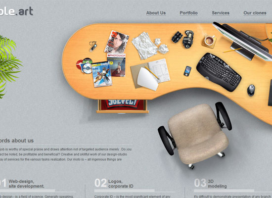
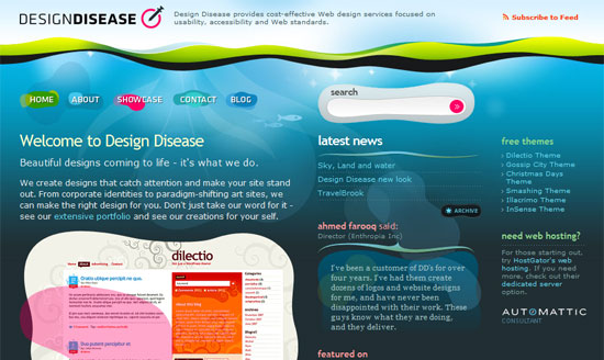
If you hover on their logo at the top left, several objects morph and the table becomes a slacker’s desk. It’s little details like these that help make your site and consequently your company more memorable to the audience. I want more!
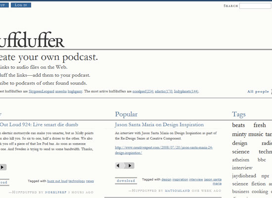
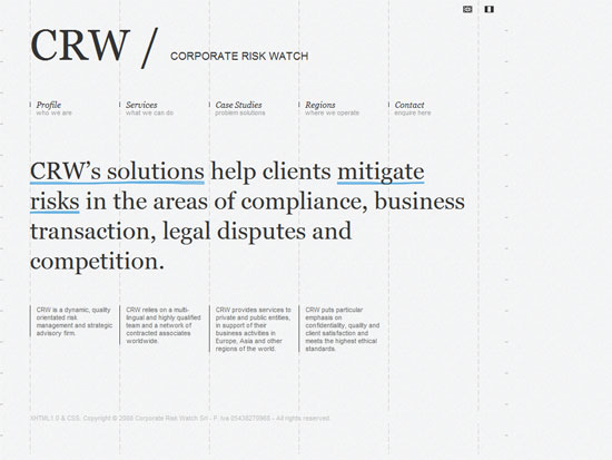
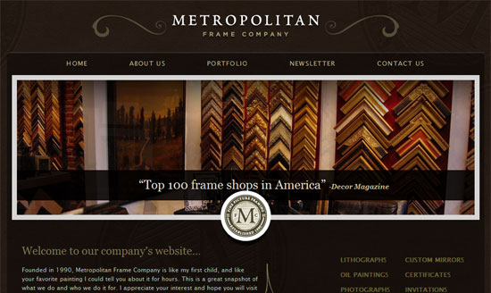
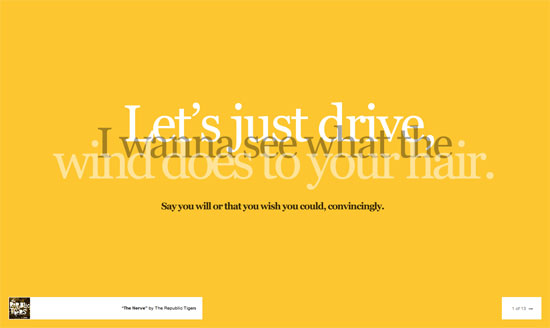
I always love a clean, type-focused design, and here’s one of them. Again, this site reads like a good book—easy on the eyes and laid out nicely. I like the black hands as arrows and of course, the sign up form, which will definitely go down in history as one of the most finely crafted ever.
Social Media Weekly
Design – Paper + Color + Concept = 40+ Creative & Inspirational Piece of Art
Beautiful graphic design and use of paper.
Programming – Fluid Grids
Learn how to create fluid layouts with grids in mind.
