Everything old is new again this week on Friday Focus. This week: some 8-bit retro inspired websites!
Designs of the Week
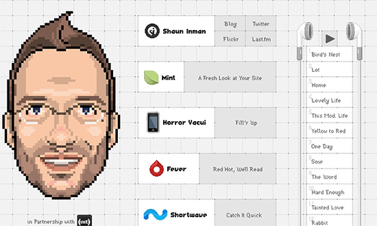
Very cool take on the one-page personal site, where everything’s 100% pixelated, even the once-detailed app icons.
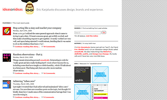
This is a nice break from all the overdone grunge, ornate, and gradient-ridden websites—just a moderate amount of sharp-edged elements. I love that the blog has low-resolution, pixelated icons to represent each post.
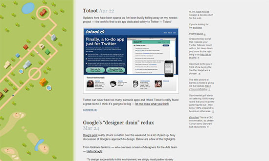
This is a softer take on the whole isometric perspective, hues and all. And it’s great that instead of a large landscape header, it’s a vertical background on the left.
Social Media Weekly
Design – The Medium is the Mess
“Yes, we can learn from the many years of work that went into divining rules of thumb for other mediums but we should also remember that the web is not just a new and different medium; it’s an ever-changing, ever-evolving medium.”
Programming – Fix It Fast: Rapid IE6 CSS Debugging
“So, is there a way to shortcut through some of the hair-pulling and learn good debugging right from the start? MAYBE. The following is my cycle of preventing, catching, and fixing bugs in IE6. If I could, I would email it to myself in 2004, but until I figure out how to do that, posting it here will have to do:”


