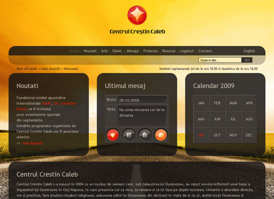
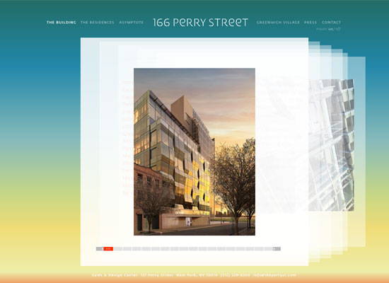
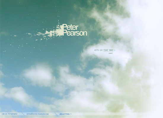
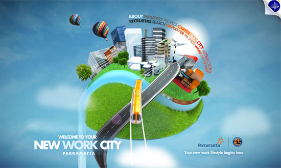
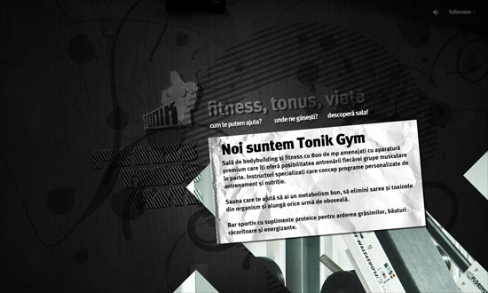
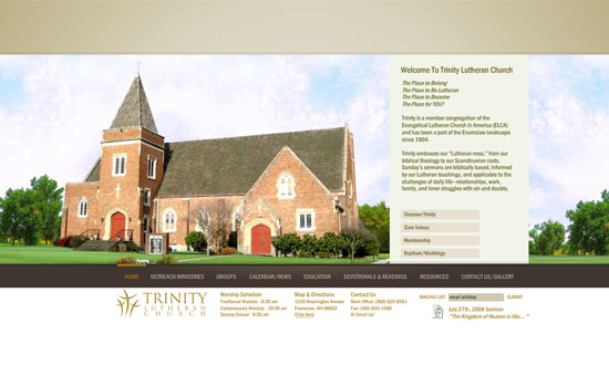
This week’s crop features designs that literally break out of the box. Time for this week’s Friday Focus!
Designs of the Week
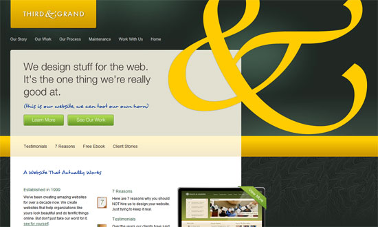
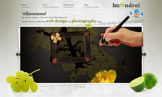
When you’ve got an ampersand as lovely as this one, why not flaunt it, right? I like the touches of handwritten type and what looks like a topographic map pattern in the background.
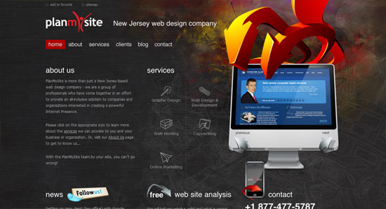
The (crazy?) 3D arrows are a good way to call attention to important parts of the page, and thankfully were used sparingly. I dig the ragged-edge flyout menus for the navigation—what a nice change from the usual same-width ones. Though I think the icons under the services section is drowned out by the stuff around it.
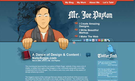
It’s a little cramped in some areas but has lots of whitespace in others. The illustrations are fantastic, especially the one in the footer!
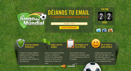
Beautiful, and everything fits in nicely.
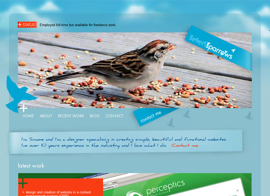
I’m enjoying the collage look here—it looks different and not so “craft project”-looking, maybe because of the photographs. The effect in the navigation menu is great too.
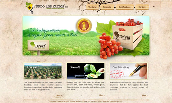
I seem to be on a roll with excellent navigation menu designs; go check this one out too. The detail on the photo frames are fantastic, with avocados and grapes on the corners.
Social Media Weekly
Programming – A pixel is not a pixel is not a pixel
“These pixels have nothing to do with the actual pixel density of the device, or even with the rumoured upcoming intermediate layer. They’re essentially an abstract construct created specifically for us web developers.”
Programming – Everything you Know about Clearfix is Wrong
“It really depends on the layout and the styling of elements. You might go from “uh oh!” to “WTF sacrebleu!”?.”
Design – Smaller PNGs
“I’m not in the practice of using Fireworks, so those of you who do can start gloating now. But as I thought about the problem a bit, I remembered that Fireworks has a few more options. Specifically, I remembered that you can save out 8-bit PNGs with alpha transparency, which seemed like the right mix.”
