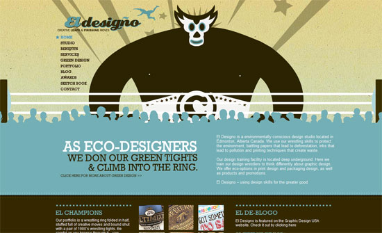
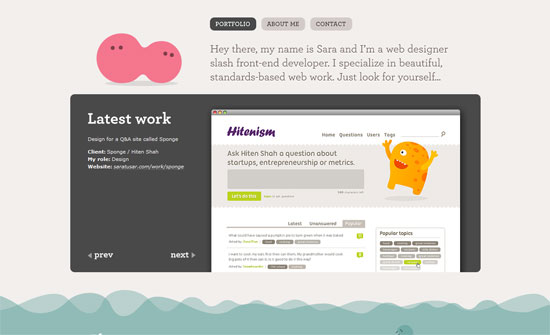
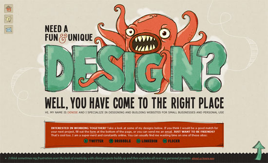
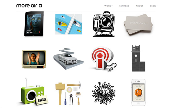
We often see portfolio and product shots that are boxed in to preserve a sense of uniformity and rhythm in the layout, but these days we’re also seeing objects presented as you see them in real life.
Designs of the Week
Need help in promoting your site? INeedHits has been in the search engine marketing since 1996!
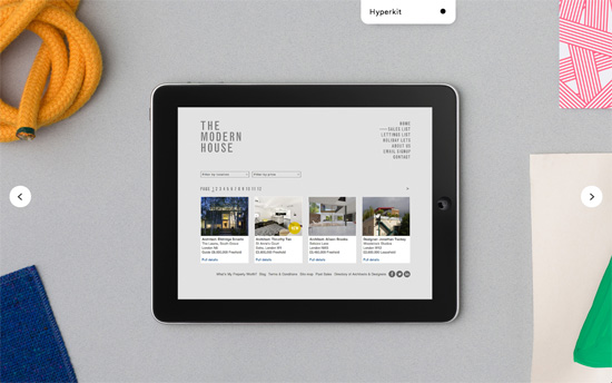
On the homepage there’s nary a title of description in the full-width, full-height slider, letting the projects speak for themselves. The inner pages are on the other hand image-less and color-coded—a single bright color for all the text and background—and framed.
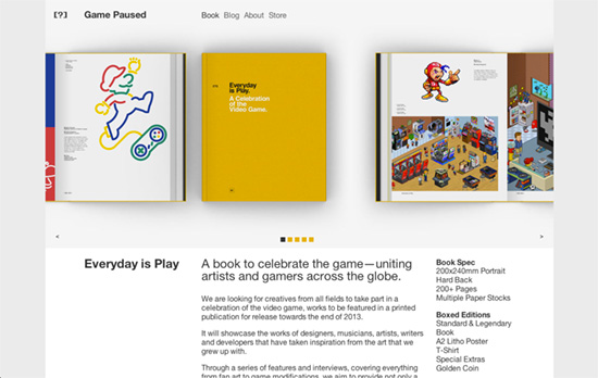
These look like prototype staged shots as the final product is not built yet, but things are kept interesting with the different angles and combinations. You’ll see the yellow/black hues run throughout the site along with the Swiss style grid.
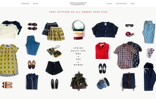
I like how the clothes and accessories differ enough in size that it looks like a very neat person just unpacked, and it’s still not chaotic. Scrolling further down you’ll see close-ups that are still neatly arranged. At the top there are mega dropdowns with a translucent background, which lead you to product category pages with large wordless photos whose info appear only on hover. You’ll get the same feel of minimalism and stylishness in the product page itself, where the photos are not boxed in but blend seamlessly into the whole width of the page. Lastly: instead of the term “cart” they use “bag”.
Again, familiar techniques at play: text moved out of the way until you want to know about it, large gorgeous photos, and a two-column layout—in this case to put both English and Japanese text side by side.
Social Media Weekly
Search Optimized, Turn-Key Designs, Unlimited Everything. Start building with the Genesis Framework today.
Business – Deleted my portfolio, made $30k in my first six months
“I came to the conclusion that I would try to make freelancing my full-time business.”
CSS – Apple Is Using Sass, And They’re Doing It Wrong
“Please, if you are going to use a preprocessor, use it responsibly. Thank you.”
Typography – Upping Your Type Game
“I want to introduce you to your brother from another mother—another group of humans that, like you, is quite under-appreciated: the type designer. Type designers and web designers have an amazing amount in common, that’s why it’s super wonderful that they’ve been collaborating more lately.”
