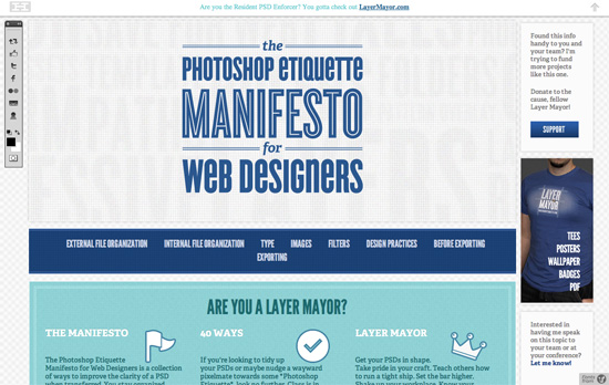
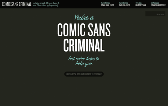
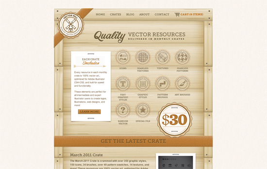
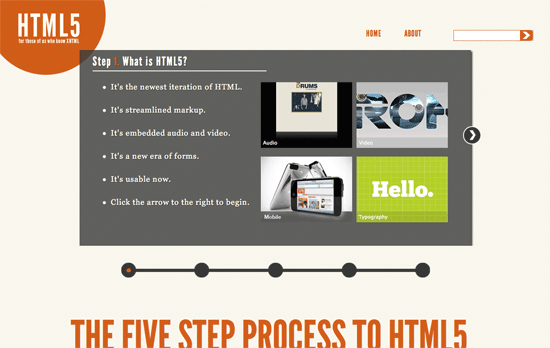
The featured designs in this week’s Friday Focus have something subtle in common: thin, repeating patterns you often see in important documents such as bills, checks, and passports, known as guilloché, and similar to the patterns generated by spirographs.
Designs of the Week

The featured pattern above repeats like a curtain in other areas, and there’s also a thinner border with matching qualities. I like that there are tiny flag icons beside the section headings, which come from the logo itself. I also like how the dark blue background from the top area stays fixed as the linen background scrolls underneath.

There’s a bit of vintage typography again although it seems isolated to the logo and would’ve been nice if we saw it elsewhere on the page. I do like that the text blocks are literally bounded by borders and fit in like LEGO pieces. I also like that the background is translucent, hinting more at the background and what their event feels like.

There’s that layered screens slash Time Machine effect at work, but with more skewing for additional perspective. The top menu uses glowing lights for its hover effects. There’s a bit of a “wall of text” going on in the FAQs and Testimonials section; I wish there were more contrast to the area. Browse the inner pages to discover different textures, patterns, and design elements that spice up but still unify the look that says spells finance.
Social Media Weekly
User Experience – 6 Epic Forces Battling Your Mega Menus
“On the surface, mega menus seem like they are the perfect solution. Yet something’s not quite right with these interaction design jewels.”
Programming – Programming Achievements: How to Level Up as a Developer
“How do I go from being a good developer to a being really good developer?”
Mobile Web Design – A Mobile Web Divided
“The tools we use should not create a web divided between mobile and desktop.”
Typography – HTML Tricks: Cross Hatched Shadows
“I’ve nicknamed it “Afterburning”, and the idea is simple: Copy the text behind the element, offset it slightly, and apply a background image over for masking.”
