Since it’s Easter next Sunday and I haven’t really seen egg-inspired designs yet, circles will have to do for now! More on this growing trend in this week’s Friday Focus.
Designs of the Week
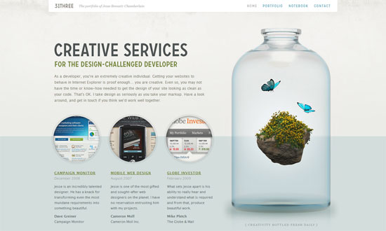
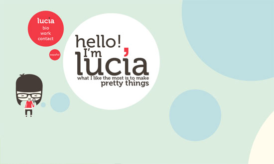
I first noticed the circles “trend” on this site, but it’s really the subtle beauty that draws you in.
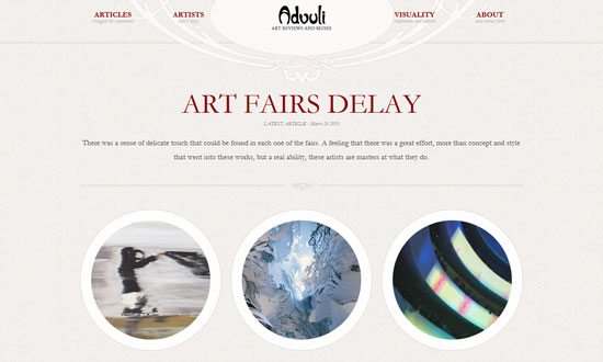
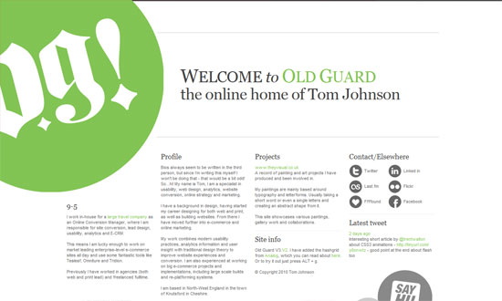
Excellent typography and ornate details, and the use of circles for buttons reinforces is neat. I also like how strongly balanced the layout is and a lot of it is center-aligned, but not at the expense of legibility.
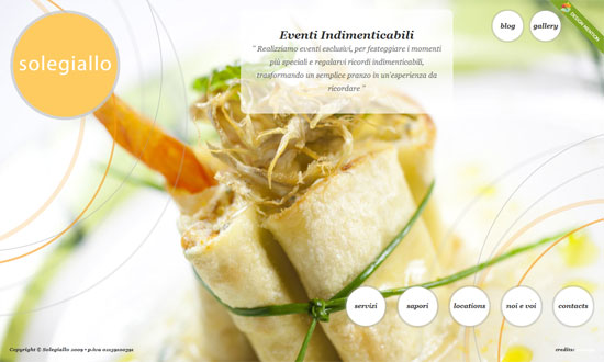
The use of circles here isn’t so groundbreaking but the thin, translucent lines blending in with the photographs are the signature look for this design.
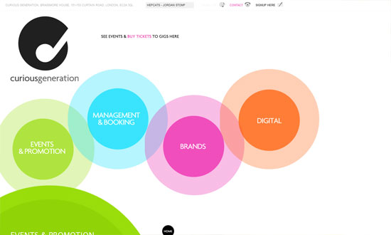
Now this uses circles in every possible way—like bubbles floating to the top. Even the lightbox popup for the newsletter was modified into a circle.
Now this one “bubbles” horizontally, and uses other forms to create seemingly animated transitions from one section to the next.
Very simple, but I like the idea of using circles with a grid.
I have some alignment issues with the bottom area but the way you play videos on this site is clever (click on a face, video shows up on the top right circle).
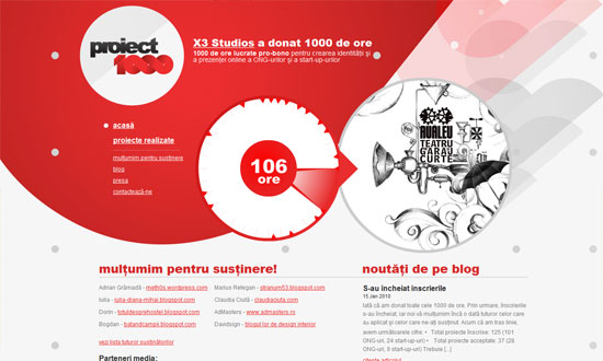
Also clever: spin your mouse around the middle wheel to view different project thumbnails. Using circles as arrows on the left menu is also a nice trick. Finally, I like to overall vibe here: abstract shapes based on but not limited to circles.
Social Media Weekly
HTML – HTML5 Forms Are Coming
“HTML forms have been, to date, quite simplistic. We’ve had limited options: the text field, the checkbox, the radio button, the textarea and finally the select drop down. Any complex data like phone numbers, email addresses or dates had to be checked by JavaScript.”
CSS – CSS Specificity Part 1: Weight, Specificity and Overruling properties
“This article will do its best to map out the problem and will hint at several fixes and workarounds. None of them fool-proof or particularly implementor-friendly. A follow-up article will then take a closer look at the core issue we’re dealing with, diving into the depths of the human mind to uncover the true problem at hand. Sounds exciting, no?”
CSS – CSS Specificity Part 2: Lacking Proximity
“In last week’s article on fuzzy css specificity I presented a case that illustrated the difference between regular specificity and css specificity. While it’s interesting to review these cases, it’s even better to get to the very core of them. This article will do just that.”
UI – An Accessible Pagination Pattern
“Pagination is a basic building block of the web, appearing practically everywhere content is displayed. From a UI perspective, a pagination widget generally ends up being presented in a very straightforward manner as a horizontal list of links, framed by “previous” and “next” links to give the user clear calls to action.”
