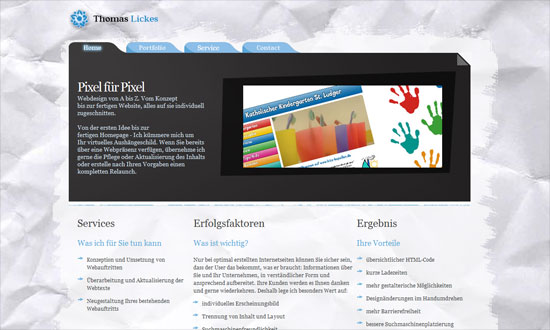
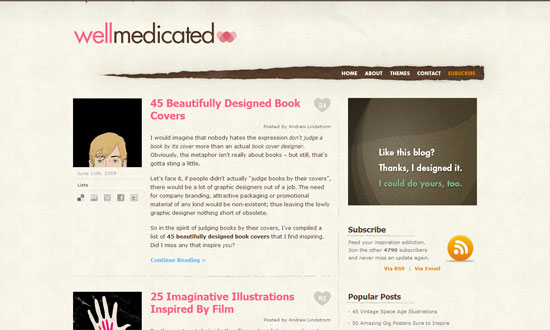
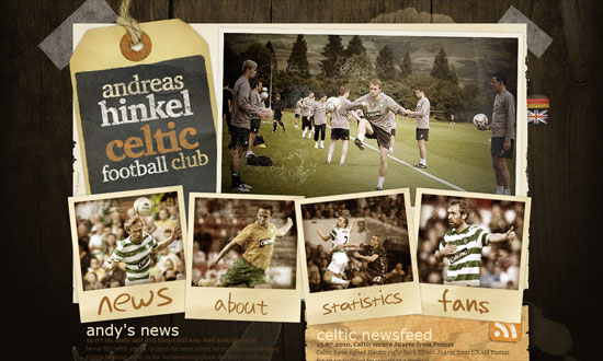
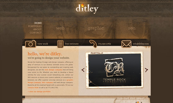
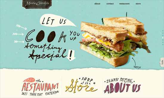
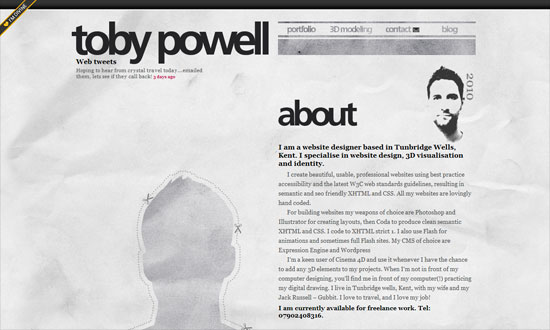
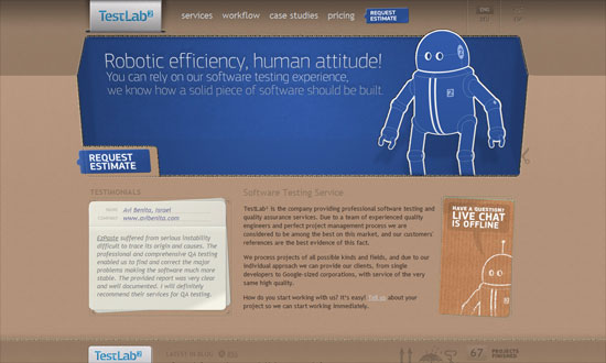
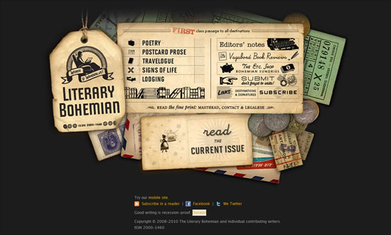
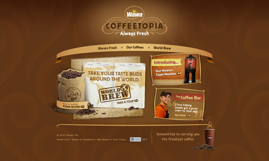
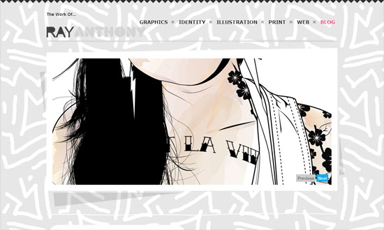
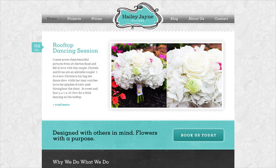
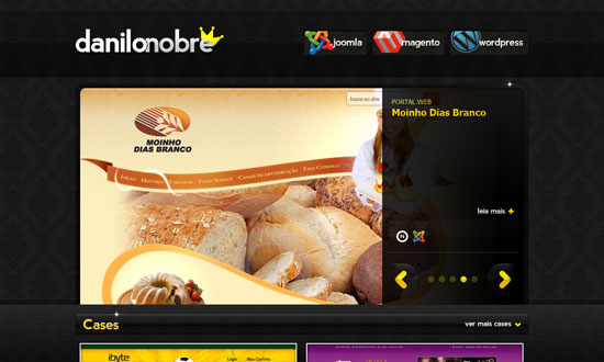
Can you believe the number of sites dedicated to curating free stuff from Dribbble? Let’s see if they’re as well designed as the goodies up for grabs.
Designs of the Week
Get solid WordPress themes, plugins, and even design training from iThemes.
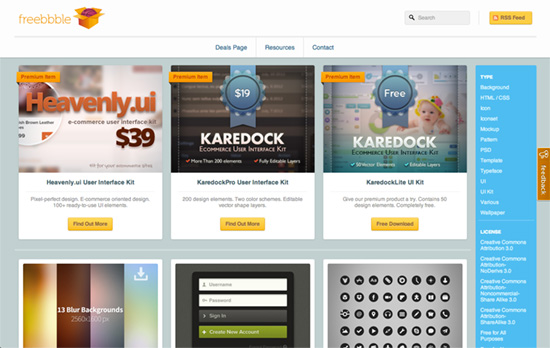
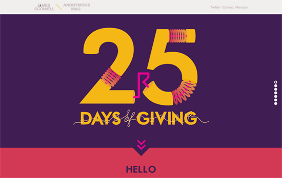
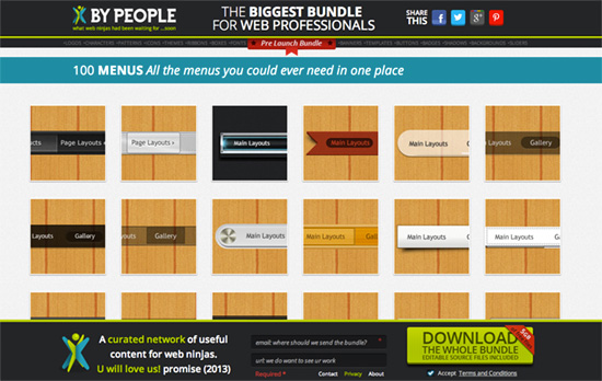
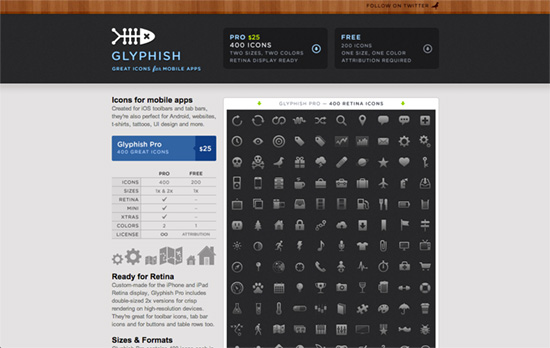
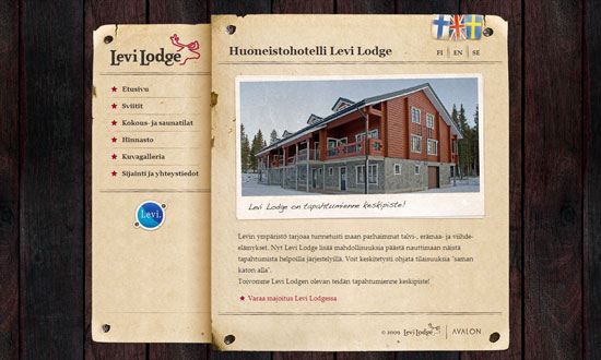
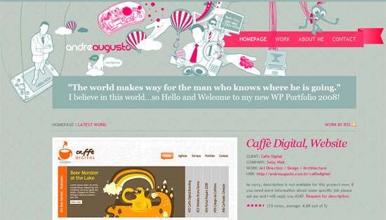
Fixed header with a slight dip in opacity. Brownie points for being responsive. The filters on the right don’t stay fixed, however. I like the buttons and the card layout, although on the inner pages I’m wanting a bit more on the visual hierarchy. Adding related shots after the post is very helpful but the volume kind of takes away the focus from it.
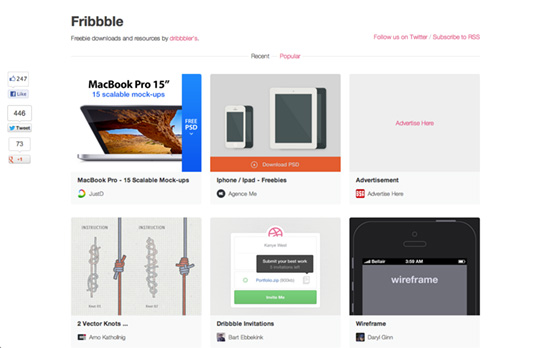
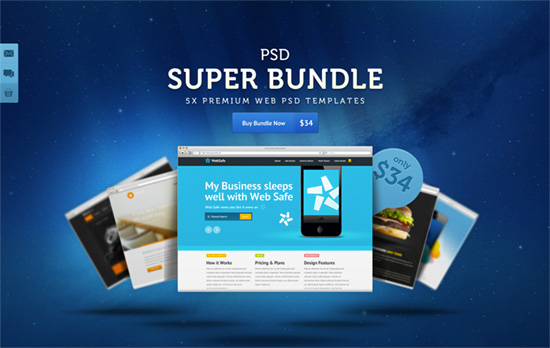
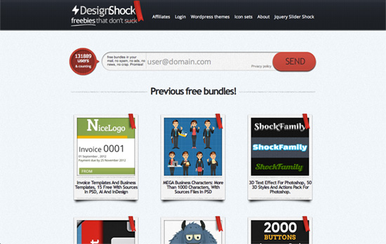
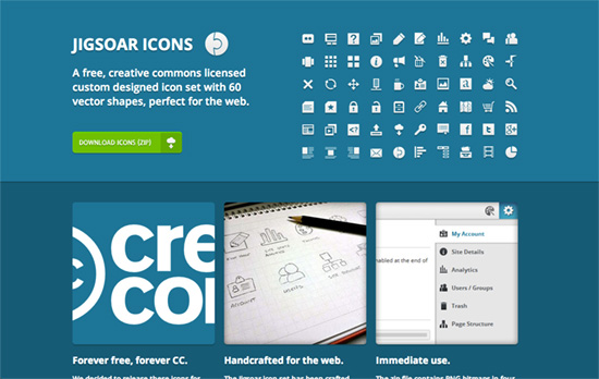
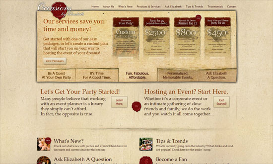
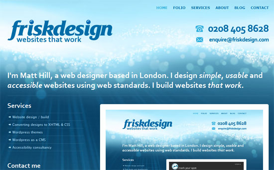
Not responsive, but I appreciate that the authors are listed with their avatars, and more importantly: even if if the shot titles are truncated with ellipses, they’re displayed in full in the tooltips (lots of people neglect this usability issue). This site’s look and functionality is more minimal than the first.
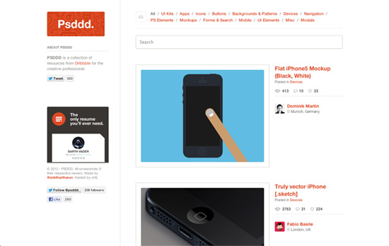
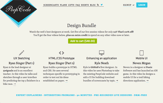
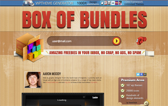
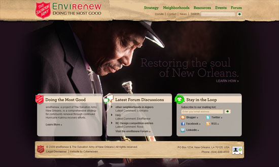
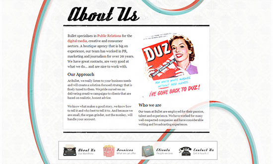
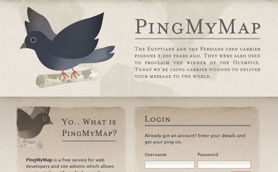
This one doesn’t shy away from using a dominant color rather than staying with neutrals. The “cover on hover” interaction isn’t unique to Dribbble but you can see it echoed here and on the previous featured site with an icon instead of text details. It’s also nice that you don’t have to click through the post to get to the Dribbble link. The trade-off is there’s no direct link (the off-Dribbble one). Another nice thing: the stats are also displayed here, which might figure into your decision-making of which to click through first.
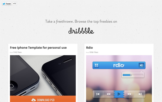
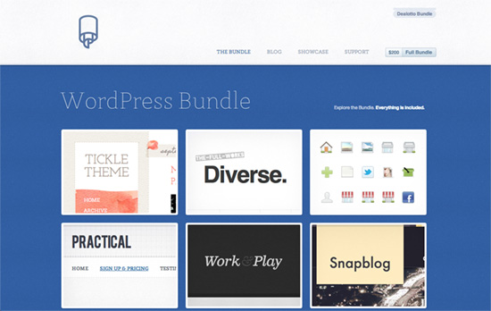
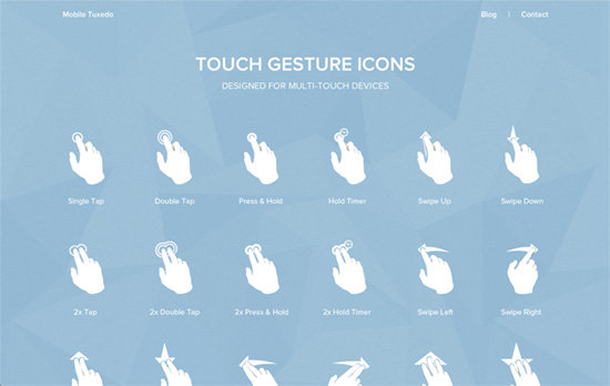
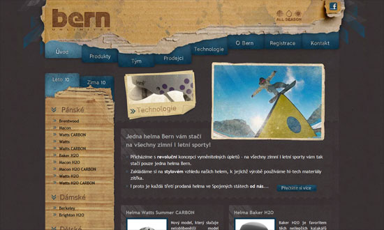
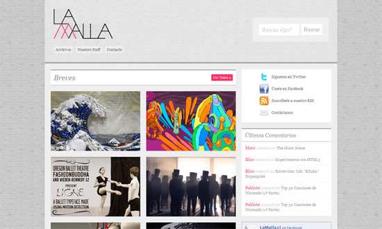
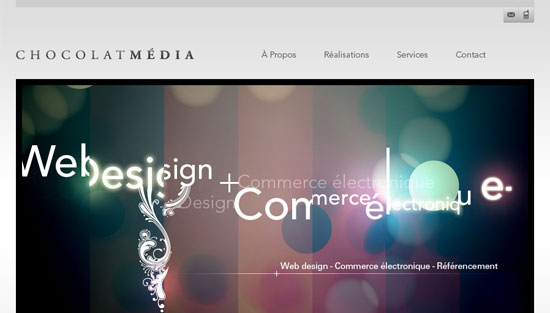
A departure from the layout and image dimensions of the previous sites: two-column and half your viewport width. Quality is a little sacrificed when the images go beyond 400-pixel width, however.
Social Media Weekly
Search Optimized, Turn-Key Designs, Unlimited Everything. Start building with the Genesis Framework today.
User Experience – Checkboxes that kill your product
“Design by committee often looks like a row of checkboxes.”
Responsive Web Design – A simple (and very rough) responsive table solution
“Would you like to see a super-simple solution for responsive tables – that needs no JavaScript and just a few lines of CSS?”
CSS – Design From the Inside Out With CSS Min-Content
“What we want, ultimately, is a way of saying, “reduce the width of the container automatically so that the image fits inside it perfectly. If text content needs to wrap inside the container to make that happen, that’s okay”.”
