These featured designs are all in keeping with a publication theme in terms of content and presentation. Although they don’t necessarily have to look like a shelf of books, it’s interesting to look at how they came up with such websites to accomplish their goals.
Designs of the Week
Build on DIYThemes’ Thesis Framework for rock solid SEO and great layout customization options.
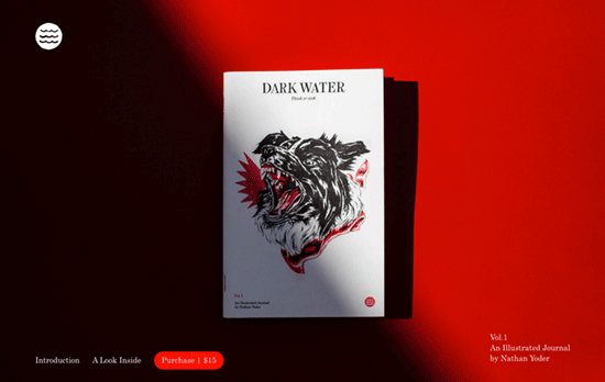
A one-pager about a journal that looks nicely typeset and keeps that masthead feel with its footer credits. The way it’s photographed in the above-the-fold picture, not to mention the red accents, give it a bit of intrigue too.
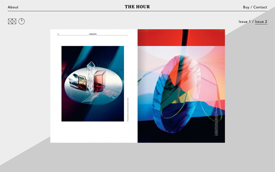
This magazine featuring watches does a very clever thing with the background mimicking the second hand rotating round a clock. To the left you’ll see a couple of icons that switch between the magazine pages and its featured watches. The upper two links in both corners show content sliding in from their respective sides.
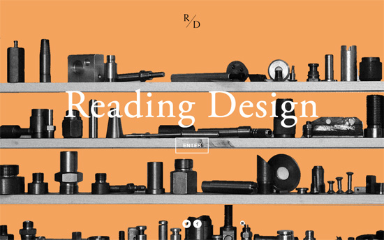
You don’t see “splash screens” too often except in asset-heavy, interactive sites. Here it’s a threshold to a text-heavy site, particularly an alphabetically arranged index of topics. Pretty much every detail here has that traditional print publication feel, apart from the quite-modern photo essays which you can view one at a time or as a grid.
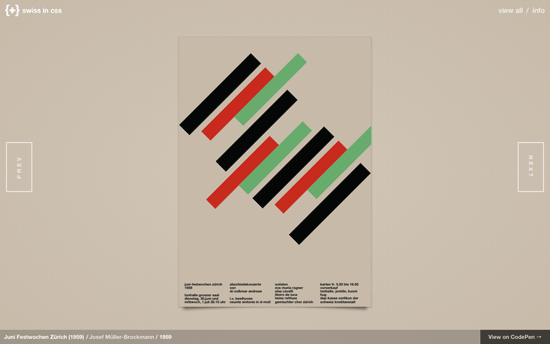
A beautiful throwback brought into this century: the International Typographic Style is recreated as different dynamic posters with CSS, and I would have loved to read the thought process on what the animations were chosen for each design.
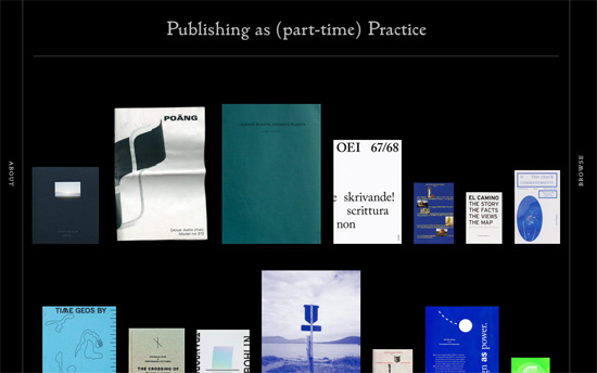
Covers of books arranged horizontally on imaginary shelf lines become vertically rotated “book spines” when hovered on. Very curious is the use of red, yellow, and blue as accent colors as you don’t see that everyday. Aside from that though, super elegant typographic details in here too.
Social Media Weekly
Need help in promoting your site? INeedHits has been in the search engine marketing since 1996!
Performance – Performance Budget Builder
“The Performance Budget builder lets you lay out your template types, set a size budget for each template type, then plug in the sizes for each asset category that will load in the template.”
UX – Any Research is Better Than No Research
“No matter how simple or complex your product, without research you are designing it based on assumptions.”
JavaScript – The Controversial State of JavaScript Tooling
“Other languages and ecosystems are victims of all-encompassing standard libraries, but the web development community takes pride in not having that problem.”
CSS – Learn CSS Layout the Pedantic Way
“CSS layout can be difficult to learn, because websites usually evolve incrementally. This means that you end up learning small tips and tricks here and there, and never learn the underlying layout algorithm.”
