• Home
  • About
  • Contact
  • Advertise

Devlounge

Design, Develop, and Grow

  • Home
  • Code
  • Design
  • Design Focus
  • Interviews
  • Publishing
  • Strategy
  • Webapps
  • Extras

Color Choices for Better Readability

January 20, 2010 By Lorraine

When I started designing websites twelve (!) years ago, I did an embarrassing large number of them in black with white text. Fast forward to 2010, and now I’d say that 99% of the sites I design have black- or dark gray- text on white backgrounds. I’ve read the studies, of course- accessibility and readability studies stating over and over again that anything but black on white is difficult to read and possibly headache-inducing.

But what really matters here aren’t necessarily the colors themselves, but how they contrast with each other. Take the following example:
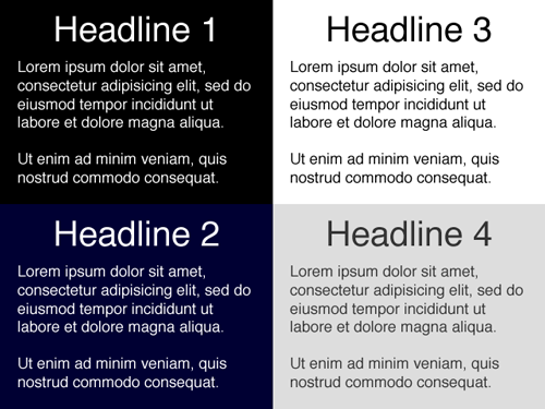
Of all these, Headlines 1 (black background, white text) and 3 (white background, black text) have the highest contrast. While these could arguably be the easiest to read, some people actually find the lower contrast examples in Headlines 2 and 4 more pleasing to the eye- myself included (note: I have bad eyesight, probably from spending too many hours in front of a computer for the past 12 years!) Which is why many designers would rather use #333 for text on a white background rather than #000.

This is also interesting:
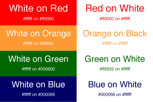
I’m not sure about you, but my eyes naturally gravitate to the boxes on the left because of their bold colors. Now I wouldn’t recommend these for long paragraphs of text, but it’s certainly something to keep in mind when choosing colors for things like banners, mastheads and advertisements.

What color choices do you make in your designs? Do you stop and think about how they relate to readability?
Friday Focus 11/20/09: You’re My Type

November 20, 2009 By Sophia Lucero

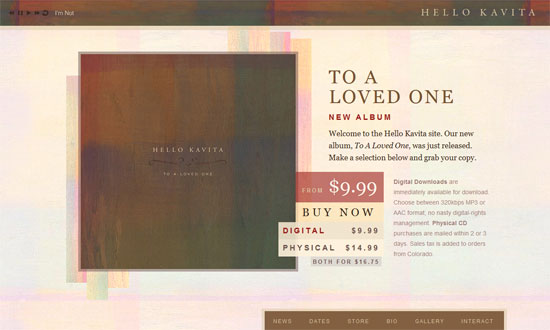
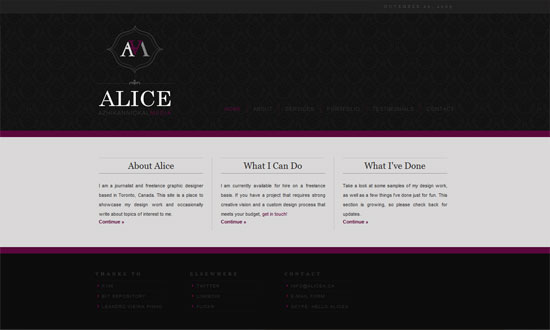
We love our fonts around these parts, so here’s another batch for this week’s Friday Focus featuring excellent typography, and nothing but.

Designs of the Week

Hello Kavita

Alice Azhikannickal

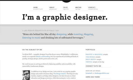
Brian Hoff

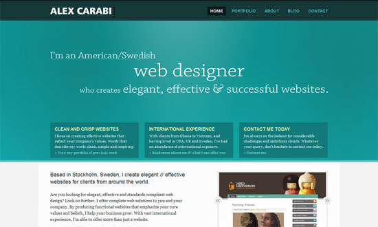
Alex Carabi

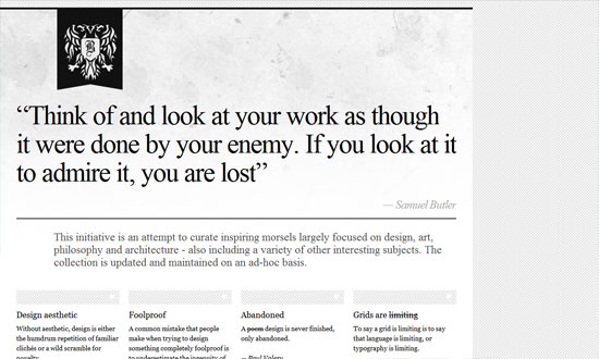
Inspire - Bora Nikolic

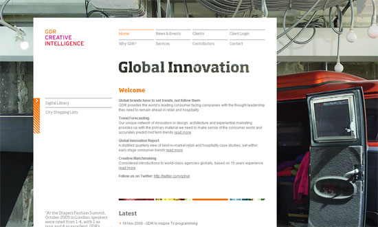
Global Design Resources

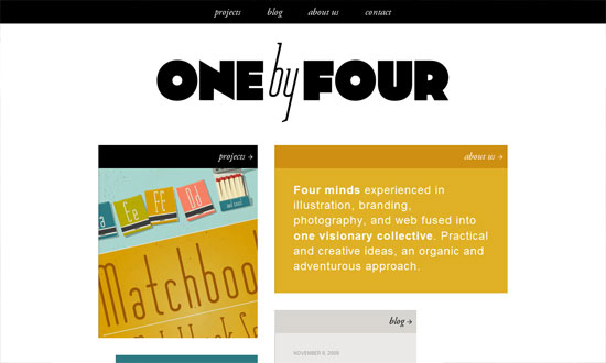
One by Four Studio

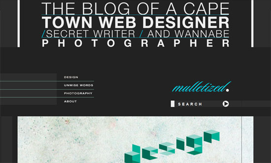
Mulletized

Less Code

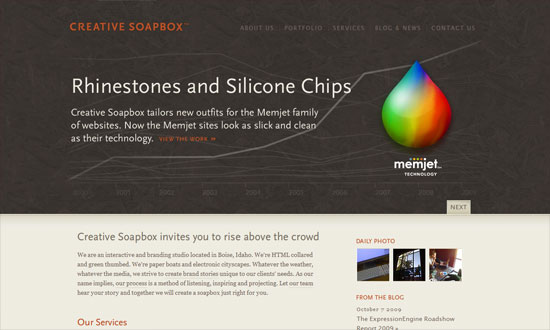
Creative Soapbox

Social Media Weekly

Design – Readability
“In the early years of a child’s reading development, the attainment of mechanical skills is gained initially with the aid of a finger to help left to right progression and accurate return sweeps from the end of one line on to the beginning of the next. By reminding ourselves of what were the perfunctory difficulties of childhood reading, we give ourselves an insight into the fundamental mechanics and principles of setting text.”

Programming – What Beautiful HTML looks like
For your desktop wallpaper?

Usability – Inexpensive Ways to Target Problem Areas
“In the past few years, technology has become available that has brought the cost and complexity of user testing down to a level where it is available for anyone. In addition, it allows designers to be exposed to users, in their native environment, not a sterile lab across town. You can run a test in only a week for less than a few hundred dollars.”

Code & Tutorials

Which Front-End Development Languages Will Grow in 2017?

Your Guide to Leveraging APIs as a Developer

Bitcoin Processing Website Integration For Web Developers

Website Security For 2016 That All Developers Need To Know

5 Reasons You Need to Be Using jQuery

About Devlounge

Want to read more about Devlounge, or maybe you want to contact us, or even advertise? Oh, and don't forget to subscribe to updates!

The Best of Devlounge

Randa Clay On Breaking Barriers

Search