It’s all retro this week on Friday Focus—robots and rainbows on the design horizon. You’re sure to have a blast with the designs below. Enjoy!
Designs of the Week
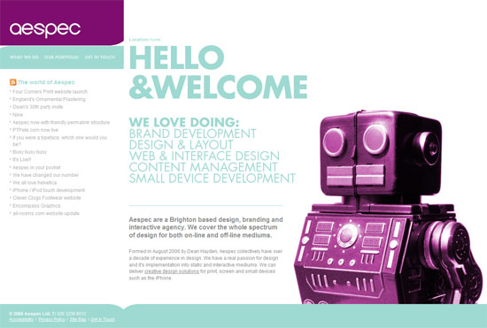
Excellent color combination, although the smaller text could have used a darker shade of blue. This site is enjoyable simply because there’s a giant purple robot on it. Without it, this would be just another nicely-designed website without any personality to it. And what could be quirkier than robots?
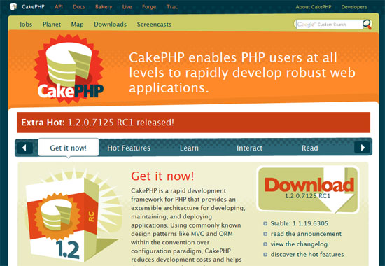
I like that the lines are skewing in all directions, but not in a chaotic way. Cheerful colors and illustrations plus some snappy JavaScript effects. Everything says “bake a cake, bake a cake, bake me a cake as fast as you can!”
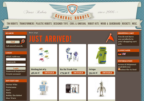
This site is so interesting not only because of the design, but because of the premise: it’s an online shop for all things robots. I would have loved a bit more kitschy-ness to the ecommerce design elements, not just the surrounding layout, but this is a fun look nonetheless.
You’ll have a good time navigating this site. The grunge effects are subtle (they look like real dirt!), and everything’s just arranged nicely.
Social Media Weekly
Design – 2008 Design Trends
Web Designer Wall has come out with its annual list of design trends. Click to find out.
Programming – Using CSS to Fix Anything: 20+ Common Bugs and Fixes
Writing CSS is never painless. This list is a must-read.
Oh, and speaking of robots, download Firefox 3 already and type about:robots into the address bar.


