This week on Friday Focus: one-page sites that sure to tickle your design tastes. They’re both playful and well-made, so enjoy!
Designs of the Week
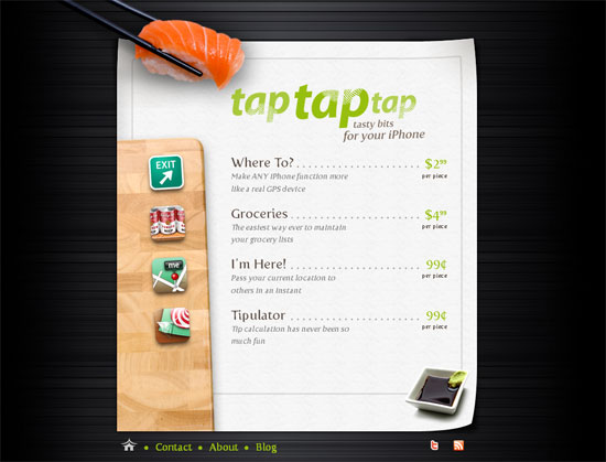
Every element in this site is just so fresh—from the sushi concept to the way the content slides out. My only tiny suggestion is to add some sort of visual cue when hovering over the iPhone-inspired icons. Even filling in the title attribute for tooltips will suffice.
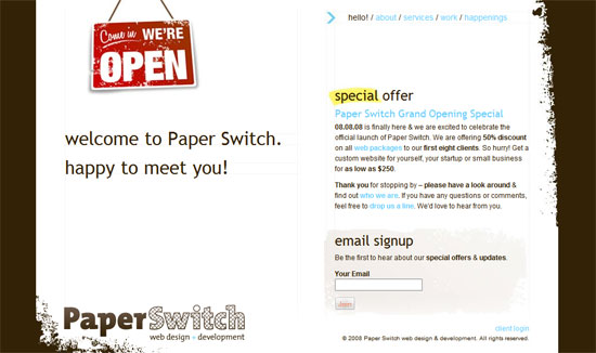
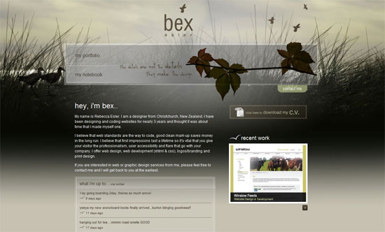
Despite the grunge feel, you can tell the makers of this site cared about details, and were not just forcing a certain style all over the place by splashing some Photoshop brushes around. The gray backgrounds for the forms in each of the sections appear to be unique (when they could have recycled images for consistency). And then there’s the scrapbook-inspired paper cutouts for the work showcase. Finally, there’s a very cute illustration of a bird perched on a tree that still looks grungy.
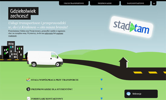
Perhaps I should’ve also included this site in last week’s “eye-catching headers” batch since the top of this site, which basically half of the whole thing, is the blurb slash header area. The lower half shows and hides content using collapsible headers. The same goes for the inverted tabs at the top. Everything is compartmentalized, which keeps things neat and uncluttered.
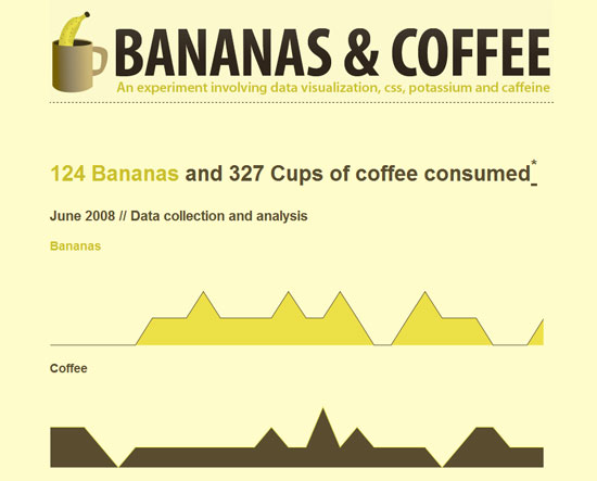
There’s not much on this site but a bunch of graphs, but they’re done very nicely, with the help of some nifty CSS and JavaScript. The colors come from the two stars of the site: yellow for the bananas, and brown for the coffee, and make you feel raring to read what would otherwise be boring old charts!
Social Media Weekly
Design – 35 Greatest Works of Reverse Graffiti
Graffiti that’s environmentally-aware but still quite rebellious.
Programming – An Experiment in Rounded Corners
Jonathan Snook creates a workaround for achieving rounded corners natively in Internet Explorer.
