Our featured sites for this week are inspired by the sea, whether it’s water and waves or the equipment used for water-related activities.
Designs of the Week
Get solid WordPress themes, plugins, and even design training from iThemes.

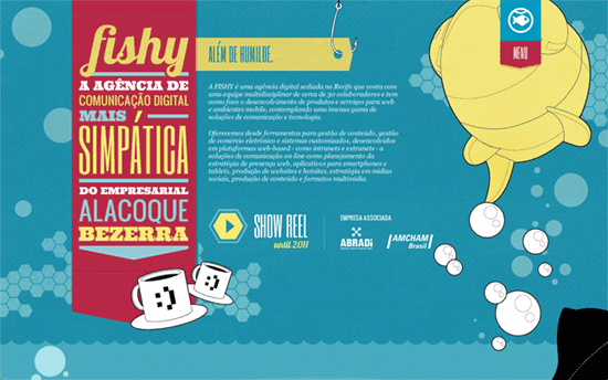
The theme touches every element of the page, even the hover effect on the arrows in the slideshow and the earphone cord behave as if they were underwater.

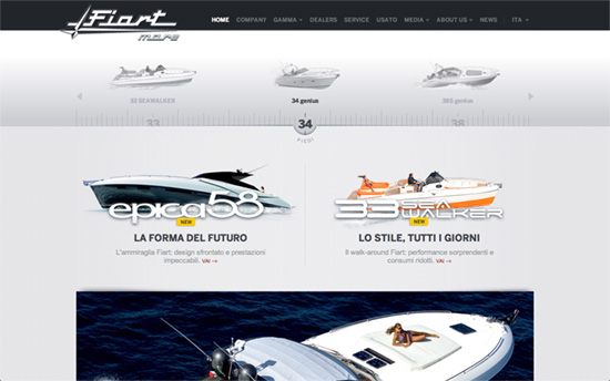
I like the slight touch of vintage typography on the logo. The ruler tick marks on the slider is also a good idea for integrating product information. In the inner pages, the listings and copy are also nicely laid out and easy to read.

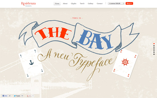
Love how you can make out an owl perched atop the anchor just by its pair of eyes. I like the idea of a red sidebar too.

Again, aside from the dependable shades of blue, red seems to be a popular complement to them on nautical designs. It’s also a really sweet touch to a heart-shaped marker on the screen-by-screen navigation on the right side.
Social Media Weekly
Build on DIYThemes’ Thesis Framework for rock solid SEO and great layout customization options.
Design – The Creative Mystic
“Pick your cards. Reveal your persona. Discover your image style.”
User Experience – Designing for Context: The Multiscreen Ecosystem
“Designing for context is especially important when designing for a multiscreen ecosystem, where multiple devices are all a part of one product.”
Design – An Explanation of Photoshop Blend Modes
“The definitions used here are from the Photoshop help files, with a few bits of added explanation where I saw fit to add them.”
