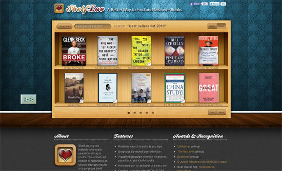
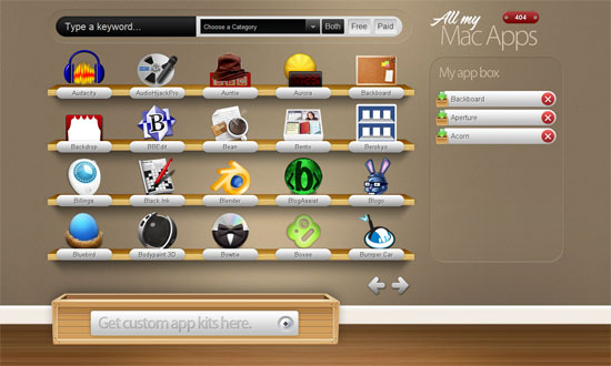
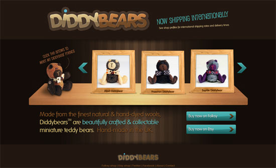
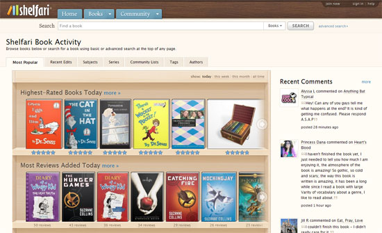
Our featured designs of the week display their content on shelves in very interesting ways. Playing with perspective and adapting a certain level of realism is always a good way to go.
Designs of the Week
Make Headway, make intuitive layouts, make it your WordPress theme of choice!
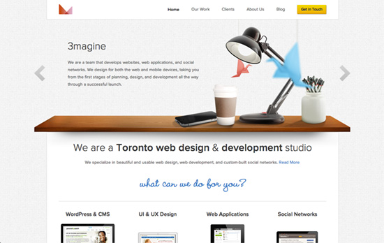
I love the animated tableau slash deconstructed slider. The geometric logo seems to change colors according to the focused slide as well. The rest of the site is more subdued but the subtle animations that fade and slide in the images/content into place, as well as the hovers on the buttons, are very much welcome.
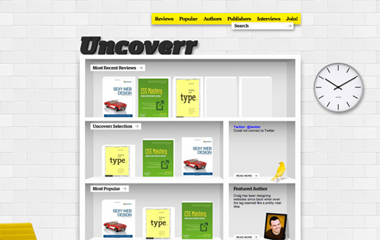
I like how the site name appears to be furniture decor lettering sitting on the shelf. Using picture frames for author interviews is also clever. I just wish this site wasn’t unfinished: the Twitter feed is broken, and there’s greeking text in the footer, not to mention, tight leading and tiny font sizes.
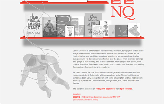
Red text or as a highlight is a trend I’ve been seeing lately, often accompanied with lots of gray as seen here. There’s also a crack of whimsy via the floating astronaut illustration too.
Social Media Weekly
Want your site to be as good-looking and inspirational as these? Start by choosing a well-designed theme from ThemeForest.
Web Standards – Dealing with IE
“You could justifiably argue that IE7 users should upgrade their damn browser. But that same argument doesn’t really hold for IE8 if the user is on Windows XP: IE8 is as high as they can go. Asking users to upgrade their browser is one thing. Asking them to upgrade their operating system feels different.”
Accessibility, Semantics – Neutered Links: A.K.A removing the href attribute
“I’ve seen a new inaccessibility pattern appear with links that are not keyboard accessible. This article will explain the problem, solution, and provides a helpful bookmarklet for finding these neutered links on your page.”

