Another text-y trend this week: these ones appear on the edges of the page, either as navigation markers, or links to menus & subsections, all oriented perpendicularly. Is this an alternative to the hamburger menu in tucking away off-canvas navigation, a smart way in highliting important site features, or a cumbersome way of displaying text?
Designs of the Week
Make Headway, make intuitive layouts, make it your WordPress theme of choice!
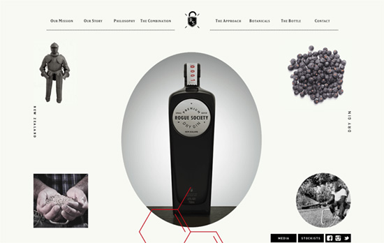
Besides the text, you’ll see familiar elements like a centered logo and several graphics floating over others, while sliding in at a delayed pace. Vintage photos and illustrations are scattered all over the site, not to mention certain key words in bold.
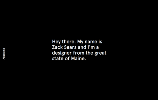
Black, white, and bright green and blue. As you scroll down, the text on the left switches to describe the section of the page, whether it’s a project or contact info. Hover on and it reveals the next few links you can skip to—take note that it doesn’t show the whole menu, just the ones you haven’t scrolled to yet.
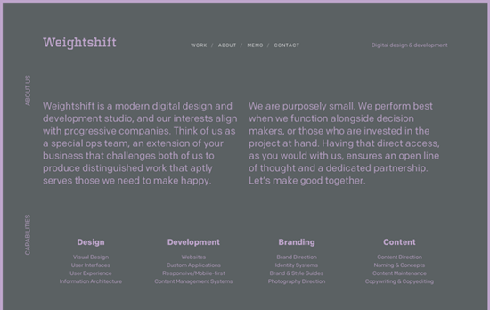
A relatively unusual color combination for this section, as the other top-level pages use neutral grays and creams. Each page also carries a slightly different layout to fulfill the functions the section needs, and that all happens with almost zero imagery. On the work page, you’ll find them as masked textures on the case study titles.
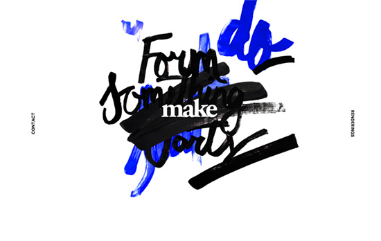
The scribblings in the center actually move according to your cursor movements, also in layers, while the rotated words on the side lead you to the rest of the site. Also another site that does not shy away from the purest shade of #0000FF.
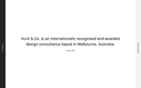
On this site the sideways text span the entire height of the page and the whole area is clickable. To the left is the site menu, while the right side shows selected works. It’s only when you select a link from either side that the middle area gets filled, and it’s another approach to layout minimalism.
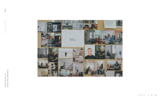
Accessibility-wise, I’m uncomfortable with the controlled scrolling (when the info section is revealed, you’ll still be scrolling the main content unless you use the scrollbar), the thin lines, the tiny text, but browsing this site feels like reading an elegant little book.
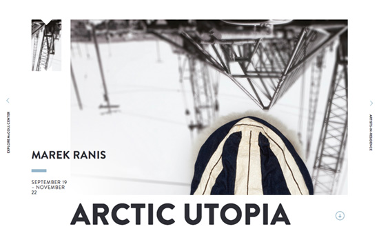
Lots of clever things here: that M-shaped image continuing the main photo actually displays the institution’s logo when you hover, how the lower content scrolls over the header and footer, even the way the event headings on the sidebar are designed, with specially-designed icons for their “spheres of influence”.
Social Media Weekly
Ready to go out and design your next website? Try building with the Catalyst Framework.
Design – 13 Ways Designers Screw Up Client Presentations
“…and one weird trick you won’t believe works every time.”
CSS – Getting Started With CSS Audits
“With these tools, you’ll be better prepared to clean up your CSS, optimize your site, and make the entire experience better for users.”
Typography – On Web Typography: Smart Quotes
“Punctuation is a system. That’s why proper quotation marks and apostrophes look like they’re part of the same family as commas, periods, colons, semicolons, and more, whereas straight quotes don’t.”
User Interface Design – The laws of shitty dashboards
“Hopefully, these anti-patterns can help PMs, designers and engineers reduce a bit the amount of time wasted building and looking at shitty dashboards.”
