-
Check out these website designs that don’t may not contain much at the moment, but grab your attention with a beautifully crafted sign up page.
Designs of the Week
Create unique, extraordinary websites with Squarespace. No experience necessary!

Love the subtle moving clouds and the masked effect on the photograph. The form steps slide up inside the black circle, and you’re led to a confirmation page with the same transition, the only difference is that the beautiful view had disappeared.

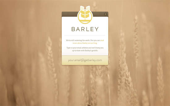
Like the previous site a beautiful background photograph with sites like these make a huge difference for setting the mood. Besides the attention to detail in the interface elements, the interaction is also a beautiful experience: all you have to do is type in your email and it’ll send the form right along, no need to hit Enter or push any button.

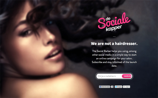
Not sure how a sultry face translates to social media campaigns but I’m curious to see how it all fits into the full site.

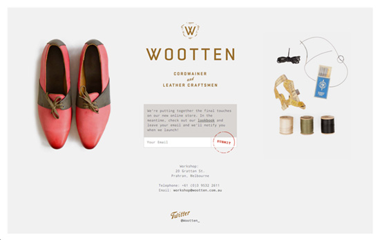
I’d have loved to include this in Excellent E-commerce Photography but let’s enjoy the sneak peeks, the warm copy, and that clever stamp-like submit button. This one’s framed, too.
Social Media Weekly
Ready to go out and design your next website? Try building with the Catalyst Framework.
User Experience – Your Website has Two Faces
“But whether or not our job titles include the phrase “user experience,” we must advocate at least as much for the people who use our software as we do for computer systems.”
Responsive Web Design – REMux: An Experimental Approach to Responsive Web Design
“This concept would solve the biggest challenge: layouts scale almost perfectly within their boundaries.”
User Experience – Stop Designing for “Users”
“Instead of analyzing specific goals and tasks, ACD focuses on the analysis of meaningful, goal-directed actions supported by tools and artifacts in a social world.”
