This week on Friday Focus: these folded, boxy 3D-looking designs pose an interesting challenge to the designer in creating perspective and breaking out of boundaries. See how these websites did it!
Designs of the Week
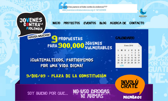
Big, colorful, chunky, and grungy. It almost feels wrong to see “normal” sans serif text fonts here and there!
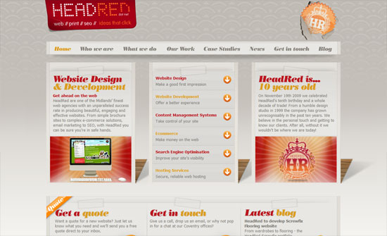
I like the use of the elegant type and wallpaper background against the less elegant ropes, folds, and tears that (which all are done in moderation).
The shadow is not so believable, but I like the look. It’s quite different from the other folded/blocky/3D ones that focus on adding folded ribbons and boxy-fying things up.
Love the icons and the color palette.
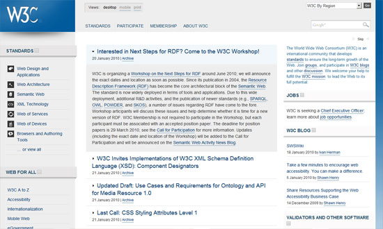
The W3C has its own subtle application of the design pattern. Clean, clear, and lovely.
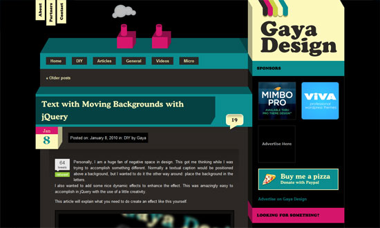
Cute little chimney effect (that isn’t Flash) going on in the header. The design looks a little busy, but I like it.
Now for something unbelievably simple, but still striking and attractive. One of those designs where the design practically goes unnoticed because it’s so subtle.
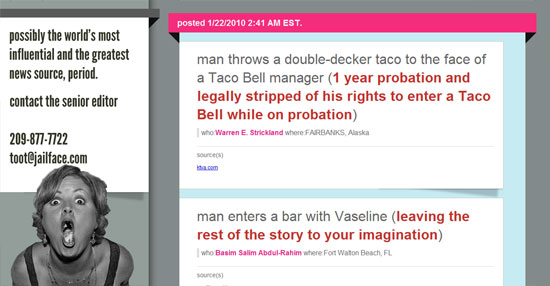
This isn’t a particularly attractive site, but there are enough attention to detail and typography that gets the job—of making the stories readable—done.
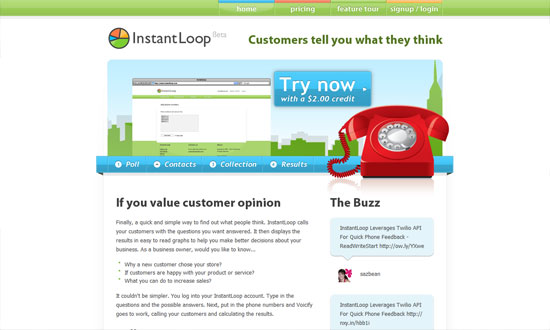
It’s been a while since I’ve seen a super shiny, “Web 2.0”-style design. Bring on the pastels!
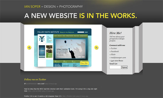
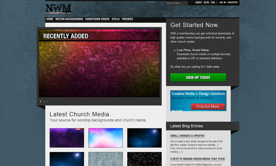
I think it makes sense for the design to be so gray and dark because the backgrounds in the gallery are so colorful.
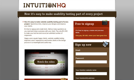
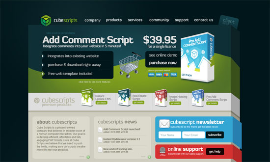
When you’ve got products presented in boxes, a boxy-looking design feels like a natural progression, doesn’t it? What I really like is the footer treatment, which looks like a few sheets of paper with two angling out of place. Not necessary but a very nice touch.
Social Media Weekly
Design – Crafting Subtle & Realistic User Interfaces
Design – Unity In Design: Creating Harmony Between Design Elements
Design – Realism in UI Design
Optimization – How to reduce the number of HTTP requests
CSS – How To Create Depth And Nice 3D Ribbons Only Using CSS3
CSS – Keeping Safari (and Chrome) Hacks Out of Your Stylesheets
