I’ve been a bit busy the last week, which is why this mockup have been somewhat delayed. Among other things, I’ve moved to a new house, with lots and lots of weird things happening. Ghosts? Who knows…
Seriously, it’s time to crank up the pace a bit. I’ve tried the previous mockup design on numerous contacts, friends, and designers this past week, and there’s a consensus that it is good. So I’m moving onwards with it. That doesn’t mean that it is a final design, it’s still just a mockup, but this is the basic style we’ll be going with.
First Single Post Mockup
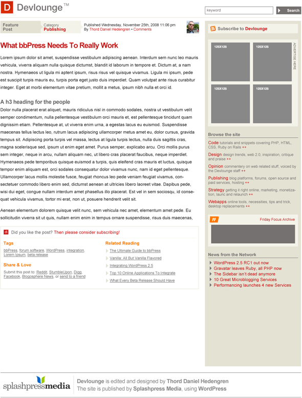
So with the front page somewhat specified, here’s the first front page mockup design. It is lacking comments at the moment, and I’m not happy with the box below the post either, it needs some flare and overall TLC. I haven’t touched the sidebar at all, see below.
Anyway, here’s the mockup.

Thoughts On The Sidebar
Today’s Devlounge is using the sidebar on single posts to promote the blogger with a short author bio, a picture, and for pushing for RSS signups. While I like the author bio box and all, I’m not a great fan of this, since it can confuse the users. If you’re used to find certain things in the sidebar, and it isn’t there on all pages, then the user might be disoriented. Not a big deal, perhaps, but still.
In short, I prefer to not alter too much in the sidebar. What are your thoughts on this? Looking forward to hearing them, and of course your thoughts on the mockup as well. As always, they’re much appreciated, so share!
