Gone are the days where websites have to be vertical…or even upright. These websites have changed the design game by challenging you to look at them from a different perspective, literally. Get ready to tilt your head!
Designs of the Week
Get solid WordPress themes, plugins, and even design training from iThemes.

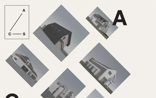
Love the geometric, architectural quality reinforced by the rotated images. The overall layout echoes the company logo too. Drilled down content are in an overlaying modal, and you can page through each section (although a “Previous” link is missing). This design also falls under the scattered, freeform look.

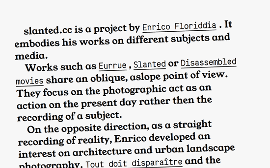
Living up to its name, this site is also an interesting text-centric page in which links display thumbnails and sub-content right beside them. That might be confusing for some, but its experimental nature fits the bill.

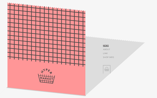
This design delights me so much: the site content looks like a sheet of paper coming out of a “supermarket” cash register, complete with a long shadow that strategically frames the top right navigation menu.

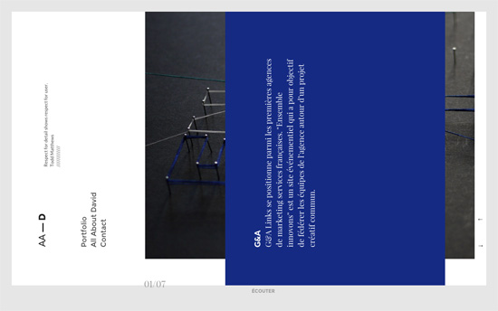
Not only does this scroll sideways with the drag of a mouse or the arrows on the lower right corner, the content is actually rotated 90 degrees counterclockwise. Not sure why one would want something harder to read, but the transitions of the layers—text, header, and subtly moving photos—are beautifully done.
Social Media Weekly
Make Headway, make intuitive layouts, make it your WordPress theme of choice!
Typography – Dashes in Web Typography
UX – Links are broken. These three alternatives have improved our readers’ reading experience.
