• Home
  • About
  • Contact
  • Advertise

Devlounge

Design, Develop, and Grow

ateşli sevgilisi fantezisini yaşamak istediğini söyler porno ona arkadaşları varken onunla gizli saklı seks yapmak istediğini sikiş söyleyen kız hafta sonu için gelen arkadaşının görmediği bir sikiş açıdan sakso çekmeye başlayınca adamın yarağını bu altyazılı porno şekilde indiremez ve açık şekilde salonda sikişimeye sex izle başladıklarında misafir kızı da bu sekslerine rokettube konuk ederler seks yapacağını düşünmeyerek onun sex izle oyun oynadığını zanneder sabah olur ve herkes uyanır hd porno bu sırada yanında şişme mankenini de getiren sapık erotik hikayeler genç sınav haftası ders çalışan genç adam üvey annesinin sikiş eve gelmesiyle hayatının şokunu yaşar

  • Home
  • Code
  • Design
  • Design Focus
  • Interviews
  • Publishing
  • Strategy
  • Webapps
  • Extras

Design Focus: Tilt Your Head

February 9, 2015 By Sophia Lucero

Gone are the days where websites have to be vertical…or even upright. These websites have changed the design game by challenging you to look at them from a different perspective, literally. Get ready to tilt your head!

Designs of the Week

Get solid WordPress themes, plugins, and even design training from iThemes.

Andrzej Capiński Studio

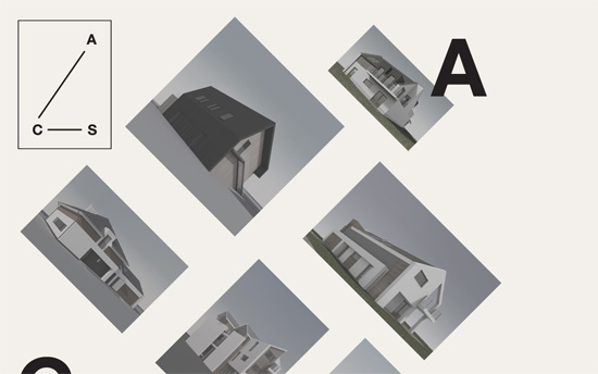
Love the geometric, architectural quality reinforced by the rotated images. The overall layout echoes the company logo too. Drilled down content are in an overlaying modal, and you can page through each section (although a “Previous” link is missing). This design also falls under the scattered, freeform look.

Slanted - Enrico Floriddia
Slanted – Enrico Floriddia

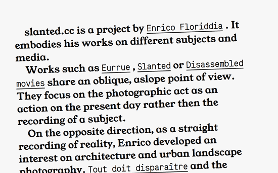
Living up to its name, this site is also an interesting text-centric page in which links display thumbnails and sub-content right beside them. That might be confusing for some, but its experimental nature fits the bill.

Hyper Market
Hyper Market

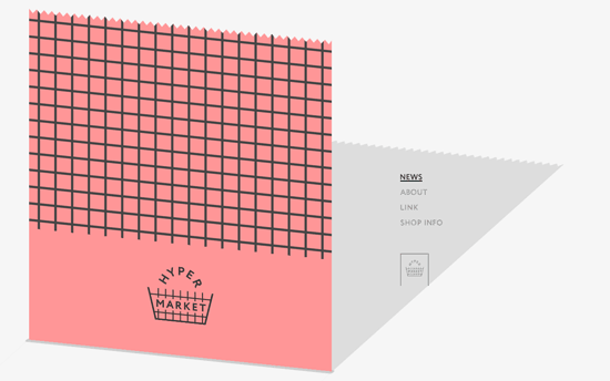
This design delights me so much: the site content looks like a sheet of paper coming out of a “supermarket” cash register, complete with a long shadow that strategically frames the top right navigation menu.

All About David
All About David

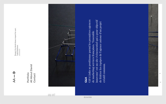
Not only does this scroll sideways with the drag of a mouse or the arrows on the lower right corner, the content is actually rotated 90 degrees counterclockwise. Not sure why one would want something harder to read, but the transitions of the layers—text, header, and subtly moving photos—are beautifully done.

Social Media Weekly

Make Headway, make intuitive layouts, make it your WordPress theme of choice!

Typography – Dashes in Web Typography

UX – Links are broken. These three alternatives have improved our readers’ reading experience.

Friday Focus 09/23/11: The Dip

September 23, 2011 By Sophia Lucero

Happy Friday Focus! Today we’re looking at designs with a bit of a “dip” in them—one content area leading into another with a nice little curve. Can you spot them? Read on!

Designs of the Week

Matthias Schütz's website

I like the combination of wood, light grunge, stripes, and glossy (web 2.0) green—all used in moderation. This design is the poster child for “the dip” technique I’m talking about: a nice column containing navigation links at the right instead of the usual header area, ending in a curly brace shape pointing downward to the rest of the sidebar.

Ellie Taylor's website

This shade of blue is quite popular for girly sites, especially wedding-themed ones, combined with slab serifs and calligraphic fonts. This one looks a little flat, literally, with no textures or gradients, and the girl looks like a cut-out doll with the stark white shadow!

Filidor Wiese's website

Looking for the content? It’s tucked away in the top drawer. The focus of this design is a parallaxed animation featuring an pixelated rendering of the site owner during different times of the day. Right now the screenshot shows him typing away at his laptop (if you watch long enough, his dog shows up but gets shooed away and floats off into space), but click on the different color swatches at the bottom left and you’ll see him doing other things like dreaming in binary, grabbing coffee from out of nowhere, and playing arcade games. Aside from the fact that the colors per scene are blended really, I think this is a smart, funny way for strangers to get to know this person better, even by a little bit.

Snowden Industries website

First, while the callouts aren’t interactive, I like how the first slide is styled especially the halo around the “view portfolio” circle. Hovering over the top navigation gives you circular backgrounds, too, but the active ones get pointers and turn into speech bubbles. There are cool slopes marking each section, and inner pages crop off the the very large headings to focus on the content below.

Sparkling Milk website

The welcome blurb plays with depth by blurring and resizing objects to make them look like they’re in the background. The illustrations are straightforward, but the use of a patch of grass to separate each section is clever. You must also check out the hover effect on each portfolio item, like a store sign or label. I must say, though, the way the contact form is center-aligned in the footer is a little weird!

Social Media Weekly

Business – How Doing Less Work for More Money Saved Client Work (or) How I Finally Became a Professional Designer
Don’t sell yourself short. Find out how “boundaries will set you free”—as in design itself.

Typography – FontDropper 1000
A bookmarklet that lets you test web fonts on any page.

HTML5 – HTML 5 Canvas Deep Dive
Start learning how to work the canvas, now!

UX, Wireframing, HTML, CSS – Building prototypes in HTML and CSS
A step by step guide to creating frames and flows, live, in the browser.

HTML, Accessibility, SEO – Pagination with rel=“next” and rel=“prev”
Google shows you how to add meaning to your navigation (and help their search engine) with semantic markup.

Friday Focus 08/12/11: Slashed Text

August 12, 2011 By Sophia Lucero

We’ve seen a lot of slanting, skewed designs before, but there seems to be an even more specific trend related to that: cropping away text by the use of diagonal lines, as though their edges have been slashed away.

Designs of the Week

Ralph Millard's website
Ralph Millard

The way the images are sliced are extremely odd and even unsemantic. Why not just reuse the dividers and background headers per section? Splitting a large image is a little more understandable perhaps to load things faster, but that also means you’re making multiple HTTP requests.

Adriano Brzozowski's website
Adriano Brzozowski

Here’s another site that uses triangles (and a couple of other shapes), and I like how it frames the Work section nicely. The use of green on the hover boxes is a little surprising even you do see it in the logo. Also, the lightbox mentions website URLs, but are not linked. Is that on purpose (some designers don’t like people to see the finished product cause there’s a good chance it’s been wrecked by other people already!) or a limitation of the script?

BUILD Windows website
BUILD Windows

While the Metro user interface that’s coming to Windows 8 impresses me, this Build logo—which is supposed to promote that same slick feel—does not. This also applies to the rest of the site design. Using Segoe with Georgia doesn’t feel that modern at all. There are bits of the Metro look here and there, but they could have taken things much further. Maybe because it’s just a conference site?

Social Media Weekly

Typography – FreeFacing
A subsection to the site Layman’s Layout, FreeFacing recommends various typographic styles using only the free fonts available on most computers (OS fonts, Adobe fonts, MS Office fonts). There are also diagrams grouping similar styles and looks (lightweights, heavyweights, cheeky, elegant, etc.).

HTML5 – The <details> and <summary> elements
More information about new semantic elements <details> and <summary>, with further explanations and examples from the HTML5 Doctor.

HTML5, CSS3 – haz.io
Which HTML5 and CSS3 features does your browser support? Visit load this website to find out.

JavaScript – What’s a Closure?
Nathan Whitehead teaches JS closures starting with the most basic lessons and builds from there. Learn by entering code directly on the page.

Design – Developer Lorem Ipsum
Need placeholder text? Try paragraphs upon paragraphs of developer buzzwords!

Friday Focus 05/20/11: Slants and Slashes

May 20, 2011 By Sophia Lucero

This week’s designs on Friday Focus are skewed to the side, making for an edgier experience. Check it out!

Designs of the Week

Solid Pink Studios

Extremely simple, but look what a world of difference the CSS3 2D transforms module and a bright shade of pink make.

Ramon Oliver

This would be a lot better if the markup were more semantic. Wrapping titles in span and div tags instead of heading tags for a web design portfolio should be taboo!

milujuvino.cz

One drawback of using slanting graphic elements is the jagged edges. Here it’s not so bad but still a little obvious. I like that irregular shapes are used everywhere though and everything feels light.

VonChurch

Great idea to have a changing triangular graphic for each section located at the bottom left, with the logo matching it. I also like the big V as a loading graphic for the homepage—wish it appeared everywhere as a transition between pages.

Unfold

Stunning layout and interactions for each section. Parallax, masks, bold color and typography—all a real treat.

HTML5 Chop

I like the cleanliness of this look but unfortunately the graphic isn’t tall enough for larger screens. That’s another disadvantage to diagonal designs—they aren’t as flexible as horizonal or vertical ones that make repeating patterns easier.

Mediatic

There’s only one slanting element on here, but it’s worth mentioning. I like the effect of a subtle, slanting background shadow on the navigation, which actually extends all the way to the third row of content. So it’s an interesting moving background technique.

Integrity Elevator

Another minor use at work here, but I quite like the effect of the colorful streaks on an otherwise conventional slideshow of photos. I have to wonder though why texts aren’t clickable when there are even arrows next to them (don’t lead someone on like that!).

Master Francilien de Santé Publique

Beautiful shapes, colors, and type. Has that almost magazine layout feel to it.

Andreas Johansson

I like the textured black background mixed with the grid lines, making the skeletal structure of the design show through. Mixed with the handwritten underline in the menu, it gives the site this blueprint-meets-chalkboard feel.

Foxbone October Filmfest

Not fond of the monospace font but I am fond of combining triangles, squares and grunge in this way.

Datinmánia

This site makes me think diagonal designs can actually be space-conscious too. I just wonder if there are a tad too many moving things at once.

Social Media Weekly

User Experience – Good Idea: “What is this charge on my credit card?” Page
“Now you might think, yeah sure, for big fancy companies with thousands of users being charged every month, this is good, but I’m just a small guy, it’s not worth the effort. Not true.”

Design – The 50 Things Every Graphic Design Student Should Know
“A condensed primer for students and graduates-to-be.”

HTML5, User Interface Design – Maqetta
“Maqetta is an open source project that provides WYSIWYG visual authoring of HTML5 user interfaces. The Maqetta application itself is authored in HTML, and therefore runs in the browser without requiring additional plugins or downloads.”

Web Browsers – The Browser Performance Pickle
“We give earlier versions of IE tons of junk that they handle quite poorly, and we give nice clean and optimized code to the toughest and most stable browsers.”

Design – Clean Up Your Mess – A Guide to Visual Design for Everyone
“If you’re like most people, you feel like a baby when it comes to visual design. You sometimes have a vague sense of what you want, but can’t articulate it or make it come about. All you can do is point and cry. This guide will help you communicate with conscious skill. It will show you how to create designs that are easy to understand and attractive.”

Friday Focus 11/05/10: The Great Outdoors

November 5, 2010 By Sophia Lucero

Imagery that will kindle your spirit of adventure is this week’s Friday Focus. After this, go outside and play!

Designs of the Week

Raids Afrique en 2cv

The text section feels a little underdesigned against all the images, but the impression they make is great.

Help Scout

Nifty metaphor to use the water bottle as a completion status indicator.

Dawn Designs

It’s a really simple idea to integrate your logo into the design this way, but it makes quite the impact.

FreeAgent Depot

I like the vertical approach to this design and all the slanted edges.

HippoApp

Whimsical and light at the top, then futuristic and dark in the bottom? There’s a disconnect that isn’t too appealing.

Paul Lee Design

I love how the illustration flies out of the content area, but I wish the navigation items had more contrast to them.

Racket

Not really the “fun” type of outdoors but look at all the nice little icons and patterns used here. The menu looks great!

Old Pulteney Row to the Pole

Love the vertical parallax, and using paddles as borders is neat.

El Dorado World's Fair

Just one of three exhibitions in typographic prowess; be sure to inspect every element.

Social Media Weekly

Design – Improving the Web for Digital Publishing by Adobe
“Check out a few of the prototypes we’ve been working on to improve webkit for Digital Publishing.”

Typography – Type-a-file
“I couldn’t find a simple css stylesheet that adhered to best typographic practices that anyone could just grab and run with. Type-a-file was inspired by—and is to be used in addition to—the famous meyerweb reset css file.”

CSS – !important CSS Declarations: How and When to Use Them
“Let’s take a look at what exactly these kinds of declarations are all about, and when, if ever, you should use them.”

CSS – Breadcrumb Navigation with CSS Triangles
“Did you know you can make triangles with pure CSS? It’s pretty easy. They are fun for all kinds of things, like little arrow sticking out from speech bubbles, navigation pointers, and more. One neat use that came to mind in this vein: breadcrumb navigation.”

CSS – Things Worth Noting About CSS Attribute Selectors
“This article will go a little further and focus on some interesting facts and bugs surrounding attribute selectors that you may not have known.”

CSS – CSS3 :target based interfaces
“The new properties in CSS3 give us more scope for creating more powerful design features with very little effort, many of which were previously only available through JavaScript or Flash. This example uses the :target selector, a healthy dose of CSS3 transitions and the general sibling combinator to create a modern user interface.”

JavaScript – Close Pixelate
“Inspired by American portrait painter Chuck Close, this script converts an image into a pixelated version using an HTML5 canvas element. It’s basically a simple demo for canvas’ imageData functionality.”

Next Page »

Code & Tutorials

Which Front-End Development Languages Will Grow in 2017?

Your Guide to Leveraging APIs as a Developer

Bitcoin Processing Website Integration For Web Developers

Website Security For 2016 That All Developers Need To Know

5 Reasons You Need to Be Using jQuery

About Devlounge

Want to read more about Devlounge, or maybe you want to contact us, or even advertise? Oh, and don't forget to subscribe to updates!

The Best of Devlounge

Sass x Class = Lea Alcantara

Search