Come for the sounds, stay for beautifully crafted websites you’ll enjoy them in.
Designs of the Week
Need help in promoting your site? INeedHits has been in the search engine marketing since 1996!
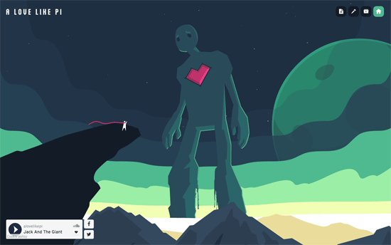
The music embed is not as clever as far as design goes, but it’s not obtrusive to the rest of the site’s adventurous nature. I like how the illustrations are drawn and animated in, and if you have to do a media gallery, might as well keep it fun with pink, floating rocks.
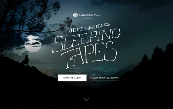
There are some subtle interactions going on here, like the parallax-y and 3-dimensional nested heads of Jeff Bridges and peekaboos from under the album covers. Since this is one long scroll, it’s always a good idea to have the music player handy as a fixed element to the page.
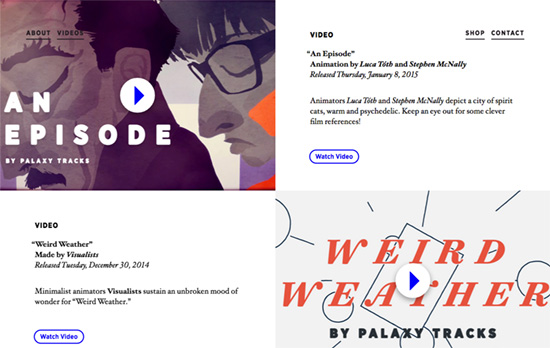
I like the layering of one section on top of the other as you scroll down, reinforced with translucency. The typography and layout are also lovely—doesn’t feel like a typical music site, but one of a portfolio with lots of stories to tell.
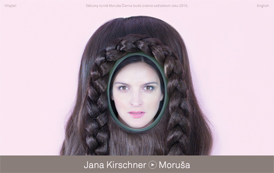
The photos are a bit freaky, but there’s a graphic design-y treatment in some places that adds a modern touch. The scattered dots in the track list section let you switch between album covers and additional artistic shots—an interesting take on the carousel/slider we’ve seen so many times.
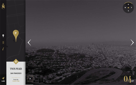
First of all, I love the logo and its overall elegant, Art Deco-esque feel. Second, I like the weird swoosh sound it makes when I go to another page like the About or the City list, although I personally prefer the sound not stopping at all. And for some of these places, you kind of wish there was video if you didn’t use the site as your ambient noise source.
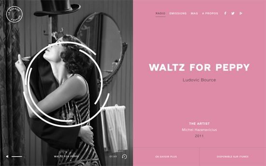
I wish there were playback controls, but this site sticks to the traditional radio station format. You can click through for additional artist info and iTunes links, which is useful.
Social Media Weekly
Create unique, extraordinary websites with Squarespace. No experience necessary!
Interface Design, Accessibility – The best icon is a text label
“Let’s talk about icons now. They’re an essential part of many user interfaces. The thing is: more often than not, they break clarity.”
Interaction Design, CSS – Animation Principles for the Web
“Long established as fundamental working practices at Disney, the 12 Principles of Animation were published as “The Illusion of Life: Disney Animation” in 1981. These principles describe how animation can be used to immerse viewers in a believable world.”
